
A fundraising website lives or dies on one thing: whether a visitor trusts you enough to give. That trust is built in the first few seconds - before anyone reads your mission statement, before they click your donate button, before they weigh whether to give $25 or $250. The design does that work. The right Squarespace fundraising template communicates urgency, credibility, and purpose the moment someone lands on your page. The wrong one makes them hesitate, and hesitation costs donations. If you're also comparing broader options, our full guide to Squarespace nonprofit templates covers more layouts suited to mission-driven organizations.
The best squarespace fundraising templates share a few things in common: bold donation CTAs placed above the fold, visual storytelling that puts your cause front and center, and layouts that work just as well on mobile as desktop - because a large share of donation decisions happen on a phone. They also need to accommodate the full ecosystem of a fundraising site: impact statistics, campaign progress, event promotion, donor recognition, and email sign-ups that turn one-time givers into recurring supporters.
We evaluated ten Squarespace templates for their ability to serve nonprofits, charities, community campaigns, and individual fundraisers. Each template below has been assessed for best donation integration, visual impact, campaign storytelling, and the trust signals that convert visitors into donors - whether you're running a capital campaign, an emergency appeal, or an ongoing giving program.
Editor's Picks
| # | Name | Best For | Price | Rating | Image | |
|---|---|---|---|---|---|---|
| 1 | Nonprofits and charities running high-urgency donation campaigns with compelling visual storytelling | Free | 4.9/5 |
|
More Info | |
| 2 | Campaign-driven fundraisers, grassroots movements, and organizations mobilizing donors around a specific time-sensitive cause | Free | 4.8/5 |
|
More Info | |
| 3 | Established nonprofits, foundations, and charities where institutional credibility is the primary trust signal for major donors and grant committees | Free | 4.7/5 |
|
More Info | |
| 4 | Community-based fundraising campaigns, local charities, and neighborhood organizations mobilizing grassroots donor support | Free | 4.5/5 |
|
More Info | |
| 5 | Fundraising organizations whose campaigns are driven by powerful visual storytelling - conservation, humanitarian, and cause-led charities with compelling photography | Free | 4.8/5 |

|
More Info | |
| 6 | Environmental and conservation fundraisers with compelling landscape and wildlife photography driving the emotional case for donation | Free | 4.9/5 |
|
More Info | |
| 7 | Fundraising nonprofits and charities that use content marketing, newsletters, and regular impact updates as their primary donor engagement strategy | Free | 4.6/5 |
|
More Info | |
| 8 | Fundraising websites where online donations are the primary conversion goal - clean design optimized for donor trust and best donation integration on Squarespace | Free | 4.8/5 |
|
More Info | |
| 9 | Individual fundraisers, personal campaign pages, and small organizations where the story of a specific person or project is the primary emotional driver of donations | Free | 4.6/5 |
|
More Info | |
| 10 | Charities and nonprofit fundraising organizations that build long-term donor relationships through storytelling, impact updates, and a warm, trust-centered brand identity | Free | 4.7/5 |
|
More Info |
Our Picks: The 10 Best Squarespace Templates for Fundraising Websites
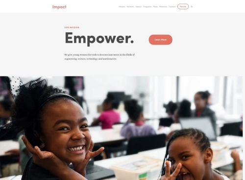
Impact
Best for Bold Campaigns & High-Urgency Fundraising Appeals ✓ Pros
- Powerful full-width hero section puts your cause and donation CTA front and center from the first scroll.
- Bold typographic hierarchy communicates mission and urgency immediately - no hunting for what the organization does.
- Spacious section layout gives campaign stats, impact numbers, and donor testimonials room to land with conviction.
- Clean visual transitions keep visitors moving down the page toward your primary fundraising call to action.
✗ Cons
- Image-heavy structure demands strong photography - weak or generic visuals undermine the template's power significantly.
- Bold, high-impact aesthetic is less suited to quieter, community-centered organizations whose brand is warmth over urgency.
- Requires deliberate copy to match the design's ambition - vague mission language falls flat against a layout this confident.
Impact is the strongest template on this list for fundraising websites that need to move visitors to action fast. Its full-bleed hero section and bold typographic hierarchy are built for the exact moment a potential donor lands on your page and decides whether to stay or leave - and Impact is designed to make them stay. The spacious layout gives your campaign metrics, impact stories, and donation pathway the room they need to build a genuine emotional and rational case for giving. For nonprofits and charities running active appeals with compelling visual assets, Impact is an outstanding foundation.
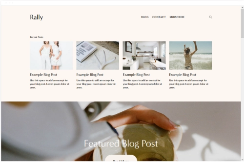
Rally
Best for Campaign Fundraising & Grassroots Donation Drives ✓ Pros
- High-energy design communicates urgency and momentum - exactly what fundraising campaigns need to push donors from interest to action.
- Strong visual hierarchy drives visitors naturally toward donation forms, sign-up prompts, and campaign pages.
- Energetic layout handles multiple concurrent fundraising initiatives without feeling cluttered or unfocused.
- High visual contrast between sections keeps donors engaged and scrolling toward your giving CTA.
✗ Cons
- High-energy aesthetic can feel tonally mismatched for somber or grief-related fundraising campaigns requiring a quieter tone.
- Bold design requires careful color customization - the wrong palette can read aggressive rather than inspiring.
- Less suited to organizations that need a primarily informational presence alongside their fundraising pages.
The Rally Squarespace theme is purpose-built for fundraising organizations whose work is campaign-driven and built around mobilizing public energy around a specific cause or deadline. Its bold visual energy and strong CTA hierarchy are designed to convert passive visitors into active donors - people who sign up, share, and give because the design makes the stakes feel real and immediate. The high-contrast layout keeps multiple simultaneous fundraising campaigns legible and compelling without competing for donor attention. For grassroots fundraisers and campaign-led nonprofits that want their website to match the energy of their community, Rally is an outstanding match.
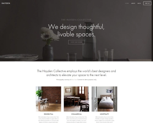
Hayden
Best for Established Nonprofits & Credibility-First Fundraising ✓ Pros
- Editorial layout gives annual reports, campaign briefs, and impact publications a credible, authoritative presentation.
- Prominent navigation structure makes it easy for donors to find giving pages, programs, and organizational information.
- Strong typographic contrast communicates importance and professionalism - right for high-value donor audiences.
- Flexible content blocks adapt well to campaign launches, giving seasons, and year-end fundraising pushes.
✗ Cons
- Text-forward design requires strong copywriting to compensate for lower visual drama compared to image-led templates.
- Formal editorial tone may feel too institutional for grassroots or community-led fundraising campaigns.
- Less visual excitement above the fold compared to photography-first templates like Impact or Tremont.
Hayden is ideally matched to nonprofits and foundations whose fundraising depends on credibility, track record, and the confidence of major donors and institutional funders. Its editorial structure lends the kind of authority that grant committees and high-net-worth donors expect from a serious charitable organization. The flexible content blocks make it straightforward to keep the site current as campaigns evolve, new impact data is published, and giving seasons change. For organizations where trust and institutional credibility are the primary drivers of donations, Hayden is a compelling and professionally finished foundation.
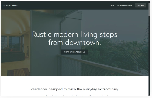
Bryant Hill
Best for Community Fundraisers & Local Charity Campaigns ✓ Pros
- Approachable, community-focused design lowers barriers for first-time donors and casual visitors.
- Clean layout balances mission communication with practical donation and event sign-up sections.
- Trust-building structure accommodates team bios, partner logos, and local impact stories naturally.
- Versatile enough to serve both neighborhood fundraisers and regional charity campaigns.
✗ Cons
- Modest visual drama makes it less effective for national or international high-stakes fundraising campaigns.
- Plainer aesthetic requires strong photography and copy to avoid feeling generic.
- Limited built-in section variety may require extra custom work for organizations with complex multi-campaign structures.
Bryant Hill is a solid, reliable choice for community-based fundraising organizations that want a site communicating local credibility, genuine grassroots engagement, and an open invitation to give. Its approachable design reduces the friction that keeps casual supporters from making a first donation or signing up to volunteer. The clean layout accommodates team bios, local event listings, and impact stories without overwhelming visitors. For fundraisers whose power comes from community relationships and word-of-mouth trust rather than large-scale brand recognition, Bryant Hill provides a welcoming and practical home base.
Tremont
Best for Visual Storytelling & Cause-Led Fundraising ✓ Pros
- Gallery-forward layout showcases cause photography at full visual impact, creating immediate emotional connection.
- Immersive full-width sections pull donors into the story behind the fundraiser before they reach the donation button.
- Strong visual flow guides visitors from storytelling sections naturally toward donation prompts.
- Image-forward design differentiates your fundraising site visually from text-heavy charity websites.
✗ Cons
- Entirely dependent on exceptional photography - mediocre images will significantly weaken donor trust and emotional resonance.
- Gallery-heavy structure can slow page load times without careful image optimization before upload.
- Less structured for organizations with complex multi-campaign portfolios requiring detailed written explanation.
Tremont is purpose-built for fundraising websites that have the visual assets to make donors feel the weight of what their gift enables. Its gallery-forward layout transforms your fundraising page into an immersive experience - one that communicates the human or environmental stakes of your cause far more effectively than any amount of descriptive copy. The visual flow naturally carries emotionally engaged visitors toward donation prompts, making the giving path feel organic rather than transactional. For cause-led charities and conservation fundraisers with strong photography, Tremont is one of the most compelling squarespace fundraising templates available.
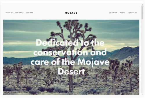
Mojave
Best for Conservation & Environmental Fundraising Websites ✓ Pros
- Full-bleed hero imagery makes cause photography land with maximum emotional impact above the fold.
- Bold typographic hierarchy communicates campaign mission and urgency before a visitor reads a sentence.
- Spacious layout gives impact statistics, campaign progress, and donor testimonials room to breathe and convert.
- Clean section transitions keep visitors scrolling naturally toward your primary fundraising call to action.
✗ Cons
- Image-heavy structure demands high-quality photography - weak photos will actively undermine the design.
- Limited sidebar functionality makes complex multi-campaign resource libraries harder to organize neatly.
- Minimal blog styling requires extra customization for fundraising organizations publishing regular updates and impact reports.
Mojave is the strongest choice among these squarespace fundraising templates for environmental and conservation organizations that have compelling visual assets and want their website to feel as powerful as the cause they're fundraising for. Its full-bleed photography sections and bold type hierarchy are designed to stop scrolling visitors and pull them into the story of what their donation protects. The spacious layout gives fundraising campaigns, impact statistics, and donor recognition the room they need to build a genuine emotional case for action. For conservation fundraisers with strong photography, Mojave is an outstanding and immediate first impression.
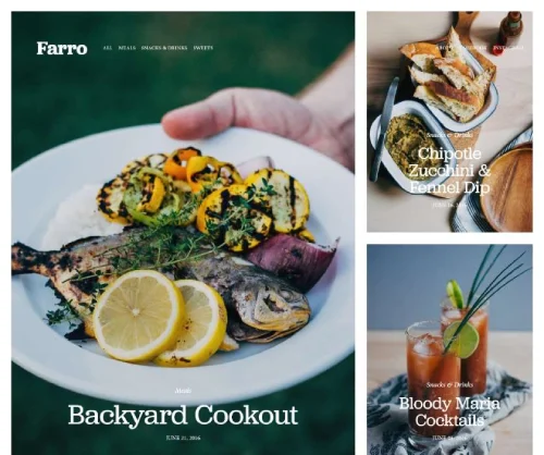
Farro
Best for Fundraising Organizations Publishing Regular Content ✓ Pros
- Warm, organic aesthetic communicates authenticity and genuine mission alignment to potential donors.
- Blog-forward structure turns impact updates, campaign stories, and donor spotlights into a core engagement channel.
- Clean grid layouts showcase fundraising programs, events, and campaigns without visual clutter.
- Soft color palette translates well to humanitarian, wellness, and community-focused fundraising brand identities.
✗ Cons
- Understated design may lack the urgency and visual drama needed for high-stakes emergency fundraising appeals.
- Less donation-focused above the fold - giving CTAs require deliberate placement to compete with content sections.
- Blog emphasis can overshadow campaign and giving pages if not carefully balanced during site setup.
Farro works especially well for fundraising organizations whose donor engagement strategy centers on content - regular impact updates, behind-the-scenes stories, volunteer spotlights, and educational content that builds a loyal audience over time. Its organic warmth and blog-forward design signal a genuine, people-first approach that resonates with recurring donors and long-term supporters. Organizations will appreciate how naturally the layout accommodates campaign stories, program descriptions, and event listings alongside their editorial content. For charities building a dedicated donor community through consistent content rather than one-off appeals, Farro is a thoughtful and well-designed platform.
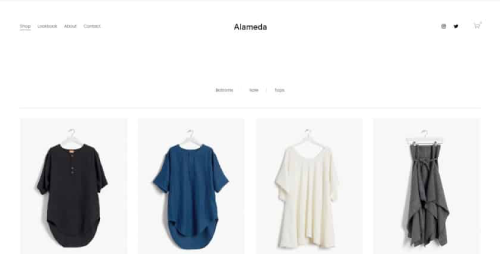
Alameda
Best for Donation-First Fundraising & Online Giving Pages ✓ Pros
- Clean, trustworthy aesthetic builds donor confidence - exactly what high-value and first-time giving decisions require.
- Prominent CTA placement supports donation buttons, campaign appeals, and giving forms above the fold.
- Uncluttered layout keeps visitors focused on the most important action without visual distraction.
- Impact-focused section structure makes it easy to show donors exactly where their money goes.
✗ Cons
- Restrained design requires excellent copywriting to compensate for lower visual drama.
- Simpler aesthetic may underserve fundraising organizations with exceptional photography portfolios.
- Minimal built-in event functionality - event-based fundraising requires additional custom sections.
Alameda is the template on this list most deliberately designed around the needs of donation-driven fundraising websites. Its clean, uncluttered structure keeps visitor attention squarely on your mission, your impact, and the clear action you want them to take. The prominent CTA placement and trust-forward aesthetic are genuinely well-suited to the psychology of charitable giving - particularly for first-time donors deciding whether to commit. For nonprofits and campaign fundraisers where the best donation integration and conversion rate matter most, Alameda offers a focused and results-oriented platform. It also pairs well with third-party tools for best Squarespace donation integration, including Donorbox and Stripe.
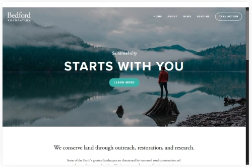
Bedford
Best for Personal Fundraising Pages & Individual Campaign Stories ✓ Pros
- Personal, story-first layout is naturally suited to individual fundraising campaigns and personal cause pages.
- Warm, readable design makes long-form campaign narratives and personal updates feel inviting rather than heavy.
- Flexible content sections accommodate fundraising progress updates, donor shout-outs, and campaign milestones.
- Approachable aesthetic builds personal trust quickly - ideal when the fundraiser's own credibility is the main conversion driver.
✗ Cons
- Modest visual scale makes it less effective for large organizational fundraising campaigns requiring institutional credibility.
- Simpler design may feel under-built for nonprofits managing multiple concurrent campaigns or programs.
- Requires consistent content updates to keep the campaign feeling active - a static Bedford site can feel abandoned quickly.
Bedford is the most human template on this list - and for personal fundraising pages and individual campaign stories, that is exactly the right quality. Its warm, readable layout makes the fundraiser's story the central focus from the first scroll, building the personal trust and emotional connection that drives donations when the cause is tied to a specific person, project, or community effort. The flexible content sections give you room to share updates, thank donors publicly, and communicate campaign progress in a way that feels genuine and personal rather than institutional. For individual fundraisers and small campaign organizations, Bedford is a quietly powerful choice.
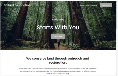
Bailard
Best for Charity Storytelling & Long-Term Donor Relationships ✓ Pros
- Generous white space creates a calm, trustworthy tone - exactly what recurring donors and major gift prospects need to feel confident giving.
- Gallery and media blocks support rich impact storytelling layouts that showcase where donations go in a compelling visual format.
- Multi-section homepage makes it easy to layer mission, programs, campaigns, and giving CTAs in a clear, logical flow.
- Clean serif typography adds warmth and credibility - a visual signal that the organization takes its work seriously.
✗ Cons
- Lighter aesthetic may feel too understated for high-urgency emergency fundraising appeals or time-sensitive matching campaigns.
- Default color palette needs deliberate adjustment to feel distinctively branded rather than generic.
- Gallery sections can slow load times if images are not optimized before upload - a real issue for mobile donors.
Bailard takes a story-first approach that suits fundraising organizations building long-term donor relationships particularly well. Its multi-section homepage allows nonprofits and charities to introduce their mission, highlight recent impact, showcase current campaigns, and invite visitors to give - all within a single, flowing page that never feels cluttered or pushy. The spacious layout breathes well and builds confidence in first-time donors who are still evaluating whether to trust the organization. Bailard works especially well for charities with strong photography, a clear narrative about the communities they serve, and a fundraising model built on recurring giving rather than one-time emergency appeals.
How to Choose a Squarespace Template for Fundraising
Lead with Your Cause, Not Your Design
The most common mistake fundraising websites make is choosing a template that looks impressive rather than one that communicates purpose. For a fundraising site, the template's job is to get out of the way and let your cause speak - the best squarespace fundraising templates do this through strong hero section support, clear CTA placement, and layouts that make impact data and storytelling easy to present. Impact and Mojave lead with full-bleed photography that makes the emotional case before a word is read. Hayden and Alameda lead with clarity and trust signals that give major donors the confidence to give at a higher level. Choose based on how your donors make decisions, not on which design you personally find most attractive.
Make Donations as Easy as Possible
Every additional click or page transition between a visitor and a completed donation costs you real money. The best donation integration on Squarespace happens when the giving button is visible in the hero section, repeated after major content sections, and available in the navigation on every page. Alameda is specifically designed around this principle; Rally and Impact both support prominent CTA placement throughout. Whichever template you choose, integrate Squarespace's native donation blocks or a third-party tool like Donorbox to keep donors on your site - external payment redirects reduce completion rates by a measurable margin for charitable organizations. For organizations concerned about squarespace fundraising templates that support progress bars and campaign-specific giving pages, all ten templates on this list can accommodate these features with basic customization.
Frequently Asked Questions
What is the best Squarespace template for fundraising?
Can I accept donations directly through Squarespace?
Do Squarespace fundraising templates include progress bars?
What Squarespace plan do I need for a fundraising website?
Is Squarespace good for charity and fundraising websites?
How We Evaluate Templates
Conclusion: The Best Squarespace Fundraising Website Templates
Whether you're running an emergency appeal, a capital campaign, a community fundraiser, or an ongoing charitable giving program, the ten templates reviewed here - Impact, Rally, Hayden, Bryant Hill, Tremont, Mojave, Farro, Alameda, Bedford, and Bailard - represent the strongest fundraising website templates Squarespace offers. Each one serves a distinct donor audience and campaign style, from high-urgency visual storytelling to long-term relationship-driven giving programs.
The right squarespace fundraising template is the one that makes your cause feel immediate, your organization feel trustworthy, and the path to donating feel effortless. Choose based on how your donors make decisions, drop in your strongest photography and most specific campaign copy, and let your fundraising website do the work. For more options across the nonprofit and charity sector, explore our full guide to Squarespace nonprofit templates.
* Read the rest of the post and open up an offer