Editor's Picks
| # | Name | Best For | Price | Rating | Image | |
|---|---|---|---|---|---|---|
| 1 | Skincare and beauty eCommerce brands | Free | 4.8/5 |
|
More Info | |
| 2 | Jewelry and accessories eCommerce stores | Free | 4.7/5 |

|
More Info | |
| 3 | Fashion boutiques and apparel brands | Free | 4.7/5 |
|
More Info | |
| 4 | Home decor and lifestyle product stores | Free | 4.6/5 |
|
More Info | |
| 5 | Wellness and natural product brands | Free | 4.5/5 |

|
More Info | |
| 6 | Fashion brands and clothing labels | Free | 4.6/5 |
|
More Info | |
| 7 | Luxury footwear and shoe brands | Free | 4.7/5 |

|
More Info | |
| 8 | Pre-launch and coming soon eCommerce stores | Free | 4.4/5 |

|
More Info | |
| 9 | Kids, family, and childrens product stores | Free | 4.5/5 |
|
More Info | |
| 10 | Artisan, handmade, and craft product stores | Free | 4.5/5 |

|
More Info | |
| 11 | Furniture and interior product stores | Free | 4.6/5 |

|
More Info | |
| 12 | Specialty food and gourmet product stores | Free | 4.5/5 |
|
More Info | |
| 13 | Beauty service businesses with product sales | Free | 4.4/5 |
|
More Info | |
| 14 | Designer bags and luxury accessories brands | Free | 4.6/5 |
|
More Info |
Our Picks: 14 Best Squarespace eCommerce Templates 2026
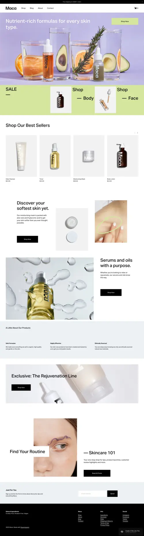
Maca
Best for Skincare and Beauty ✓ Pros
- Product grid layout keeps skincare lines organized and visually clean.
- Bold hero sections let lifestyle photography lead with impact.
- Full commerce architecture handles variants, bundles, and subscriptions natively.
✗ Cons
- Energetic aesthetic is a poor fit for clinical skincare brands.
- Requires strong product photography, weak images undermine the layout.
- Limited blog emphasis if content marketing is central to your strategy.
Maca is one of the strongest Squarespace eCommerce templates for beauty and skincare brands that want products front and center. The clean grid and shopping-forward structure make purchases feel effortless. For a deeper look, read our full Maca template review.
Anise
Best for Jewelry ✓ Pros
- Ultra-clean grid layout lets product photography speak without distraction.
- Subtle hover effects add a polished, modern interactive feel.
- Mobile presentation is conversion-friendly out of the box.
✗ Cons
- Limited visual drama, not ideal for bold or maximalist aesthetics.
- Homepage layout requires high-quality photography to avoid feeling flat.
- Minimalist structure offers less room for brand storytelling.
Anise brings a disciplined minimalism that works especially well for jewelry brands positioning themselves as refined. The breathable product grid lets delicate pieces shine without visual competition. See our Anise template review for more detail.
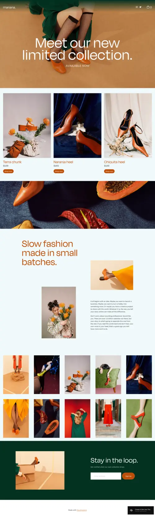
Mariana
Best for Fashion Boutiques ✓ Pros
- Full-width imagery creates an editorial, magazine-style shopping experience.
- Product pages give garments generous space to feel premium.
- Flexible layout handles both capsule drops and larger seasonal collections.
✗ Cons
- Image-heavy pages need careful optimization for fast load times.
- Not the best fit for stores with hundreds of SKUs needing dense filtering.
- Requires professional photography to reach its full visual potential.
Mariana is a Squarespace eCommerce template built for fashion brands that want their website to feel like a lookbook. The full-width imagery and spacious product pages communicate quality before a visitor reads a single description. It works well for boutiques and designers running seasonal collections.
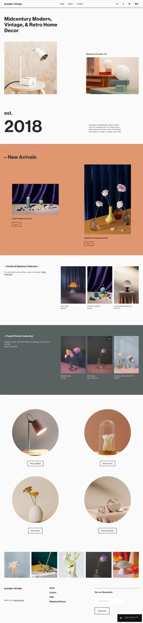
Granger
Best for Home Decor ✓ Pros
- Warm, editorial layout communicates taste and lifestyle aspiration naturally.
- Room-scene imagery sections let you show products in context.
- Blog integration supports the content marketing home decor buyers respond to.
✗ Cons
- Slower visual pace may not suit impulse or deal-driven shoppers.
- Requires styled lifestyle photography, flat-lay shots look out of place.
- Navigation needs customization for stores with deep category trees.
Granger is one of the best Squarespace store templates for home decor brands because it lets you sell a lifestyle, not just a product. The layout encourages room-scene photography alongside the catalog, which is how home decor shoppers prefer to discover items. Check out our Granger template review for a detailed breakdown.
Saltless
Best for Wellness Products ✓ Pros
- Clean, calming aesthetic aligns with wellness brand values immediately.
- Storytelling sections give natural brands room to educate on ingredients.
- Commerce features handle supplements, skincare, and subscriptions smoothly.
✗ Cons
- Understated design may feel too quiet for high-energy brands.
- Needs strong copy and photography to avoid feeling sparse.
- Blog sections require consistent content to justify homepage prominence.
Saltless feels purpose-built for wellness product brands, the calm typography, generous whitespace, and clean product layouts communicate intentionality. It handles everything from supplements to organic skincare without feeling cluttered, and gives space to tell ingredient stories that build trust.
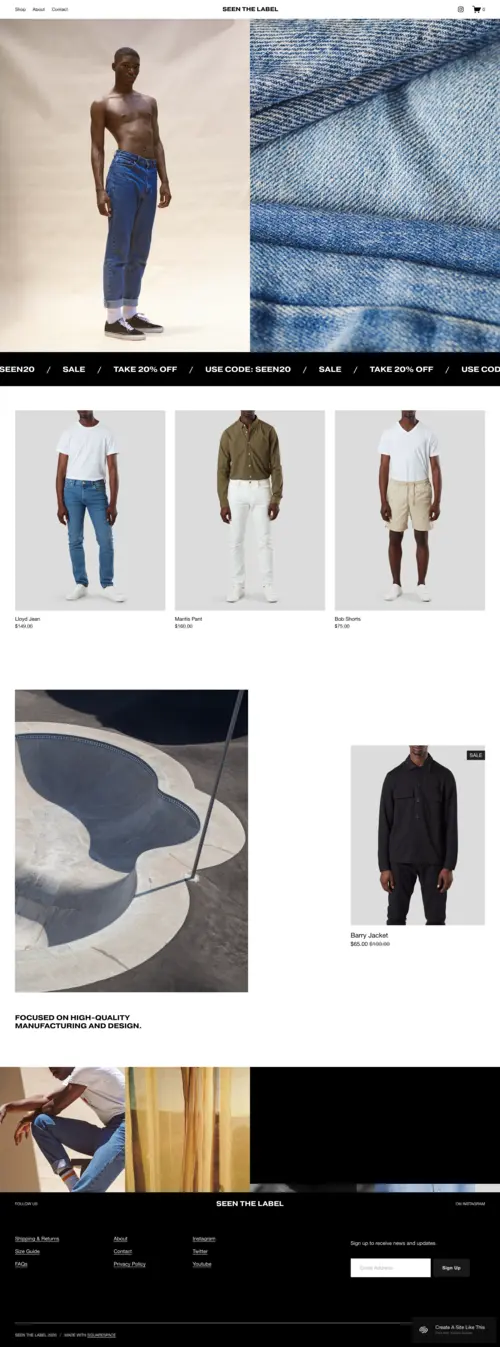
Seen
Best for Fashion Brands ✓ Pros
- Bold visual layout gives fashion brands the editorial presence they need.
- Large-format product imagery showcases garments with detail and clarity.
- Strong mobile experience keeps visual impact intact on smaller screens.
✗ Cons
- Needs high-quality campaign photography to deliver on the layout's promise.
- Less suited for non-fashion eCommerce where editorial styling feels off.
- Product filtering is basic without customization for large catalogs.
Seen puts fashion brands in the spotlight with large, impactful imagery and a visual rhythm that mirrors fashion editorial content online. It works well for clothing labels and accessories brands that want their store to feel like a brand experience, not just a product catalog.
Zaatar
Best for Luxury Footwear ✓ Pros
- Full-bleed imagery keeps the focus on product craftsmanship and detail.
- Clean typographic hierarchy gives the layout a high-end editorial feel.
- Product pages have generous whitespace, making items feel premium.
✗ Cons
- Minimal filtering options for large inventories without custom CSS.
- Heavy image use can slow load times without proper optimization.
- Restrained design may feel too quiet for bold streetwear brands.
Zaatar is a standout among Squarespace eCommerce templates for luxury footwear brands that want photography to lead the conversation. The editorial layout with full-width hero sections and spacious product grids puts craftsmanship at the center. Read our Zaatar template review for more detail.
Zorayda
Best for Pre-Launch Stores ✓ Pros
- Coming soon layout builds anticipation and captures email signups effectively.
- Converts quickly into a full store once your product line is ready.
- Email capture integration helps build an audience before you have inventory.
✗ Cons
- Limited functionality until you expand it into a full store.
- Pre-launch structure needs deliberate redesign when transitioning to commerce.
- Less useful for established stores that already have products to sell.
Zorayda fills a gap in the Squarespace eCommerce template lineup by giving new brands a polished pre-launch presence. Build anticipation, capture emails, and establish your visual identity while products are in development, then transition into a full Squarespace online store when ready.
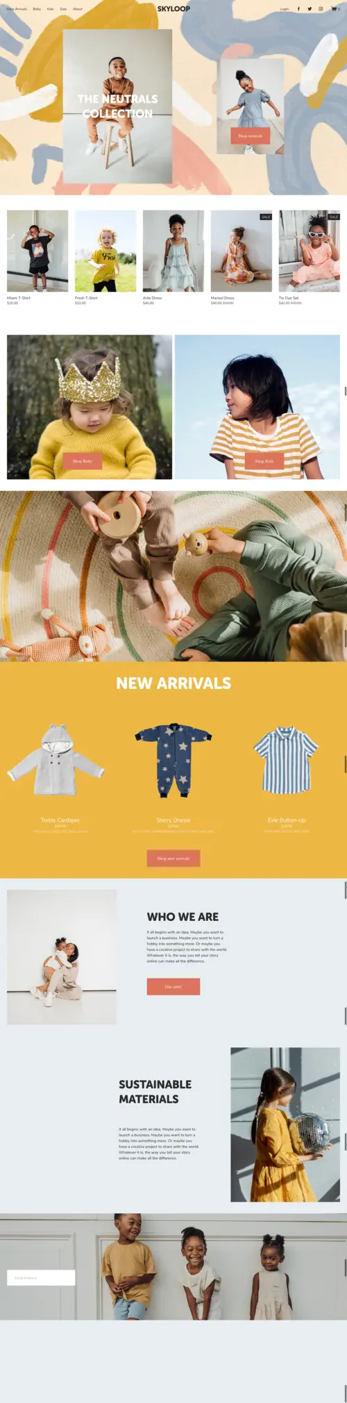
Skyloop
Best for Kids & Family ✓ Pros
- Bright, playful layout appeals to parents shopping for children's products.
- Flexible grid handles toys, clothing, and accessories without looking chaotic.
- Mobile experience is fast and easy to navigate for on-the-go parents.
✗ Cons
- Playful aesthetic limits its usefulness for luxury brand positioning.
- Color scheme needs careful customization to match your brand identity.
- Less suited for brands targeting teens or older demographics.
Skyloop balances playfulness with genuine shopping functionality for kids and family product stores. The layout feels approachable without being childish, which matters when selling to parents who want quality and trust alongside fun. See our Skyloop template review for more.
Maru
Best for Artisan Products ✓ Pros
- Warm, tactile design communicates handmade quality and craft authenticity.
- Storytelling sections let you share your process and maker background.
- Layout handles limited-edition and small-batch inventory naturally.
✗ Cons
- Artisan aesthetic limits appeal for mass-market or high-volume brands.
- Slower browsing pace may frustrate shoppers wanting quick transactions.
- Needs consistent photography style to keep the handmade feel cohesive.
Maru feels designed by someone who understands what makes artisan products sell online. The layout gives handmade ceramics, woodwork, and textiles visual breathing room that communicates quality. It encourages maker storytelling alongside listings, exactly the strategy that works for artisan eCommerce.
Camdez
Best for Furniture Stores ✓ Pros
- Large-format image sections showcase furniture with the scale it needs.
- Clean, spacious layout communicates the quality furniture buyers expect.
- Room-scene sections let you present pieces in styled interior settings.
✗ Cons
- Slow-scroll design may not suit shoppers browsing large catalogs quickly.
- Requires professional interior photography to reach its visual potential.
- Navigation needs work for stores with many product subcategories.
Camdez gives large products the visual space they need to make an impression. Furniture is a considered purchase, buyers want to see craftsmanship, scale, and how a piece fits into a real living space. Camdez delivers with generous image areas and a layout that encourages room-scene storytelling.
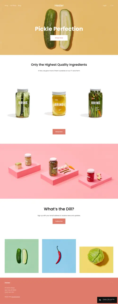
Hester
Best for Specialty Food ✓ Pros
- Warm, inviting layout makes food products feel artisanal and high-quality.
- Product grid handles varying packaging sizes and food categories cleanly.
- Works well for gift boxes, subscription bundles, and seasonal collections.
✗ Cons
- Food-oriented aesthetic limits versatility for non-food product categories.
- Requires appetizing, well-lit photography to sell food effectively online.
- Subscription features may need third-party integrations for complex setups.
Hester understands how specialty food sells online, through visual appetite appeal and brand storytelling that makes artisan products feel like gifts worth giving. The layout handles mixed food types well, from individual items to curated gift boxes and seasonal collections.
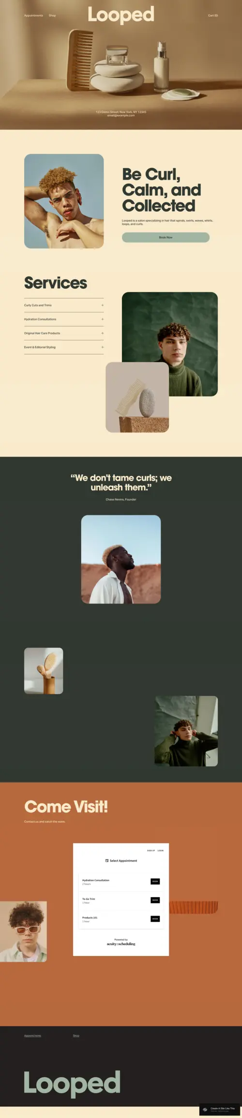
Looped
Best for Beauty Services ✓ Pros
- Blends service booking and product sales in a single cohesive layout.
- Visual style suits salons, spas, and beauty professionals selling retail.
- Mobile layout handles both browsing and booking without friction.
✗ Cons
- Hybrid structure can feel unfocused without clear content hierarchy.
- Less optimized for pure eCommerce stores without a service component.
- Product catalog functionality is secondary to the service-first layout.
Looped is designed for beauty businesses that sell both services and products, salons retailing professional haircare, spas selling skincare, or beauty professionals with a curated product collection alongside their booking calendar. It handles the hybrid model without making either side feel like an afterthought.
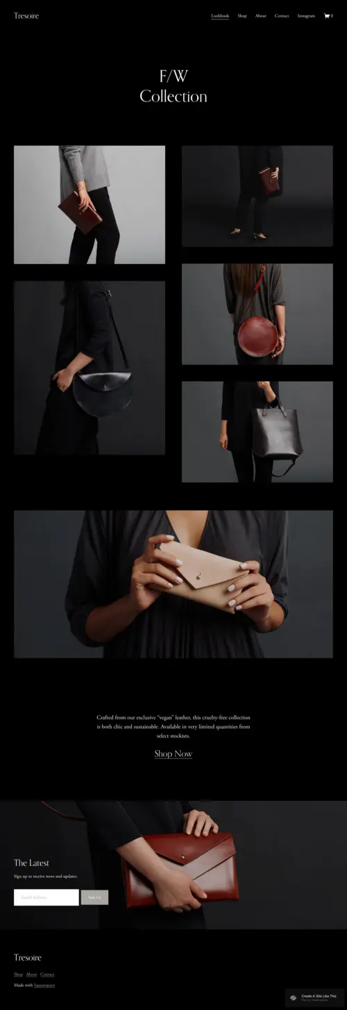
Tresoire
Best for Designer Bags ✓ Pros
- Refined layout communicates the premium positioning luxury accessories demand.
- Large product imagery showcases leather quality and craftsmanship details.
- Whitespace-forward design makes each product feel like an investment piece.
✗ Cons
- Premium aesthetic is misaligned with budget-friendly bag brands.
- Requires professional product photography to justify the luxury positioning.
- Less effective for stores with very large product catalogs.
Tresoire is built for designer bag brands that need their website to match the quality of what they sell. Large imagery, generous whitespace, and refined typography create a shopping experience that feels premium from the first scroll. Read our Tresoire template review for a deeper understanding.
How to Choose the Right Squarespace eCommerce Template
Match the Template to Your Product Type
The most common mistake is picking a Squarespace store template that looks good in its demo without considering your product type. A fashion-forward template with full-bleed imagery feels awkward for specialty food, and a storytelling-heavy template frustrates shoppers wanting fast catalog browsing. Start by identifying your product category, then narrow from there.
Prioritize Mobile Experience
Most eCommerce traffic comes from mobile devices, making the mobile version of your Squarespace online store the primary shopping experience. Test every template on a phone, check that product images load quickly, checkout is smooth, and navigation does not require too many taps.
Consider Your Catalog Size
Some Squarespace commerce templates suit brands with five to twenty curated items. Others handle larger catalogs with category navigation and grid layouts. Match the template's structure to your inventory size so products feel neither sparse nor overwhelming.
Think About Growth and Flexibility
Your store will evolve, a launch template may need to support a blog, subscriptions, or wholesale ordering within a year. Choose Squarespace eCommerce templates with flexible section structures and native commerce integration so you can expand without a full redesign.
Frequently Asked Questions
Is Squarespace good for eCommerce?
How much does a Squarespace online store cost?
Can you sell products on Squarespace?
What is the best Squarespace template for an online store?
Do all Squarespace templates support eCommerce?
Can I change my Squarespace template after launching my store?
How We Evaluate Templates
Conclusion
Each of the 14 Squarespace eCommerce templates in this guide is built for a specific product type and brand style. Once your store is running, the Klaviyo Squarespace integration is the most effective way to add abandoned cart recovery and automated email flows that drive repeat sales. Identify the template that matches your product category and brand tone, customize it with your photography and copy, and let Squarespace handle the technical side so you can focus on converting visitors into customers.
* Read the rest of the post and open up an offer