Editor's Picks
| # | Name | Best For | Price | Rating | Image | |
|---|---|---|---|---|---|---|
| 1 | Family dentists, general practices, and wellness-oriented dental clinics | Free | 4.8/5 |
|
More Info | |
| 2 | Cosmetic dentistry studios, premium dental clinics, and practices targeting high-value patients | Free | 4.7/5 |

|
More Info | |
| 3 | Paediatric dentists, children's dental practices, and family clinics targeting young families | Free | 4.6/5 |

|
More Info | |
| 4 | Solo dentists, small dental practices, and booking-focused general dentistry websites | Free | 4.7/5 |
|
More Info | |
| 5 | Specialist dental clinics, orthodontists, implant practices, and boutique private dentists | Free | 4.6/5 |

|
More Info |
Our Picks: The Best Squarespace Dentist Website Templates
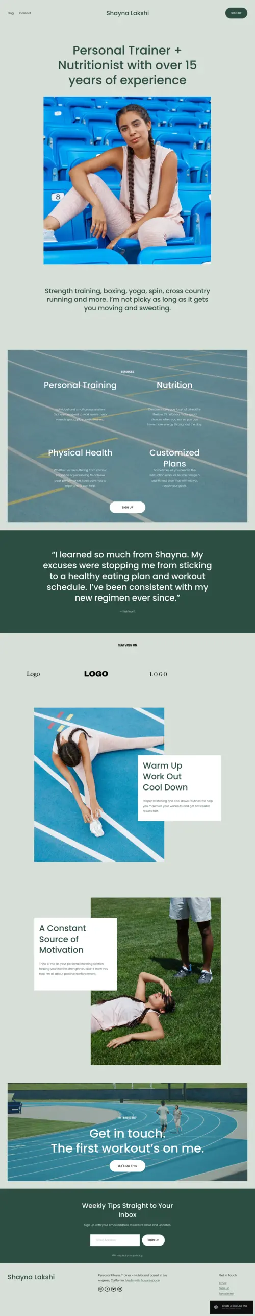
Lakshi
Best for Family Dental Practices & Practitioners Who Lead With Personalised Care ✓ Pros
- Warm, balanced visual layout immediately communicates the kind of personalised, attentive care that distinguishes a family dental practice from an impersonal corporate clinic - patients read trustworthiness into design before they read a single word of copy.
- Dedicated space for patient testimonials is positioned to do maximum conversion work - dental patients research reviews obsessively before booking, and Lakshi puts that social proof front and centre where it directly influences the booking decision.
- Service promotion sections translate naturally into a dental context: general check-ups, hygiene appointments, teeth whitening, and orthodontic consultations can each be given visual prominence without the page feeling overcrowded.
- Mobile-responsive design ensures the squarespace dental website performs on smartphones - the majority of dental practice research now happens on mobile, and Lakshi's layout holds its visual clarity across every screen size.
- Minimalist white space approach gives the design a clean, clinical feel without the coldness of purely clinical layouts - striking the precise tone that earns trust from patients who are already anxious before they arrive at your homepage.
✗ Cons
- The elegance of Lakshi's design demands high-quality photography - dental practices using stock imagery of generic smiling patients will find the gap between the template's premium feel and low-quality visuals undercuts the trust the design is trying to build.
- Not the right fit for high-volume multi-dentist practices that need robust staff directory pages, treatment room galleries, multiple booking calendars, or complex multi-location architecture beyond what this streamlined single-practice layout accommodates.
- The approachable, wellness-adjacent aesthetic may not align with specialist dental clinics (orthodontists, oral surgeons, implant specialists) that need to position themselves as clinical authorities rather than approachable generalists.
Lakshi is the dentist website template that earns patient trust through visual warmth without sacrificing professional credibility. The clean layout, the testimonial-forward architecture, the service sections that feel like genuine invitations rather than sales pages - every element is working to convert a hesitant visitor into a booked appointment. For family dental practices that want their squarespace dental website to feel as welcoming as their waiting room, Lakshi delivers that without a single line of custom code.
Myhra
Best for Cosmetic Dentistry & Premium Dental Clinics With a Strong Visual Identity ✓ Pros
- Rich, dark aesthetic communicates premium positioning immediately - cosmetic dental patients associate visual sophistication with clinical quality, and Myhra's design triggers that association before a single service is described.
- Multiple content sections allow a comprehensive service menu to be displayed elegantly - teeth whitening, veneers, Invisalign, dental implants, and smile makeovers can each be given dedicated space without the page becoming a wall of text.
- Blog section architecture supports the kind of patient education content that builds organic search visibility over time - "how much do veneers cost," "Invisalign vs braces," and "how to whiten teeth" are high-intent search queries a cosmetic dental blog can address directly.
- Sophisticated typography paired with high-contrast design makes treatment outcomes and before/after imagery feel like art rather than clinical documentation - ideal for cosmetic practices where outcome photography is a primary conversion tool.
- Event and announcement sections can be repurposed for seasonal promotions, new treatment launches, or patient education seminars - giving the practice flexible marketing real estate within the design structure.
✗ Cons
- The dark, premium aesthetic requires professional photography that matches the tone - practices without high-quality outcome images or a visually considered clinic environment will find the template's ambition exceeds their current visual assets.
- The multi-section architecture creates complexity that requires more content investment than simpler templates - a dental practice without an active content strategy may find Myhra's blog and announcement sections sitting empty, which signals neglect to visitors.
- Not calibrated for anxious patients or dental phobics who need maximum warmth and reassurance - the cool sophistication that attracts cosmetic patients can feel intimidating to general dentistry patients researching routine care.
Myhra is the squarespace dental website template for cosmetic and premium practices that understand their visual identity is part of their service proposition. Patients paying for smile makeovers, veneers, or invisible aligners are choosing a provider partly based on the confidence the clinic projects - and Myhra projects exactly that confidence. If your practice has invested in its physical environment and its clinical outcomes, this is the template that translates both into a digital presence that attracts the right patients.
Noll
Best for Paediatric Dentistry & Family-Focused Practices That Want to Stand Out ✓ Pros
- Playful, vibrant visual design immediately signals a non-threatening environment - parents researching dentist websites for their children need to see a practice that understands child psychology, and Noll's energetic aesthetic communicates that before a service is listed.
- Bold, eye-catching typography grabs attention in a market of uniformly calm, clinical dental websites - Noll's visual distinctiveness is itself a differentiation strategy in local search results where standing out is as important as what you say.
- Well-structured sections for services, team bios, and practice philosophy translate naturally into a paediatric dental context: meet the team, what to expect at your first visit, our approach to nervous young patients.
- Approachable, energetic tone bridges the gap between clinical professionalism and the emotional reality that parents are not just choosing a dentist - they're choosing someone their child will need to trust, possibly under stress.
- Customisable colour palette can be adapted to a practice's specific brand colours while maintaining the playful visual energy that distinguishes Noll from generic dental website designs.
✗ Cons
- The playful, retro-inspired aesthetic has a specific target audience - general adult dentistry practices or specialist clinical services will find Noll's tone misaligned with the trust signals their patient demographic expects from a dental professional.
- The bold visual personality requires confident brand photography that matches the energy - stock images of generic families or standard dental chairs will feel incongruous against Noll's distinctive visual character.
- Less suited to practices emphasising clinical authority, specialist credentials, or high-value adult treatments like implants or full-mouth rehabilitation, where the playful aesthetic can undermine rather than build the necessary credibility.
Noll is the dental website template for practices that understand their brand is the antidote to dental dread. In a category where every competitor looks the same - white backgrounds, stock smiles, generic "we care about your health" headlines - Noll's visual boldness is a genuine competitive advantage. Paediatric dentists and family practices that build their reputation on making dental visits feel less like appointments and more like experiences will find Noll captures that positioning in a design that earns attention and earns trust.
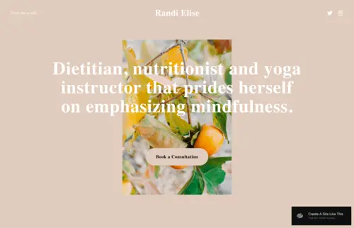
Randi
Best for Solo Dentists & Booking-First Dental Websites That Prioritise Simplicity ✓ Pros
- Clean, distraction-free layout removes every obstacle between a visitor's decision to book and the action that matters - for solo dental practices where a single practitioner and a single booking CTA are the whole story, this conversion architecture is exactly right.
- Soft, neutral colour palette creates immediate visual calm - reducing the ambient anxiety that dental patients carry to any interaction with dental websites, and priming them for the trusting engagement that a first-time booking requires.
- Integrated booking section is front and centre without feeling aggressive - the design communicates "I'm ready when you are" rather than the high-pressure "book now" urgency that triggers resistance in already-anxious patients.
- Single-page simplicity eliminates navigation confusion - patients who arrive stressed or distracted (which is most dental patients) follow one clear path from landing to booking without getting lost in a complex menu structure.
- Clean aesthetic is adaptable across dental sub-niches - general dentistry, hygiene appointments, preventative care, or holistic dental approaches - without requiring significant restyling between service types.
✗ Cons
- The single-page format limits content depth - dental practices that rely on blog content for organic search visibility, or need condition-specific landing pages for treatments like implants, Invisalign, or root canals, will outgrow Randi quickly.
- Limited sections for credentials, education history, professional memberships, or patient testimonials make it less suitable for practices where authority and social proof are primary conversion drivers rather than simplicity and ease.
- The soft, gentle palette skews slightly feminine in visual tone - dental practices with a predominantly male patient base or a sports/corporate professional positioning may find the aesthetic doesn't match their target audience's expectations.
Randi is the dentist website template for practitioners who understand that patients in pain or anxiety need simplicity, not sophistication. Not every squarespace dental website needs a content archive and a multi-service menu - some practices convert best when the entire design says: we're here, here's what we do, here's how to book, here's the button. For the solo dentist building their first professional web presence, or the established practice that wants a clean, calming refresh, Randi removes every layer of friction and lets the booking relationship begin immediately.
Clune
Best for Specialist & Boutique Dental Clinics With a Premium Patient Experience ✓ Pros
- Luxury-calibrated minimalism communicates premium positioning without ostentation - specialist dental patients (those researching implants, full-mouth rehabilitation, or premium cosmetic work) associate visual restraint with clinical precision, and Clune speaks that language fluently.
- High-quality imagery framework gives individual treatments and outcomes the visual prominence they deserve - a before/after implant series or smile transformation gallery in Clune's clean layout has the impact of gallery art rather than medical documentation.
- Dedicated testimonial architecture integrates credibility smoothly into the design flow - rather than feeling like a review widget bolted on, social proof in Clune's layout reads as an organic part of the patient experience narrative.
- Service-by-service layout allows a specialist clinic to communicate depth of expertise without complexity - each treatment type gets its own visual moment, signalling breadth of capability while maintaining the focused, uncluttered aesthetic.
- Elegant overall structure keeps the brand memorable - in a competitive dental market where practices often look identical, Clune's visual distinctiveness creates a recall advantage for patients who visit multiple sites before making their decision.
✗ Cons
- Premium aesthetic requires premium photography - a specialist dental clinic using mediocre imagery in Clune's framework will find the contrast between the design's ambition and the visual reality creates a credibility gap that undermines the entire positioning strategy.
- The boutique, refined visual tone is calibrated for private-pay or elective dental work - NHS-focused practices or high-volume general dentistry clinics will find Clune's premium positioning misaligned with their patient communication needs.
- Limited blog and content section depth makes Clune less suitable for practices investing seriously in content marketing and SEO - the design prioritises visual impact over content architecture, which is the right trade-off for some practices and the wrong one for others.
Clune is the dentist website template for practices that have invested in the quality of their clinical work and want their digital presence to match that investment. The clean layouts, the premium-feeling white space, the seamlessly integrated testimonials - every element communicates the same message: this is a practice that takes precision seriously. For specialist clinics and boutique private dentists positioning at the top end of their local market, Clune is the design that earns the first phone call from exactly the right patient.
How to Choose the Right Squarespace Dentist Website Template
Match the Visual Tone to Your Patient Demographics
Dental patients are not a homogeneous group, and the squarespace dental website design that converts for a paediatric practice in a suburban family neighbourhood will perform completely differently to one for an implant specialist in an urban professional district. Noll's playful energy speaks directly to parents researching for children. Myhra's sophisticated dark palette attracts cosmetic patients who equate visual polish with clinical quality. Randi's gentle minimalism suits the anxious first-timer who needs maximum reassurance with minimum overwhelm. Lakshi's warm, approachable layout connects with patients who prioritise feeling known and cared for. Clune's refined restraint signals the precision that specialist patients are specifically looking for. Before choosing a dental website template, look at your actual patient mix: who books with you, why do they choose you over competitors, and which of these five visual languages would make that patient feel immediately at home on your site.
Prioritise Online Booking as Your Primary Conversion Goal
The most important technical decision in any dentist website design is how directly and frictionlessly the template moves a visitor toward booking an appointment. Dental patients often arrive at your site during a moment of motivation - they're in pain, they've decided to act, or they've just received a reminder that they're overdue. That motivation has a half-life of minutes, not days. Every additional click, every form submission that ends in "we'll be in touch," and every booking system that opens a new browser tab introduces friction that costs you the appointment. All five templates reviewed here support booking integration - but the right choice depends on how prominently you want booking positioned. Randi puts it front and centre from the first scroll. Lakshi and Clune offer it as the natural destination after the service overview. Connect whichever template you choose to a live scheduling system (Squarespace Scheduling, Dentally, or Pabau) so patients can confirm a slot in real time, not after a 24-hour wait.
Think About the Content Depth Your Practice Needs
Some dental practices need a clean, direct web presence: services, hours, location, booking. Others need a full content architecture supporting treatment-specific landing pages, patient education blog posts, FAQ hubs, and review integration. Randi and Lakshi suit the former - they're designed to communicate clearly and concisely within a contained layout. Myhra is built for the latter - a full blog and multi-section architecture that rewards practices investing in content marketing. A well-maintained dental blog addressing questions like "how much do dental implants cost," "what to expect at a hygienist appointment," and "can Invisalign fix my bite" builds compounding organic search visibility that paid advertising cannot replicate. Match your template's complexity to your actual content strategy, not your aspirational one - an empty blog section signals neglect and costs you trust.
Consider How Your Practice Will Grow Into the Template
A solo dentist building their first squarespace dental website has different needs from a multi-dentist clinic expanding into specialist services. Randi's streamlined simplicity is perfect for sole operators who need a professional, conversion-ready web presence without the content overhead of a larger site. Lakshi and Myhra scale gracefully as practices add services, staff members, and content libraries. Clune and Noll are best matched to practices with clear, stable positioning - the boutique specialist and the paediatric-focused family practice respectively. Match the template's complexity to where your practice actually is today, not where you hope it will be in three years - you can always migrate to a more expansive design as your patient volume and content depth grows.
Frequently Asked Questions
What is the best Squarespace template for a dentist website?
Do I need a special Squarespace plan to add online booking to my dental website?
What pages should a dental practice website include?
How much does a Squarespace dental website cost?
Can I add patient reviews to my Squarespace dental website?
Is Squarespace GDPR compliant for dental websites in the UK?
Can I switch Squarespace dentist templates after my site is live?
What makes a good dentist website design?
How We Evaluate Templates
Conclusion: Squarespace Dentist Website Templates That Earn Patient Trust Before You Say a Word
The right Squarespace dentist website template is not just a design choice - it's a patient acquisition strategy. Every visual decision, from the colour palette to the typography to the placement of the booking button, is communicating something to a prospective patient who is making a trust decision under anxiety. Lakshi builds that trust through approachable warmth. Myhra earns it through cosmetic sophistication. Noll creates it through playful energy that dissolves dental fear. Randi delivers it through radical simplicity. Clune signals it through premium precision.
The dental practice that wins the new patient isn't always the closest or the cheapest - it's the one that made the right impression at exactly the right moment. Choose the template that matches how your practice earns trust, make the booking path as frictionless as possible, and let your squarespace dental website do the patient acquisition work around the clock.
Looking for more healthcare design inspiration? Explore our hand-selected guides for nutritionist website templates, personal trainer templates, and yoga studio templates - all chosen with the same priority: helping health and wellness professionals build websites that earn trust and drive bookings.
* Read the rest of the post and open up an offer