Editor's Picks
| # | Name | Best For | Price | Rating | Image | |
|---|---|---|---|---|---|---|
| 1 | Marketing agencies, creative studios, and multi-service firms | Free | 4.4/5 |
|
More Info | |
| 2 | Content marketing agencies, PR firms, and thought leadership brands | Free | 4.3/5 |
|
More Info | |
| 3 | Consulting agencies, digital service firms, and appointment-based businesses | Free | 4.5/5 |
|
More Info | |
| 4 | Design agencies, branding studios, and visual-first creative firms | Free | 4.3/5 |
|
More Info | |
| 5 | Business consulting, management agencies, and professional service firms | Free | 4.5/5 |
|
More Info | |
| 6 | Video production agencies, social media firms, and multimedia studios | Free | 4.2/5 |
|
More Info | |
| 7 | SEO agencies, performance marketing firms, and speed-conscious brands | Free | 4.3/5 |
.jpg)
|
More Info | |
| 8 | Social media agencies, influencer management firms, and community-driven brands | Free | 4.1/5 |
.png)
|
More Info | |
| 9 | Boutique agencies, niche consultancies, and specialist firms | Free | 4.2/5 |
|
More Info | |
| 10 | Startup agencies, freelancers scaling to agencies, and new digital firms | Free | 4.0/5 |
|
More Info |
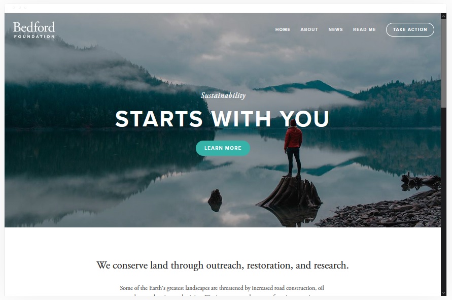
Bedford
Best Overall Squarespace Agency Template ✓ Pros
- Versatile layout adapts to virtually any agency type - from digital marketing to design to consulting - without needing heavy customization out of the box.
- Sidebar navigation keeps your menu accessible at all times while leaving the main content area wide open for portfolio pieces and case studies.
- Scrolling index page lets you build a compelling single-page narrative that walks prospects through your services, work samples, and team in one smooth flow.
- Built-in banner sections with strong CTAs make it easy to direct visitors toward booking a consultation or requesting a proposal at every scroll point.
- Handles service selling naturally with dedicated content blocks for packages, pricing tiers, and process explanations that agencies need to close deals.
✗ Cons
- The sidebar navigation style can feel unconventional for prospects used to top-bar menus, which may cause brief orientation confusion on first visit.
- Requires strong visual content to fill its generous layout - agencies without polished portfolio images will find the template exposes thin creative assets.
- The scrolling index page can become unwieldy if you try to pack too many service categories into a single flow without editing ruthlessly.
Bedford is the Swiss army knife of Squarespace agency templates. It doesn't push you into one style or one industry - it gives you the bones to build whatever your agency needs. The sidebar navigation is a smart touch that keeps your brand name visible while prospects scroll through your work. For agencies that sell multiple services and need a site that can grow with them, Bedford handles scale without breaking a sweat.
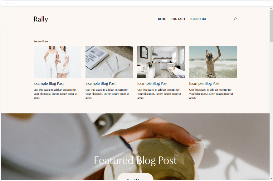
Rally
Best for Content-Driven Agencies ✓ Pros
- Streamlined layout with smooth scrolling creates a polished, editorial feel that works perfectly for agencies that sell through expertise and thought leadership.
- Top-right menu with integrated social links keeps navigation clean while signaling that your agency is active across platforms - a subtle trust builder for prospects.
- Built-in blog functionality is genuinely strong, making it ideal for agencies that use content marketing to attract and nurture leads before the sales call.
- Smooth scrolling transitions give the site a premium, app-like feel that positions your agency as modern and technically competent without any custom code.
- Works well for selling expertise through long-form content - service pages, case studies, and strategy breakdowns all read beautifully in Rally's typography system.
✗ Cons
- The editorial focus means Rally is weaker for agencies that lead with visual portfolio work - it prioritizes text and narrative over image galleries.
- Limited layout variation can make multi-page sites feel repetitive if you don't vary your content structure across service and about pages.
- The streamlined design may feel too restrained for creative agencies that want bold, experimental layouts to showcase their design capabilities.
Rally is the template for agencies that close clients with ideas, not just visuals. If your agency publishes thought leadership, runs content campaigns, or positions its team as industry experts, Rally's blog-forward design turns your website into a lead generation engine. The smooth scrolling and clean typography make every page feel like a well-produced article - and that's exactly the impression a content-driven agency should leave.
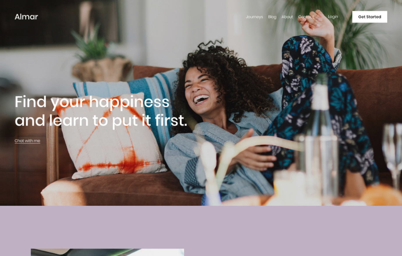
Almar
Best for Service-Focused Agencies ✓ Pros
- Clean, professional layout with prominent CTAs guides visitors directly toward booking a consultation - the primary conversion action for most service agencies.
- Fast-loading design ensures prospects don't bounce before seeing your offer, which matters when paid ad traffic is driving visitors to your agency site.
- Built-in appointment booking integration works seamlessly for agencies that sell discovery calls, strategy sessions, or initial consultations as their front-door offer.
- Handles both services and products naturally, making it versatile for agencies that sell retainers alongside one-off deliverables like audits or templates.
- Minimalist aesthetic keeps attention on your value proposition and credentials rather than competing with distracting design elements.
✗ Cons
- The clean, minimal look may feel too plain for creative agencies that need their website itself to demonstrate bold design thinking.
- Limited visual drama means Almar relies heavily on your copy being strong - weak messaging has nowhere to hide in this layout.
- Not the best choice for agencies with extensive visual portfolios, since the template prioritizes text content and CTAs over gallery displays.
Almar is built for agencies that measure success in booked calls, not pageviews. The layout is clean on purpose - it removes everything that doesn't move a prospect closer to scheduling a meeting with you. If your agency runs on consultations, strategy sessions, or discovery calls, Almar makes that path frictionless. No distractions, no dead ends, just a straight line from "I'm interested" to "I'm booked."
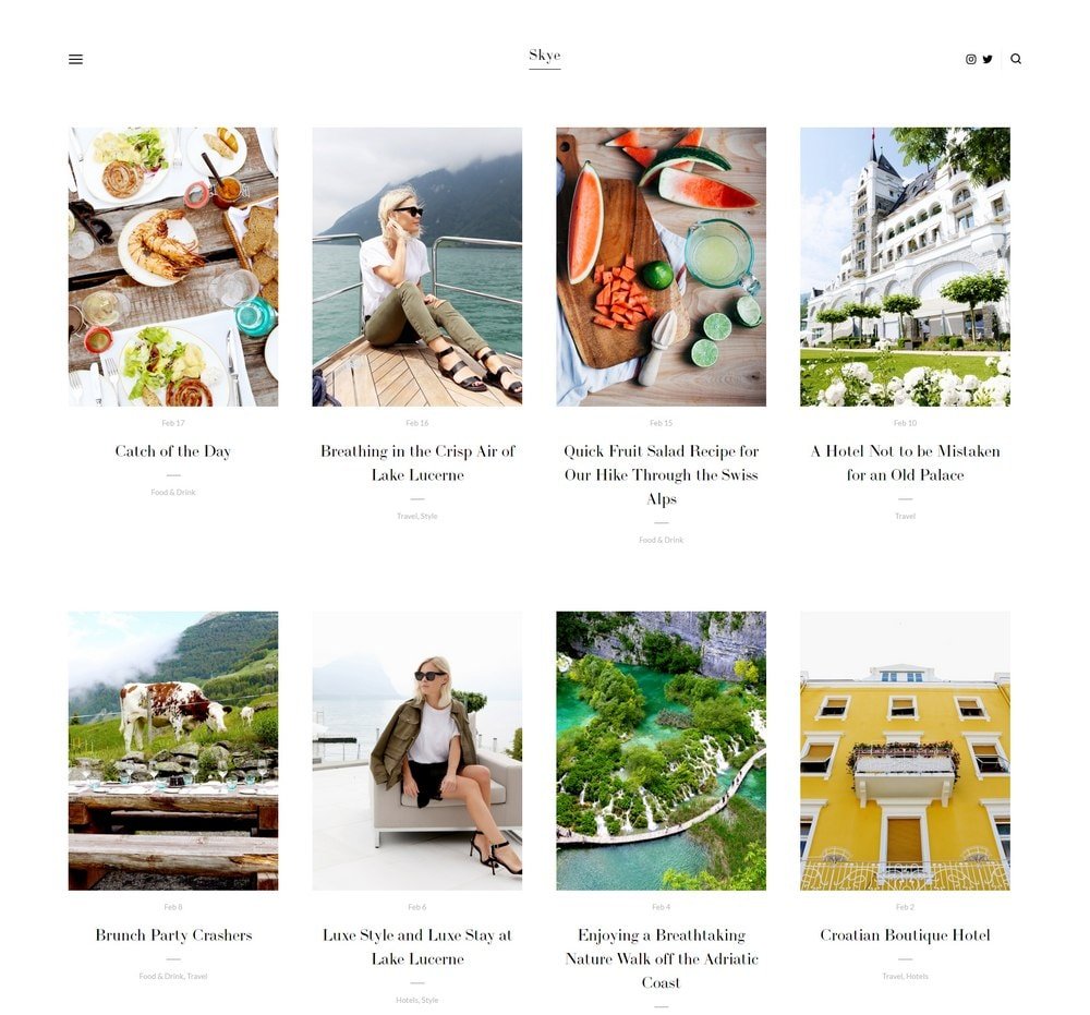
Skye
Best for Visual & Creative Agencies ✓ Pros
- Grid-based layout with fullscreen image support makes portfolio presentation the centerpiece - exactly what design and branding agencies need to win clients visually.
- Strong blogging capabilities let creative agencies publish process breakdowns, design case studies, and behind-the-scenes content that builds trust and authority.
- Fullscreen images and video support create an immersive experience that demonstrates your creative quality before a prospect reads a single word of copy.
- Mobile-optimized design ensures your portfolio looks just as impressive on phones and tablets, where many prospects first discover your agency.
- Grid structure organizes diverse project types cleanly - you can showcase branding, web design, print, and video work without the page feeling chaotic.
✗ Cons
- The visual-first approach means service descriptions and text content take a back seat - agencies that sell through detailed proposals may find this limiting.
- Requires a strong, curated portfolio to look impressive - a sparse or inconsistent image grid will make the template feel empty rather than intentional.
- The grid layout can feel formulaic if you don't vary image sizes and aspect ratios across your portfolio entries.
Skye lets your work do the talking. For creative agencies, design studios, and branding firms, the portfolio is the pitch - and Skye makes sure it lands. The fullscreen images fill the screen with your best projects, and the grid keeps everything organized without cramping your style. If a prospect visits your site and doesn't immediately think "I want my brand to look like that," your portfolio needs work, not your template.
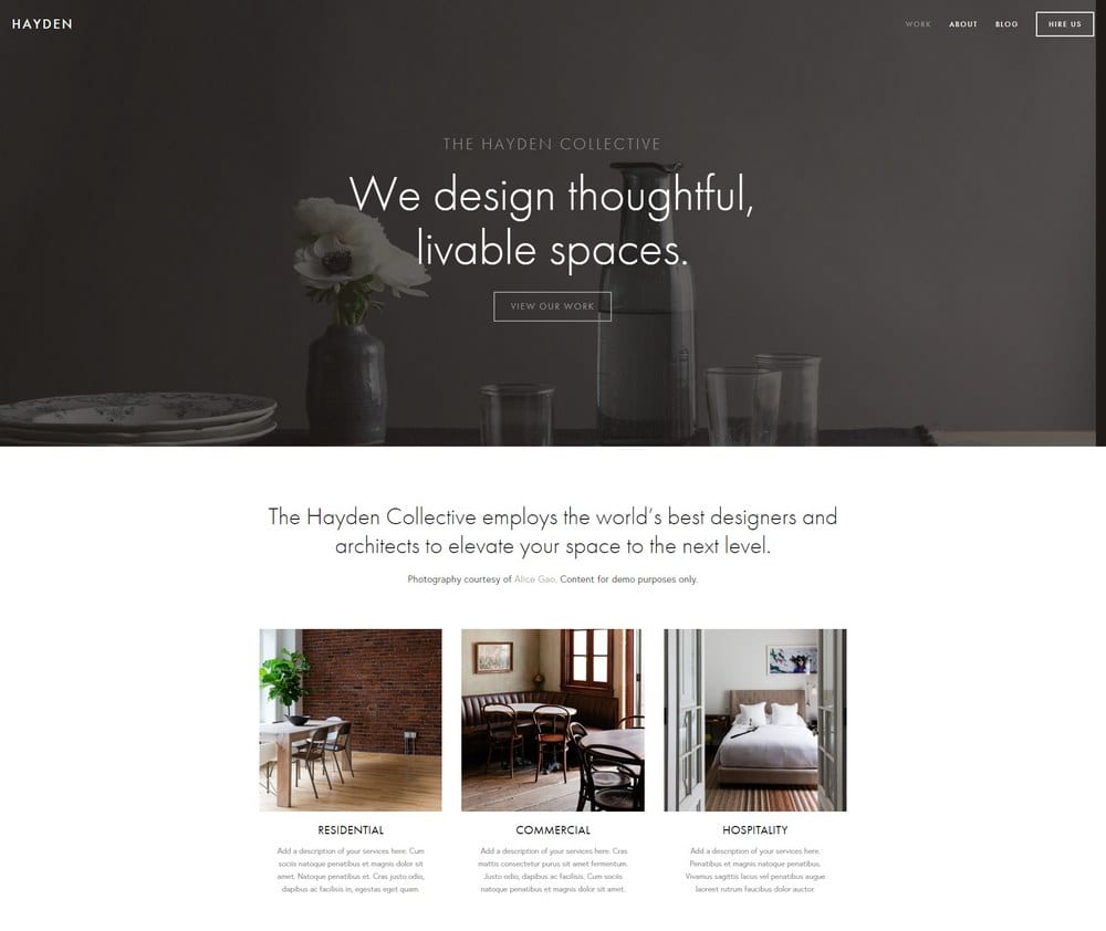
Hayden
Best for Professional Service Agencies ✓ Pros
- Professional, polished layout with a sticky menu keeps your agency's navigation accessible as prospects scroll through detailed service pages and case studies.
- Strong blog integration supports thought leadership content that consulting and professional agencies use to attract high-value clients organically.
- Portfolio section showcases client work and project outcomes in a structured, business-appropriate format that feels like a credentials deck, not an art gallery.
- Built-in booking system integration makes it easy for prospects to schedule consultations directly from any page - reducing friction in the sales process.
- The overall aesthetic signals established authority, which matters for agencies competing against larger firms for enterprise or institutional clients.
✗ Cons
- The corporate feel may be too formal for scrappy startup agencies or creative shops that want their personality to come through in the design.
- Hayden's structured layout is less flexible for agencies that want unconventional page designs or experimental navigation patterns.
- The sticky menu can crowd the viewport on smaller screens if you have too many top-level navigation items.
Hayden is the template that says "we've done this before, and we'll do it well for you." It's built for agencies that compete on credentials, process, and track record - not flashy design. The sticky menu keeps prospects oriented as they explore your services, and the blog gives you a home for the kind of long-form expertise content that wins consulting engagements. If your agency's pitch is built on trust and competence, Hayden backs that up visually. For more templates in this category, see our Squarespace business and services templates guide.
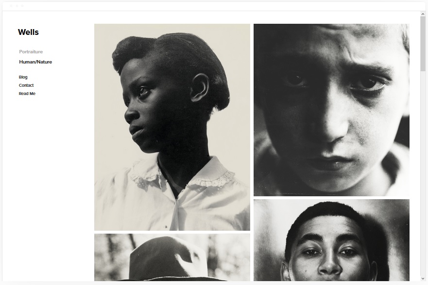
Wells
Best for Agencies With Video Content ✓ Pros
- Visual showcase layout with native video support via YouTube URL lets you lead with your best reel or case study video - the most persuasive asset a production agency has.
- Strong eCommerce integration supports agencies that sell productized services, templates, or digital assets alongside their core retainer work.
- Social media integration keeps your latest platform activity visible on your site, which builds credibility for agencies that manage social accounts for clients.
- Image-forward design showcases campaign visuals, ad creative, and brand work in a way that feels like a curated lookbook rather than a generic portfolio page.
- Works well for agencies that produce multimedia content - video, photography, and graphics all display effectively within the same layout structure.
✗ Cons
- The visual emphasis means text-heavy service descriptions and detailed process explanations feel secondary - agencies that sell through written proposals may find this limiting.
- Video integration relies on YouTube URLs, so agencies hosting content on Vimeo or private platforms will need workarounds for embedding their reels.
- The showcase-heavy layout can feel more like a portfolio than a business site if you don't balance visuals with clear service descriptions and CTAs.
Wells is for agencies where seeing is believing. If your best pitch is a 60-second reel or a campaign highlight video, Wells puts that front and center the moment someone lands on your site. The video integration is seamless, the visual layout is impressive without being overwhelming, and the social media tie-ins show prospects that your agency practices what it preaches. For video-first and social-first agencies, this template closes the credibility gap fast.
Avenue
Best for Fast-Loading Agency Sites ✓ Pros
- Minimalist grid layout loads fast, which directly impacts search rankings - a critical advantage for agencies that depend on organic traffic to generate leads.
- Clean structure makes it easy to rank high for target keywords because search engines can crawl and index the content without wading through heavy scripts or animations.
- Grid-based design organizes service offerings, case studies, and team bios into a scannable format that respects how busy decision-makers browse agency sites.
- Fast page speed improves conversion rates across all traffic sources - paid ads, referrals, and organic search all benefit from a site that loads in under two seconds.
- The minimal aesthetic forces you to lead with your strongest content, which typically produces better messaging than templates that let you hide behind flashy design.
✗ Cons
- The stripped-back design may feel too sparse for agencies that want their site to demonstrate creative ambition or visual storytelling capabilities.
- Limited animation and transition options mean the browsing experience can feel static compared to more dynamic agency templates.
- Not the best fit for agencies with large visual portfolios - the grid keeps things organized but doesn't create the immersive viewing experience that Skye offers.
Avenue is the template that practices what performance-focused agencies preach. If you tell clients that page speed matters, that clean design converts better, and that less is more - your own site should prove it. Avenue loads fast, ranks well, and gets out of the way so your content can do the selling. For SEO agencies, growth consultancies, and any firm that measures results in numbers, Avenue walks the talk.
Native
Best for Social Media Agencies ✓ Pros
- Strong social media integration with rounded thumbnails creates a feed-like browsing experience that feels native to the platforms your agency manages daily.
- Blog locations and content sections let you showcase your agency's own social strategy - proving you can grow audiences by demonstrating it on your own channels.
- Scrolling layout mimics the infinite-scroll behavior prospects already know from social platforms, making navigation feel intuitive and frictionless.
- Rounded image thumbnails add a modern, friendly aesthetic that aligns with the approachable, personality-driven tone most social media agencies cultivate.
- Works well for agencies that create content across multiple platforms - the layout handles diverse content types from short-form video screenshots to campaign graphics.
✗ Cons
- The social-first aesthetic may not project enough corporate authority for agencies targeting enterprise clients or traditional industries.
- Rounded thumbnails and feed-like layouts can feel trendy rather than timeless - the design may age faster than more classic template choices.
- The casual, scrolling format is less effective for communicating complex service offerings or multi-tier pricing structures that larger agencies need.
Native is the template that feels like it was designed by a social media manager - and that's the compliment. Everything about it mirrors the platforms your agency lives on: scrolling content, rounded visuals, integrated feeds, and a tone that's engaging without being stuffy. If your agency sells social media management, content creation, or community building, Native proves your expertise the moment someone scrolls your homepage. Your site becomes a portfolio piece itself.
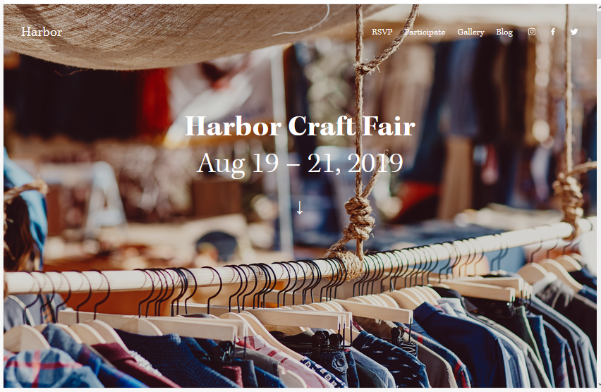
Harbor
Best for Boutique & Specialist Agencies ✓ Pros
- Bold background image creates a strong first impression that sets the mood for your agency's brand - ideal for boutique firms that want to feel curated rather than corporate.
- Simple, focused menu structure keeps navigation minimal, which works perfectly for specialist agencies with a tight service offering and a clear target client.
- Portfolio section displays project work in a clean, gallery-style format that lets your best cases speak without competing with heavy design elements.
- CTA placement for bookings is prominent and natural, making it easy for prospects to schedule a consultation after viewing your portfolio or reading your about page.
- Fast-loading design ensures your site performs well across devices and connection speeds - important for agencies whose prospects may find them through mobile search.
✗ Cons
- The simple menu and focused layout can feel limiting for full-service agencies that need to communicate a wide range of capabilities across multiple pages.
- Heavy reliance on the background image means you need one strong visual - a weak or generic hero image undermines the entire first impression.
- Not ideal for agencies that need extensive blog or resource sections, since Harbor's strength is focused simplicity rather than content depth.
Harbor is for agencies that do one thing and do it exceptionally well. The background image sets the tone, the simple menu keeps prospects focused, and the CTA drives them toward a booking. There's no fluff, no sprawling service lists, no "we do everything" messaging. If your agency is a specialist - whether that's brand strategy, SEO, or Shopify development - Harbor frames that expertise with the kind of confident restraint that attracts premium clients.
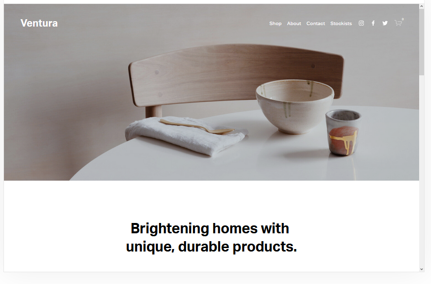
Ventura
Best for New & Startup Agencies ✓ Pros
- Simple, minimalist design is easy to set up quickly - ideal for new agencies that need a professional web presence fast without spending weeks on design decisions.
- Built-in mailing list integration lets you start building your prospect list from day one, which is critical for agencies still developing their referral network.
- eCommerce functionality supports productized service offerings like audits, strategy sessions, or template packs that help new agencies generate revenue while building retainer clients.
- Easy setup process means you can go from zero to a live, professional agency website in a single afternoon without any design or development experience.
- Clean aesthetic ages well and won't need a redesign in six months - important for agencies focused on growing their client base rather than constantly updating their own site.
✗ Cons
- The simplicity that makes Ventura easy to set up also means it lacks the visual impact of more established-looking templates like Bedford or Hayden.
- Limited customization options compared to more flexible templates may feel restrictive as your agency grows and your brand identity becomes more defined.
- The minimal design can read as "new" or "small" to enterprise prospects who expect a more polished, feature-rich agency website experience.
Ventura is the template that gets you live. When you're building an agency from scratch, the worst thing you can do is spend three months perfecting a website instead of finding clients. Ventura strips away the complexity and gives you a clean, professional site that you can launch this week. The mailing list integration starts building your pipeline immediately, and the eCommerce features let you sell productized services while you grow your retainer base. It's not the flashiest template on this list - it's the one that gets out of your way so you can focus on what actually builds an agency: delivering great work.
How to Choose the Right Squarespace Template for Your Agency
Match the Template to Your Agency Type
The single biggest factor is what kind of agency you run. Creative and design agencies need visual-first templates like Skye that let the portfolio do the selling. Consulting and professional service agencies need structured layouts like Hayden that communicate authority and process. Content and social media agencies should lean toward Rally or Native, where editorial and feed-style content feel natural. Start with what your clients expect to see when they visit an agency like yours.
Consider How You Win Clients
If your agency wins work through referrals and word-of-mouth, prioritize templates that showcase testimonials and case studies - Bedford and Hayden handle that well. If you generate leads through content marketing, Rally's blog-first approach is purpose-built for that. If paid ads drive your traffic, fast-loading templates like Almar and Avenue will convert better because prospects won't bounce before seeing your offer. Match the template to your actual sales process, not an aspirational one.
Think About What You Need to Show vs. Tell
Design agencies show. Consulting agencies tell. Most agencies do both. If your work is visual - branding, web design, video production - Skye and Wells give you the canvas. If your value is harder to photograph - strategy, SEO, operations - Bedford and Almar let you explain your process and results without needing a gallery of images. The strongest agency websites balance showing and telling, but your template should lean toward whichever drives more conversions for your specific offer.
Plan for Growth From the Start
Your agency will change in the next twelve months. You'll add services, hire team members, or pivot your positioning. Choose a template that can grow with you. Bedford and Hayden scale well from solo consultants to multi-team agencies. Ventura gets you live fast but may need replacing as you grow. Harbor and Almar work best when your offer stays focused. Think about where your agency is headed, not just where it is today, and pick a template that won't need replacing when you get there.
Frequently Asked Questions
What is the best Squarespace agency template for a marketing agency?
Can I build a professional agency website on Squarespace without a developer?
How much does a Squarespace agency website cost?
Which Squarespace template is best for a creative agency portfolio?
Can I add client booking to my Squarespace agency website?
Is Squarespace good for SEO for agency websites?
Can I switch my Squarespace agency template later without losing content?
What Squarespace template should a new digital agency use?
How We Evaluate Templates
Conclusion: Build Your Agency Site and Start Winning Clients
Your agency's website is your most public proof of work. Bedford handles everything from services to portfolios to team pages. Rally turns your expertise into content that attracts clients. Almar gets prospects booked fast. Skye lets your creative work speak for itself. And Ventura gets a new agency online in an afternoon.
Pick the Squarespace agency template that matches how you win clients, customize it with your best work and clearest messaging, and let your site start generating leads while you focus on delivering results. For more options across all business types, explore our full guide to Squarespace templates for business and services.
* Read the rest of the post and open up an offer