Editor's Picks
| # | Name | Best For | Price | Rating | Image | |
|---|---|---|---|---|---|---|
| 1 | Admin, executive, and service-focused virtual assistants | Free | 4.8/5 |

|
More Info | |
| 2 | Operations, marketing, and tech-specialist virtual assistants | Free | 4.9/5 |
|
More Info | |
| 3 | Content, social media, brand, and creative virtual assistants | Free | 4.7/5 |

|
More Info |
Çimen
Best for Organized, Service-Focused VAs ✓ Pros
- Minimalist layout puts your services front and center with zero visual noise - exactly what a virtual assistant website needs to convert visitors into client inquiries.
- Premium, understated aesthetic signals professionalism before a single word is read, making it ideal for VAs targeting high-ticket clients or corporate accounts.
- Generous whitespace creates a calm, organized feel that mirrors the efficiency and clarity clients are hiring you to bring to their business.
- Natural text hierarchy guides visitors from your headline to your services to your contact form - the three stops every virtual assistant website must nail.
- Works beautifully when you offer a small number of defined service packages, keeping focus tight rather than diluting attention across a sprawling service list.
✗ Cons
- The restrained layout doesn't showcase personality strongly - if your VA brand is playful or creative, Çimen's minimalism may undersell your energy.
- Not ideal for VAs with large service menus or multiple niche specializations, where visitors need more guidance navigating different offerings.
- Weak copy or generic stock photos fall flat here - the template's strength amplifies great content but also exposes thin messaging.
Çimen is the template equivalent of a perfectly organized inbox. It doesn't try to impress with bells and whistles - it earns trust through clarity. If your virtual assistant brand is built on reliability, calm competence, and getting things done without drama, this layout makes that promise the second someone lands on your page. It's not flashy. That's exactly the point.
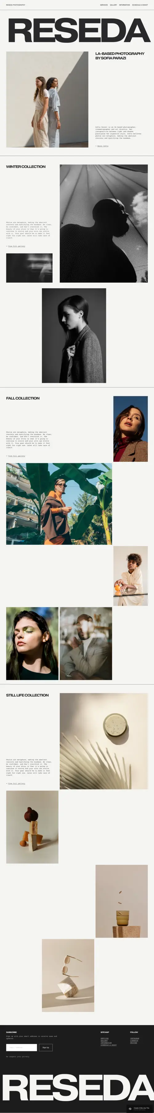
Reseda
Best for Established VAs & Systemized Offers ✓ Pros
- Bold, oversized typography commands attention immediately - powerful for VAs who want to position themselves as the expert rather than just another service provider.
- Layout architecture guides visitors directly toward your offer: massive headline, service summary, CTA button - the cleanest booking path of these three templates.
- Works exceptionally well for high-value VA niches like operations management, marketing systems, or tech stack support, where authority positioning closes clients.
- Generous content sections give space to explain your process, methodology, or package tiers in a way that justifies premium pricing and filters out low-budget inquiries.
- Scales well as your virtual assistant business grows - testimonials, case studies, and portfolio work integrate cleanly without disrupting the template's confident structure.
✗ Cons
- The authority-first aesthetic can feel impersonal for VAs building a warm, relationship-driven brand where approachability is a key selling point.
- Relies heavily on sharp headline copy - the oversized typography amplifies confident messaging but equally amplifies weak or generic positioning statements.
- Not the best fit for newer VAs still defining their niche, since the template's powerful structure works best when you already have a clear, confident offer ready.
Reseda turns "I help with admin" into "I run the show." If you're a virtual assistant with defined packages, a clear niche, and clients who are ready to pay for results - this is your digital HQ. The layout doesn't invite browsing; it invites booking. Everything points toward your offer, and nothing distracts from it.
Ortiz
Best for Creative & Social Media VAs ✓ Pros
- Colorful, personality-forward design naturally appeals to clients looking for creative VAs - brand stylists, content strategists, social media managers, and copywriters all feel at home here.
- Built-in booking CTA button is prominently placed and impossible to miss, keeping your inquiry path smooth even for first-time visitors who don't know where to click.
- Playful aesthetic differentiates you immediately from the sea of neutral, corporate-feeling virtual assistant websites - memorability is a real conversion advantage.
- Editorial vibe and bold visual language let your website double as a portfolio of your aesthetic sensibility, showing creative clients your taste before they read your services.
- Flexible content blocks handle a varied service offering well - ideal for VAs who blend social strategy, content creation, admin support, and brand consulting in one offer.
✗ Cons
- The bold, colorful energy won't suit VAs targeting conservative industries like legal, finance, or executive support, where understated professionalism is a non-negotiable.
- Requires intentional curation - inconsistent photography or an unclear brand voice will clash with Ortiz's confident, personality-driven layout rather than complement it.
- Not ideal for VAs whose core brand promise is calm, organized efficiency over creative energy - there are better virtual assistant website templates if reliability is your headline.
Ortiz is for the virtual assistant who isn't afraid to show up loud. If your services lean creative - social strategy, content production, brand support - this template makes your personality part of your pitch. Clients will know in five seconds: you're not just organized. You're creative, confident, and in demand.
How to Choose the Right Squarespace Template for Your Virtual Assistant Website
Match the Template to Your VA Specialty
The most important factor is what you actually do. If your virtual assistant services are admin-heavy - inbox management, scheduling, data entry, executive support - Çimen's clean, organized aesthetic mirrors the service you're selling. If you specialize in systems, operations, or marketing strategy at a premium level, Reseda's authority-first layout positions you accordingly. If your work is creative - social media management, content strategy, brand support, graphic coordination - Ortiz's colorful, expressive design makes your aesthetic sensibility part of the pitch. Choose the template that reflects the specific type of virtual assistant you are, not just "professional" in the generic sense.
Consider Who Your Ideal Client Is
Corporate clients and busy executives respond to quiet professionalism and fast information - they want to see your services, your process, and your contact form in under two scrolls. Çimen and Reseda handle this well. Small business owners and creative entrepreneurs looking for a virtual assistant tend to connect more through personality and story - Ortiz and Reseda's bolder layouts meet that expectation. The question isn't which template looks better; it's which one your specific ideal client will trust on sight.
Think About Your Stage of Business
Newer VAs building their first virtual assistant website benefit most from Çimen's clarity - it's forgiving of an early-stage portfolio because the layout never demands you fill space you don't yet have. Established VAs with defined packages, testimonials, and case studies can leverage Reseda's authority-first structure to justify premium pricing. Creative VAs with a developed portfolio and a clear brand aesthetic will get the most out of Ortiz. Match the template's ambition to where you actually are, not where you plan to be.
Factor in How You Actually Book Clients
If clients book through an inquiry form or discovery call, any of these three templates work - but prioritize the one that makes your contact point easiest to reach. If you use a direct booking tool like Acuity or Calendly, Ortiz's prominent CTA placement keeps that booking link front and center throughout the page. If you primarily take inbound leads from referrals who already trust you, Çimen's considered, low-pressure layout converts warm leads without overselling. Think about the actual path from landing on your page to becoming a client, and choose the template that makes that path shortest.
Frequently Asked Questions
What should a virtual assistant website include?
Which Squarespace template is best for a virtual assistant website?
Do virtual assistants need a website?
Can I use Squarespace for my virtual assistant business?
Should I list my rates on my virtual assistant website?
Are Squarespace templates for virtual assistants free?
How do I make my virtual assistant website stand out?
Which virtual assistant website template works best for social media VAs?
How We Evaluate Templates
Conclusion: Your Virtual Assistant Website Should Work As Hard As You Do
The right Squarespace template for your virtual assistant business isn't the one that looks the most impressive - it's the one that most clearly communicates who you help, what you do, and how to hire you. Çimen builds trust through organized calm. Reseda commands authority and drives bookings. Ortiz wins clients with personality and creative confidence.
Pick the one that fits where you are and who you're talking to, drop in your services and a strong headline, and let your website start converting while you're busy running everyone else's business.
Looking for more options? Explore our top picks for service-based businesses and creative freelancers for more Squarespace layouts built to book clients.
* Read the rest of the post and open up an offer