
What separates a good Squarespace template from a great one? Performance, flexibility, and longevity. The templates on this list aren't just popular-they're proven. They work across industries, adapt to different business models, and continue to deliver results years after their release. Whether you need e-commerce power, portfolio elegance, or service-business functionality, these templates have earned their reputation as the platform's best.
Editor's Picks
| # | Name | Best For | Price | Rating | Image | |
|---|---|---|---|---|---|---|
| 1 | Service businesses, consultants & conversion-focused sites | Free | 4.9/5 |
|
More Info | |
| 2 | Brand promotion, creative agencies & project showcases | Free | 4.8/5 |
|
More Info | |
| 3 | Therapists, healthcare providers & wellness practitioners | Free | 4.7/5 |
|
More Info | |
| 4 | Online educators, coaches & membership-based businesses | Free | 4.8/5 |
|
More Info | |
| 5 | Minimalist brands, luxury products & clean design lovers | Free | 4.7/5 |
|
More Info | |
| 6 | Landing pages, personal brands & focused business sites | Free | 4.6/5 |

|
More Info | |
| 7 | Service providers, salons, consultants & appointment-based businesses | Free | 4.7/5 |
|
More Info | |
| 8 | Schools, educational institutions & mission-driven organizations | Free | 4.6/5 |
|
More Info | |
| 9 | Bloggers, content creators & media-rich websites | Free | 4.8/5 |
.jpg)
|
More Info | |
| 10 | Online stores, product-based businesses & e-commerce brands | Free | 4.8/5 |
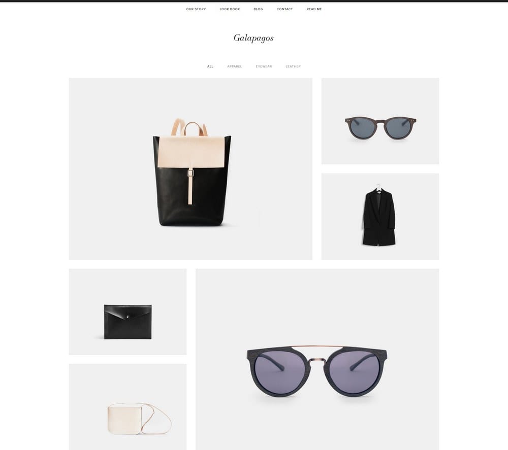
|
More Info |
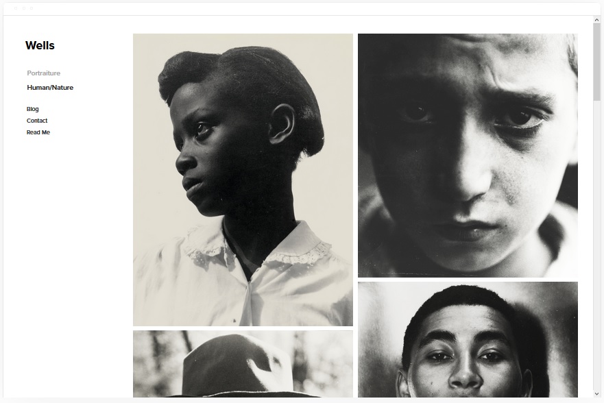
Wells
Best for High-Converting Business Websites
✓ Pros
- Conversion-optimized layout guides visitors naturally toward contact forms and calls-to-action
- High-resolution image support creates visual impact without sacrificing page load speed
- Video embedding via URL keeps media-rich pages fast and responsive
- Built-in e-commerce functionality supports product sales, digital downloads, or service bookings
- Clean, professional aesthetic works across industries from consulting to creative services
✗ Cons
- Conversion-focused structure may feel too sales-oriented for portfolio or editorial sites
- Professional aesthetic requires quality imagery to avoid looking generic
- Layout emphasis on conversion may limit creative experimentation for artistic brands
Wells has earned its reputation by doing one thing exceptionally well: turning visitors into customers. The layout doesn't just look professional-it's engineered to guide attention toward the actions that matter for your business.
What makes Wells a perennial favorite is its versatility within a conversion framework. Service businesses use it to drive consultation bookings. Product companies use it to showcase offerings and capture sales. The template adapts to your business model while maintaining the structure that actually converts.
Place your primary call-to-action above the fold with a contrasting button color that draws immediate attention. Use Wells' video embedding to add a 60-second introduction video-pages with video convert significantly higher than static alternatives.
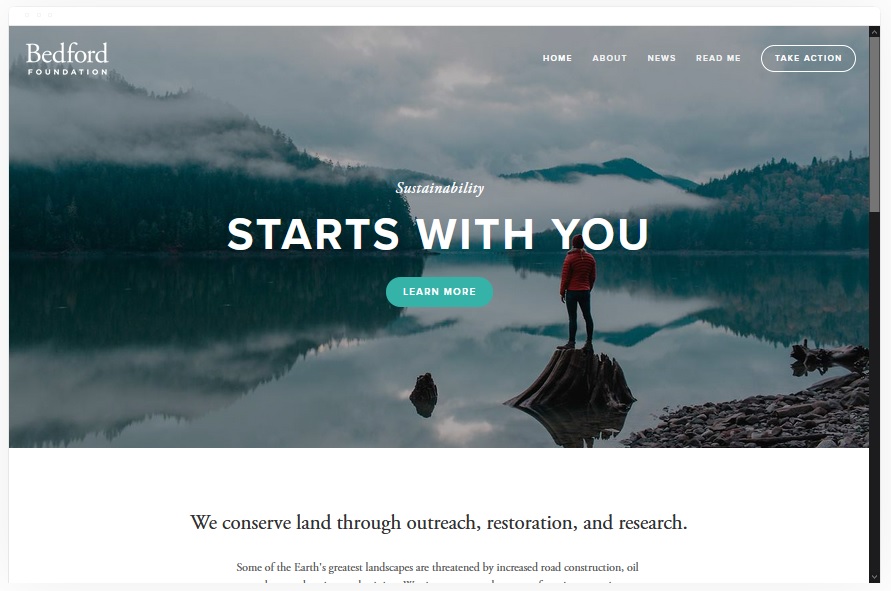
Bedford
Best for Brand-Focused Businesses & Creatives
✓ Pros
- Sidebar navigation creates distinctive browsing experience that sets your site apart
- Project showcase feature highlights your best work with dedicated presentation pages
- Banner system with individual call-to-action buttons drives engagement across sections
- E-commerce integration supports product sales alongside portfolio or service content
- Strong visual hierarchy keeps brand identity prominent throughout the user journey
✗ Cons
- Sidebar navigation may feel unconventional for users expecting traditional top menus
- Banner-heavy design requires multiple strong images to avoid repetitive appearance
- Project-focused structure needs adaptation for businesses without visual portfolios
Bedford understands that brand perception happens in seconds. The distinctive sidebar navigation immediately signals that this isn't a generic business site-it's a brand with intention and style.
The project showcase is where Bedford earns its place on this list. Whether you're displaying client work, case studies, or product collections, the dedicated project pages give each piece the spotlight it deserves. Combined with banner CTAs throughout, Bedford keeps visitors engaged while consistently reinforcing your brand.
Use Bedford's banner call-to-action buttons strategically-each banner should drive a specific action (view portfolio, book consultation, shop products). Vary the CTAs to capture visitors at different stages of their decision journey.
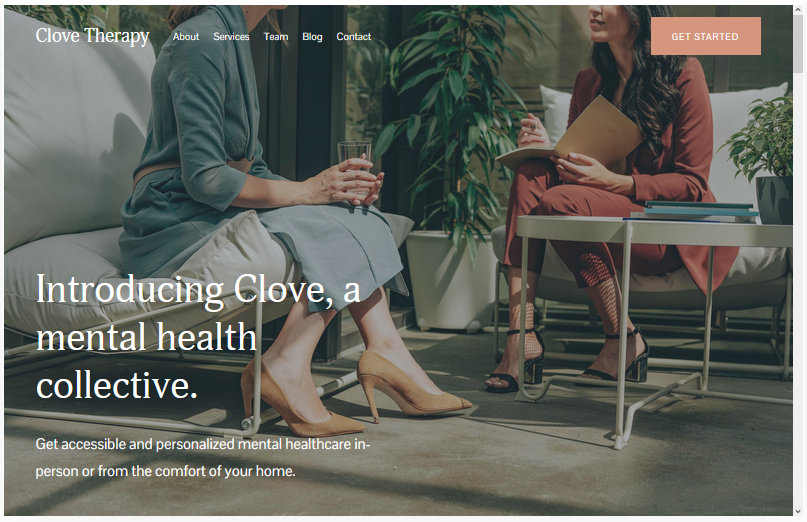
Clove
Best for Healthcare & Wellness Professionals
✓ Pros
- Calming color palette (green, blue, rust) creates immediate trust for healthcare visitors
- Patient portal and insurance form integration handle healthcare-specific functionality
- Professional imagery sections showcase credentials, team members, and facilities
- Service page layouts clearly present treatment options and specializations
- Modern design balances clinical professionalism with approachable warmth
✗ Cons
- Healthcare-specific features may require removal for non-medical businesses
- Calming aesthetic might feel too subdued for high-energy wellness brands (fitness, sports)
- Specialized design requires more customization to adapt for non-healthcare industries
Clove was built for healthcare, and it shows. The soothing color palette isn't arbitrary-it's designed to create the trust and calm that patients need when researching providers. Every design choice supports the patient journey from concern to confidence.
The healthcare-specific features set Clove apart from generic templates forced into medical contexts. Insurance forms, patient portals, and team credential sections aren't afterthoughts-they're core to the design. For therapists, practitioners, and healthcare providers, Clove eliminates the template-fighting that plagues other options.
Build out your "About the Team" section with individual provider pages including credentials, specializations, and personal treatment philosophies. Patients choosing healthcare providers want to know who they'll be working with before they ever make contact.
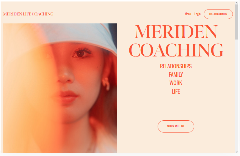
Meriden
Best for Course Creators & Membership Businesses
✓ Pros
- Native course and podcast support built into the template structure from the start
- Membership functionality enables gated content and recurring revenue models
- Squarespace Scheduling integration handles appointment booking without third-party tools
- Flexible layout adapts to educational content, coaching services, or hybrid models
- Full customization options let you align the design with your personal brand
✗ Cons
- Course-focused structure requires significant adaptation for non-educational businesses
- Membership features need Commerce plan ($33+/month) to fully utilize
- Content-heavy design demands consistent production to avoid sparse appearance
Meriden solves the course creator's dilemma: how to sell education without a complicated tech stack. Courses, podcasts, memberships, and scheduling all work natively, letting you focus on content instead of platform integration.
The flexibility is what earns Meriden its spot on this list. Fitness instructors use it for class bookings and workout memberships. Business coaches use it for course sales and one-on-one scheduling. The template adapts to whatever educational or service model you're building.
Create a free mini-course or resource library that requires email signup to access. This captures leads who aren't ready to purchase while demonstrating your teaching style and expertise-warming them up for paid offerings.
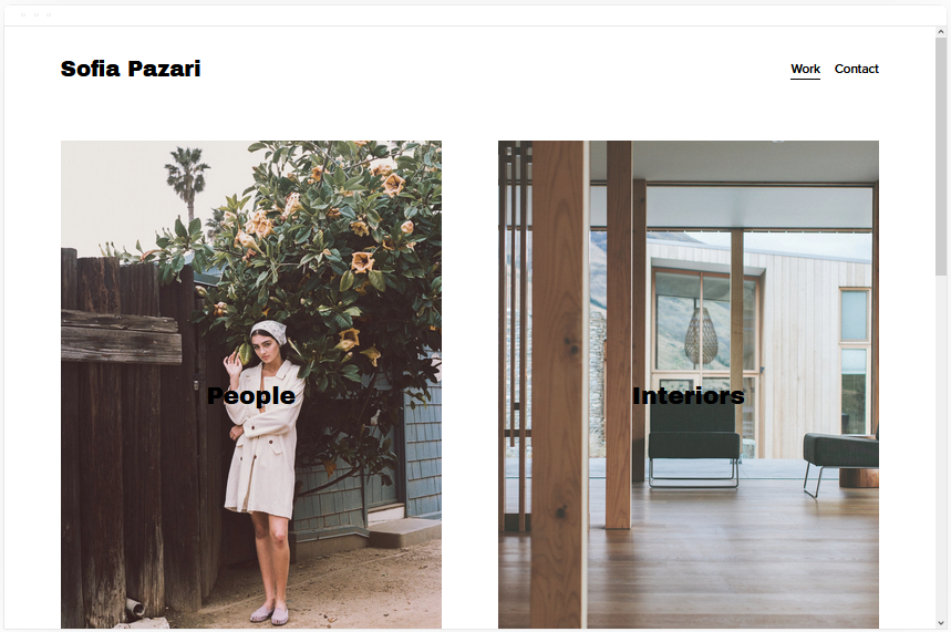
Sofia Pazari
Best for Minimalist Brands & Clean Aesthetics
✓ Pros
- Two-image hero layout creates immediate visual impact without overwhelming visitors
- Minimalist structure naturally improves page load speed and SEO performance
- Clean navigation keeps user attention focused on content rather than interface
- Flexible page options accommodate services, products, and portfolio content
- Timeless aesthetic won't feel dated as design trends shift
✗ Cons
- Minimalist design requires exceptional imagery-average photos have nowhere to hide
- Sparse layout may feel too empty for businesses with extensive service offerings
- Two-image hero structure limits options for content-heavy homepages
Sofia Pazari proves that restraint is a design choice, not a limitation. The two-image hero forces you to choose your strongest visuals, and that constraint creates impact. There's nowhere for mediocrity to hide.
The SEO benefits of minimalism are real. Fewer elements mean faster load times, and faster load times mean better search rankings. Sofia Pazari's clean code and streamlined structure give you a technical advantage that more complex templates sacrifice for features you may never use.
Choose your two hero images with extreme care-they'll set the entire tone for your site. Use one lifestyle/emotional image and one product/service image to communicate both your brand personality and what you actually offer.
Wycoff
Best for Single-Page & High-Performance Sites
✓ Pros
- Single-page structure eliminates navigation friction and keeps visitors scrolling
- High-performance design loads fast across all devices and connection speeds
- Mobile-optimized layout ensures consistent experience on smartphones and tablets
- Call-to-action integration captures conversions without multi-page journeys
- Low-maintenance structure requires minimal ongoing updates to stay current
✗ Cons
- Single-page format limits content depth for businesses needing extensive information
- One-page structure can hurt SEO compared to multi-page sites with more indexable content
- Minimalist approach requires every element to earn its place-no room for filler
Wycoff is proof that complexity isn't always better. The single-page format strips away everything except what matters: your message, your offer, and the action you want visitors to take. No distractions, no dead ends.
Performance is where Wycoff dominates. Fewer pages mean faster loads, and faster loads mean higher conversions. For landing pages, personal brands, or businesses with focused offerings, Wycoff delivers results that multi-page templates struggle to match.
Structure your single page with clear section breaks that function like individual pages-About, Services, Testimonials, Contact. Use anchor links in your navigation so visitors can jump directly to sections, combining single-page speed with multi-page organization.
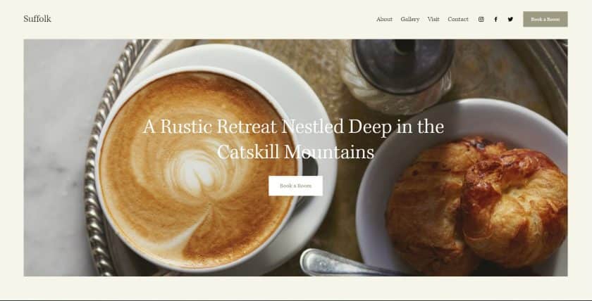
Suffolk
Best for Service Businesses & Appointment-Based Companies
✓ Pros
- Sticky navigation menu keeps key pages accessible throughout the browsing experience
- Scheduling integration enables direct appointment booking without leaving your site
- Clean, traditional design establishes professional credibility across industries
- Collection time functionality supports businesses with pickup or delivery options
- Fully customizable structure adapts to any service-based business model
✗ Cons
- Traditional aesthetic may feel too conservative for creative or cutting-edge brands
- Scheduling features require Squarespace Scheduling subscription for full functionality
- Clean design demands strong copywriting-there's no visual complexity to compensate
Suffolk does the unglamorous work that service businesses actually need. The sticky menu keeps your booking page one click away at all times. The scheduling integration eliminates the back-and-forth of appointment setting. It's not flashy, but it's effective.
The traditional design is intentional. Service businesses-consultants, salons, professional services-need to communicate reliability. Suffolk's clean professionalism builds that trust without trying to be trendy.
Make your "Book Now" button the most visually prominent element in your sticky navigation. Use a contrasting color that follows visitors as they scroll, ensuring the path to booking is never more than one click away regardless of where they are on your site.
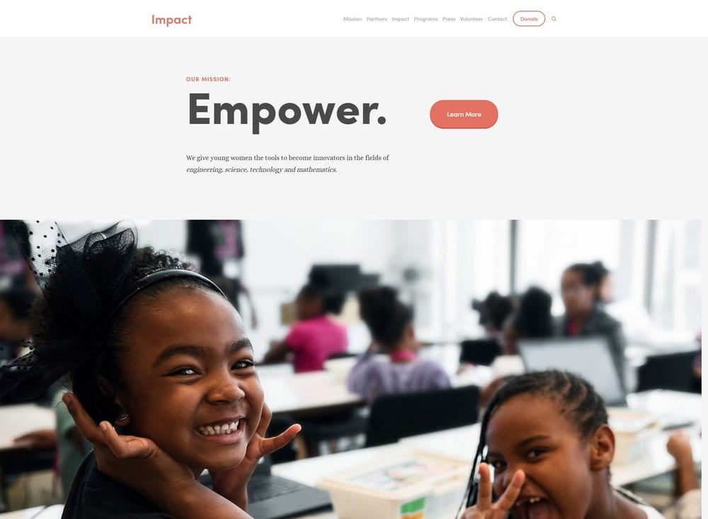
Impact
Best for Educational Organizations & Nonprofits
✓ Pros
- Fast-loading, clean-coded structure keeps visitors engaged across all devices
- Well-organized sections present complex information clearly and accessibly
- Header area accommodates essential information visitors need immediately
- Call-to-action integration drives enrollments, sign-ups, or donation conversions
- Professional design communicates institutional credibility and trustworthiness
✗ Cons
- Educational focus requires adaptation for non-institutional businesses
- Section-heavy structure needs substantial content to avoid feeling incomplete
- Professional aesthetic may feel too formal for casual or creative brands
Impact handles the information density that educational organizations require. Course catalogs, program descriptions, faculty listings, event calendars-the template organizes complexity without creating chaos.
The fast-loading structure matters for education. Students researching programs often browse multiple schools. A slow site loses them to a competitor. Impact's clean code keeps load times low, giving you an edge in the attention competition.
Use Impact's header section to answer the three questions every educational visitor has: What programs do you offer? How do I apply? What makes you different? Placing this information above the fold reduces bounce rates from visitors who can't quickly find what they need.
Mojave
Best for Bloggers & Content-Driven Businesses
✓ Pros
- Striking visual design captures attention and encourages content exploration
- Scrolling effects create engaging, immersive browsing experience
- Blog, events, gallery, and product pages all natively supported
- Social sharing integration amplifies content reach across platforms
- Newsletter signup functionality builds owned audience alongside content
✗ Cons
- Visual complexity may distract from content on text-heavy sites
- Scrolling effects can impact performance on older devices or slow connections
- Design-forward aesthetic requires consistent high-quality imagery throughout
Mojave makes content feel like an event. The scrolling effects and visual design create anticipation as visitors move through your site. For bloggers and content creators, that engagement translates to longer sessions and more pages viewed.
The multi-format support is where Mojave earns its spot. Blog posts, event listings, image galleries, and product pages all work together seamlessly. Content creators rarely fit into single-format boxes, and Mojave accommodates that reality.
Place your email newsletter signup between content sections rather than only in the footer. Readers who've just finished an engaging article are most likely to subscribe-capture them while they're engaged rather than after they've scrolled past your best content.
Galapagos
Best for E-Commerce & Online Stores
✓ Pros
- Quick View functionality lets shoppers preview products without leaving the catalog
- Integrated Squarespace shopping cart provides seamless checkout experience
- Modern e-commerce design builds trust and encourages purchase confidence
- Product-focused layout showcases inventory without overwhelming shoppers
- SEO-friendly structure helps product pages rank in search results
✗ Cons
- E-commerce focus requires Commerce plan ($33+/month) for full functionality
- Product-centered design needs substantial inventory to avoid sparse appearance
- Shopping-optimized layout may feel too commercial for service-based businesses
Galapagos is built to sell. The Quick View feature keeps shoppers in browsing mode longer-they can check product details without losing their place in your catalog. That reduces friction and increases the chance of multiple items in cart.
The trust signals matter for e-commerce. Galapagos' modern, professional design communicates legitimacy before shoppers ever read your return policy. In a world of skeptical online shoppers, that visual credibility converts browsers into buyers.
Enable Quick View for all products and ensure your product images are consistent in style and quality-shoppers will be viewing them side-by-side as they browse. Add urgency elements like "limited stock" badges or sale timers to convert browsers who might otherwise bookmark and forget.
How to Choose the Right Squarespace Template for Your Website
Start with Your Primary Goal
Every template on this list excels at something specific. Wells converts visitors into leads. Galapagos sells products. Mojave showcases content. Identify what your website must accomplish first, then choose a template built for that purpose. Fighting against a template's core strength wastes time you could spend growing your business.
Consider Your Content Reality
Visually-driven templates like Mojave and Bedford require consistent high-quality imagery. Content-heavy templates like Meriden need ongoing material production. Minimalist templates like Sofia Pazari demand exceptional photography because there's nothing else to carry the visual weight. Be honest about what you can actually produce before committing to a content-hungry design.
Think About Long-Term Maintenance
Single-page templates like Wycoff require minimal updates. Content-driven templates like Mojave need regular posts to stay fresh. E-commerce templates like Galapagos require ongoing inventory management. Choose a template whose maintenance requirements match the time you can actually commit.
Match the Aesthetic to Your Audience
Healthcare clients expect Clove's calming professionalism. Creative clients expect Bedford's brand-forward style. E-commerce shoppers expect Galapagos' modern retail experience. Your template should meet the visual expectations of the people you're trying to reach.
Frequently Asked Questions
Can I switch Squarespace templates after building my website?
Yes. Squarespace allows you to switch templates at any time without losing your content. Pages, blog posts, products, and images remain intact. However, switching requires reconfiguring your layout and design settings, so it's worth choosing carefully upfront. Templates with similar structures (like Wells and Suffolk) make switching easier than moving between dramatically different designs.
How much does Squarespace cost for a business website?
Squarespace plans start at $16/month for basic websites. The Business plan ($27/month) removes Squarespace branding and adds advanced features. E-commerce plans start at $33/month for online stores. All plans include hosting, SSL certificates, and access to all templates-you're choosing between features, not template options.
Which Squarespace template is best for SEO?
Templates with clean code and fast load times-like Sofia Pazari, Wycoff, and Impact-provide the strongest technical SEO foundation. However, content matters more than template choice for rankings. Any template on this list, combined with quality content and proper optimization, can rank well in search results.
Do I need coding skills to customize Squarespace templates?
No. Squarespace templates are designed for visual customization without code. You can change colors, fonts, layouts, and content through the drag-and-drop editor. For advanced customization, Squarespace supports custom CSS, but it's optional-not required for professional-looking results.
Which Squarespace template is best for e-commerce?
Galapagos is the strongest pure e-commerce option with features like Quick View and integrated cart functionality. However, Wells, Bedford, and Meriden all support e-commerce alongside other business functions. Choose based on whether e-commerce is your primary focus or one component of a broader business model.
Are Squarespace templates mobile-responsive?
Yes. All Squarespace templates are fully responsive and automatically adjust to smartphones, tablets, and desktop screens. Templates like Wycoff are specifically optimized for mobile performance. Mobile-responsiveness is built into the platform-you don't need to create separate mobile versions.
Which Squarespace template loads fastest?
Minimalist templates like Wycoff, Sofia Pazari, and Suffolk load fastest due to their streamlined code and fewer visual elements. Single-page templates generally outperform multi-page alternatives. However, your content choices-image sizes, video embeds, third-party integrations-impact speed more than template selection.
Can I use any Squarespace template for any type of business?
Technically yes, but strategically no. While all templates are customizable, each is optimized for specific use cases. Clove works best for healthcare. Galapagos works best for e-commerce. Forcing a template into a purpose it wasn't designed for creates extra work and often produces inferior results compared to choosing the right template from the start.
How We Evaluate Templates
These templates were evaluated based on performance across real-world business applications: page load speed, conversion optimization, mobile responsiveness, customization flexibility, and long-term design viability. We tested each template across multiple industries to identify which consistently deliver results regardless of specific niche-templates that have earned their reputation through proven performance over years of platform updates and design trend shifts.
Conclusion: Choose the Template That Works for Your Business
The best Squarespace template is the one that matches your specific goals, content capacity, and audience expectations. Wells converts. Galapagos sells. Mojave engages. Wycoff performs. Each template on this list has earned its place through proven results across thousands of websites. Pick the one aligned with what your business actually needs, customize it to reflect your brand, and start building the site that moves your business forward.
* Read the rest of the post and open up an offer