Editor's Picks
| # | Name | Best For | Price | Rating | Image | |
|---|---|---|---|---|---|---|
| 1 | Minimalist business websites and digital/physical product sellers | Free | 4.5/5 |
.jpg)
|
More Info | |
| 2 | Service businesses, creative agencies, and consultants | Free | 4.3/5 |
.png)
|
More Info | |
| 3 | Bloggers, small eCommerce stores, and service providers | Free | 4.5/5 |
|
More Info | |
| 4 | Online stores selling fashion, accessories, home goods, and lifestyle products | Free | 4.4/5 |
|
More Info | |
| 5 | Photographers, designers, videographers, and creative freelancers | Free | 4.3/5 |
|
More Info | |
| 6 | Accountancy firms, marketing agencies, design studios, and professional service brands | Free | 4.4/5 |
|
More Info | |
| 7 | Construction companies, real estate agencies, and trade service businesses | Free | 4.1/5 |
|
More Info | |
| 8 | Businesses, startups, and brands that want a versatile, high-converting modern design | Free | 4.4/5 |
|
More Info | |
| 9 | Bloggers, artists, online shops, and consultants who take appointments | Free | 4.3/5 |
|
More Info | |
| 10 | Designers, artists, and creative professionals who want a standout portfolio | Free | 4.1/5 |

|
More Info |
Avenue
Best for Minimalist Business & Product Sites ✓ Pros
- Grid-based content building system makes it easy to arrange sections exactly how you want them - no coding or design experience needed.
- Minimalist layout loads fast, which directly helps your site rank higher on Google and keeps bounce rates low on mobile.
- Built-in eCommerce support lets you sell physical and digital products without bolting on third-party tools or complicated integrations.
- Clean, modern aesthetic adapts to virtually any industry - from creative agencies to product shops - without feeling generic.
- Highly customizable without technical skills, so you can adjust colors, fonts, and layouts through the visual editor and have a polished site in hours.
✗ Cons
- The minimalist approach may feel too stripped-back for brands that rely on bold visuals or heavy storytelling to make an impact.
- Grid-based layouts can look repetitive across pages if you don't vary your section designs and content blocks intentionally.
- Not the strongest choice for content-heavy sites like magazines or news blogs that need dense, text-forward layouts.
Avenue is the modern Squarespace template you pick when you want the site to get out of the way and let your work speak. The grid system is flexible enough to build almost anything, and the minimalist foundation means every element you add carries visual weight. Nothing competes for attention because nothing unnecessary is there. If speed and simplicity are your priorities, Avenue delivers both without sacrificing the polish that makes visitors take your brand seriously.
Sofia Pazari
Best for Bold Service-Based Brands ✓ Pros
- Bold, modern look that makes an immediate impression - visitors know your brand means business before they scroll past the hero section.
- Two side-by-side images on the homepage let you showcase your main services or signature projects right where attention is highest.
- Minimalist layout with fast load times keeps your site performing well in search rankings and reduces visitor drop-off on slower connections.
- Simple top-right menu navigation keeps the interface clean and intuitive, letting your content take center stage without visual clutter.
- Dedicated pages for about, services, and contact create a natural flow that guides potential clients from discovery to inquiry.
✗ Cons
- The bold, high-contrast design may overpower brands that want a softer, more understated online presence.
- Limited built-in page variety means eCommerce-heavy businesses will need to build out additional product or shop pages from scratch.
- Projects page works well for portfolios but may not suit businesses that don't have visual work to showcase.
Sofia Pazari is built for service brands that want to look established from day one. The two-image hero layout is a smart design choice - it immediately communicates range and capability without needing a word of copy. The rest of the template follows that same logic: show, don't tell, and make it easy to get in touch. If your business runs on client relationships and first impressions, this modern Squarespace template handles both with confidence.
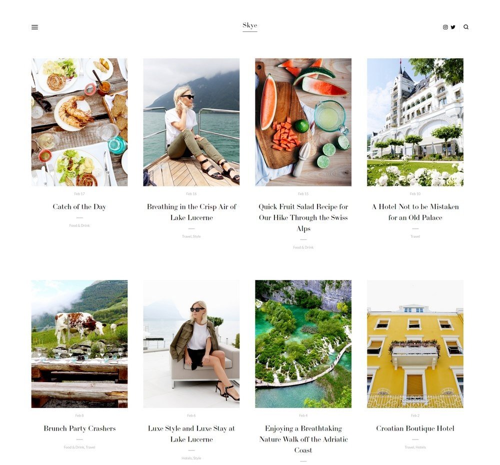
Skye
Best for Bloggers & Small eCommerce ✓ Pros
- Grid-based content block system gives you full control over page layouts, making it one of the most versatile modern Squarespace templates available.
- Large image sections showcase products, portfolio pieces, or blog featured images with the visual impact they deserve.
- Built-in blog functionality is optimized for content marketing - businesses publishing 15+ posts per month can generate up to 70% more leads through organic traffic.
- Fullscreen mode creates an immersive browsing experience that sets your site apart from standard grid-and-sidebar layouts.
- Fast-loading and fully responsive design means your site performs well on Google and looks sharp on phones, tablets, and desktops alike.
✗ Cons
- The large image focus means you need strong photography - weak or inconsistent images will hurt rather than help the overall impression.
- Fullscreen mode, while visually impressive, can slow down the path to key information for visitors who just want quick answers.
- May feel like overkill for simple single-page sites or businesses with very limited visual content to display.
Skye is one of the best modern Squarespace templates for a reason - it handles almost everything well. Bloggers get a content-first layout that makes posts look great. Shop owners get clean product displays. Service providers get a professional framework that builds credibility. The grid system gives you room to build exactly what you need without fighting the template. The fullscreen mode is a genuine differentiator. It turns a standard website into something that feels more like an experience, and that distinction matters when you're competing for attention in crowded niches.
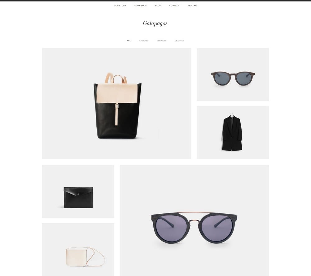
Galapagos
Best for Modern eCommerce Stores ✓ Pros
- Sleek, sophisticated eCommerce design that makes products look premium - even affordable items feel elevated in this layout.
- Quick view popup lets shoppers preview product details without leaving the browse page, reducing friction and keeping them in the shopping flow.
- Seamless Squarespace shopping cart integration handles checkout, inventory, and order management without any third-party plugins.
- Minimal design with strong feature placement ensures that product imagery and CTAs dominate the page rather than competing with decorative elements.
- Improved navigation structure makes it easy for customers to browse categories, filter products, and find what they're looking for quickly.
✗ Cons
- The eCommerce-forward design feels less natural for service-based businesses or portfolio sites that don't sell physical products.
- Minimal design language means the template leans heavily on product photography - weak images will make the store look sparse rather than sophisticated.
- Quick view popups may not display enough detail for products that require long descriptions, size guides, or specification tables.
Galapagos is the top-performing modern Squarespace template for eCommerce. It does what the best online stores do - puts products front and center, removes anything that slows down the buying decision, and makes the checkout process feel effortless. The quick view popup alone saves shoppers enough time to keep them browsing instead of bouncing. If you're serious about selling online, Galapagos gives you a storefront that competes with dedicated eCommerce platforms while keeping everything inside Squarespace's ecosystem.
Kent
Best for Creative Portfolios & Freelancers ✓ Pros
- Attractive, clean layout puts the spotlight directly on your past work and projects - exactly what potential clients and collaborators want to see first.
- Portfolio pages support a mix of videos, images, and text descriptions, giving you the flexibility to present different project types in their best format.
- Multiple page types including cover, blog, event, and album pages give you a full toolkit to build out a complete professional presence.
- Built-in commerce features let you sell products, prints, or services directly from your portfolio site without needing a separate shop platform.
- Modern, uncluttered design lets your creative work dominate the visual experience rather than competing with template decorations or heavy navigation.
✗ Cons
- Portfolio-centric layout may feel underpowered for businesses that need strong service pages, pricing tables, or lead generation forms as their primary content.
- The clean aesthetic relies on strong creative work - a thin or visually inconsistent portfolio will be more exposed in this minimal framework.
- Blog functionality exists but takes a back seat to portfolio features, which may frustrate content-heavy creators who want blogging front and center.
Kent is built for creatives who want their work to do the talking. The portfolio pages are the real star - they handle video, photography, and mixed-media projects with equal polish, and the clean surrounding design ensures nothing distracts from what you've made. It's the modern Squarespace template equivalent of a well-lit gallery wall. The ability to sell directly from the same site turns Kent from a portfolio into a business platform. Show the work, then let visitors buy it or hire you - all without leaving the page.
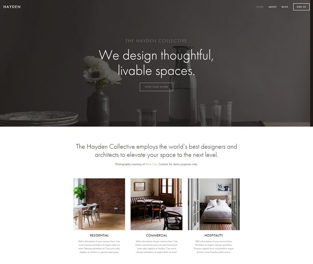
Hayden
Best for Professional Service Agencies ✓ Pros
- Professional design that immediately communicates credibility - ideal for service brands where trust is the deciding factor in winning new clients.
- Blog section supports content marketing strategies, and businesses publishing 15+ posts per month can see up to 70% more inbound leads.
- Portfolio section lets you showcase past work and case studies, giving potential clients the proof they need before reaching out.
- Built-in ticket booking and scheduling integration makes it easy for prospects to book consultations or appointments directly from your site.
- Sticky top-right menu with social media links keeps navigation accessible while reinforcing your professional online presence across platforms.
✗ Cons
- The professional, corporate-leaning design may feel too formal for creative brands, solo freelancers, or businesses that want a more relaxed personality.
- Requires real case studies or portfolio pieces to fill the designated sections - placeholder content or weak examples will undermine the professional impression.
- The structured layout leaves less room for experimental or unconventional page designs that break from the template's polished grid.
Hayden is the modern Squarespace template that accountancy firms, marketing agencies, and design studios reach for when they want to look like they've been in business for years - even if they launched last month. The layout is built around credibility: portfolio for proof, blog for authority, booking for conversion. Every section earns its place. The sticky navigation and social links are small details that make a real difference. They keep your brand visible and accessible no matter how far down the page a visitor scrolls.
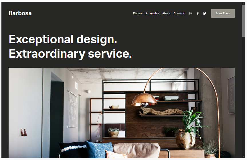
Barbosa
Best for Construction, Real Estate & Service Niches ✓ Pros
- Versatile layout works across construction, real estate, hospitality, and other service niches that need a professional but approachable online presence.
- Dedicated pages for booking, contact, about, and amenities cover every touchpoint a service business needs to convert visitors into clients.
- Portfolio section lets you display completed projects, property listings, or service galleries with clean, organized presentation.
- Fast loading and search-engine-friendly structure helps your site rank well for local service queries on Google.
- Easy to customize with no coding required - the gray default background is fully adjustable to match any brand palette.
✗ Cons
- The gray default color scheme feels industrial out of the box, which requires deliberate customization to warm up for client-facing service brands.
- Less visually dynamic than other modern Squarespace templates on this list - it prioritizes function over visual flair.
- Not the best fit for creative portfolios or visually-driven brands that need dramatic image presentations and bold typography.
Barbosa is the workhorse of this list. It's not trying to win design awards - it's trying to get your construction company, real estate firm, or trade business a professional website that actually generates leads. The page structure covers everything: bookings, contact forms, project galleries, and service descriptions. All the things clients look for when they're deciding who to hire. The template's strength is its adaptability. Change the background, swap in your brand colors, and Barbosa transforms to fit almost any service niche without fighting you on layout.
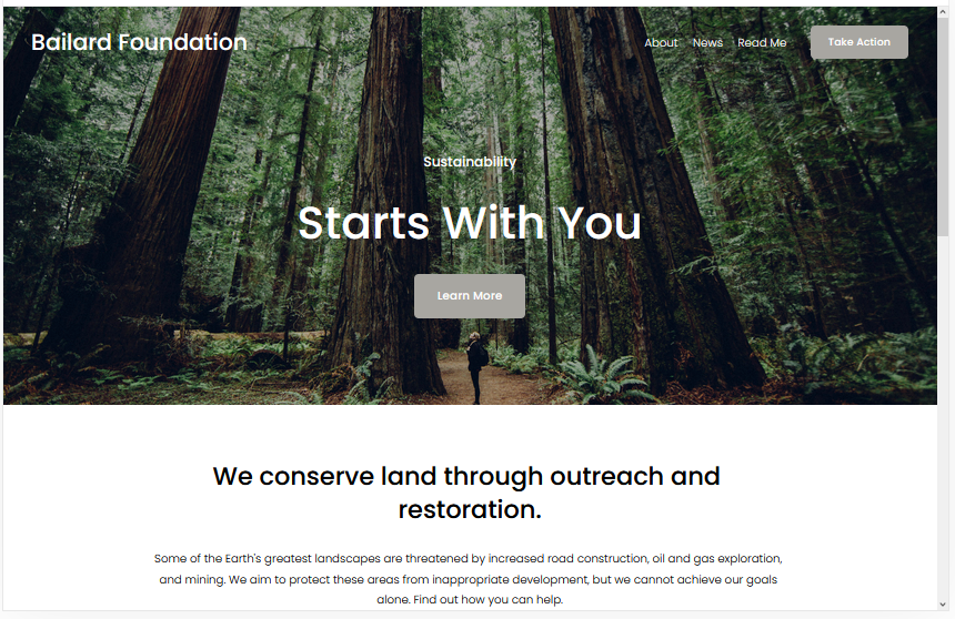
Bailard
Best Overall Modern Template ✓ Pros
- One of the most popular Squarespace templates for a reason - the bold, minimalist design works across virtually every industry and business type.
- Two CTAs built into the layout - one on the hero image and one in the top-right menu - give visitors multiple opportunities to convert without feeling pushy.
- Lazy loading for images keeps page speed fast even with high-resolution photography, which directly benefits your Google rankings.
- Bold typography and generous whitespace create a modern, authoritative feel that builds trust with first-time visitors immediately.
- Fast-loading architecture means your site performs well on Core Web Vitals, which Google uses as a ranking signal for search results.
✗ Cons
- Its popularity means you may encounter other sites using the same template - strong branding and custom imagery are essential to stand out.
- The minimalist framework requires discipline - adding too many sections or elements can dilute the clean, modern impact that makes Bailard effective.
- Less suited for content-dense sites like news publications or resource hubs that need complex navigation and heavy text layouts.
Bailard is the modern Squarespace template that most people end up choosing, and for good reason. The dual CTA approach - hero image and top menu - is a conversion design pattern borrowed from the best SaaS landing pages, and it works just as well for service businesses, product brands, and startups. You get two chances to capture a visitor's attention before they even scroll. The lazy loading is the kind of under-the-hood feature that separates good templates from great ones. Your images look sharp, your pages load fast, and Google rewards you for both.
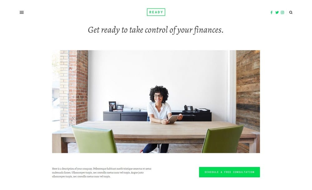
Ready
Best for Creatives, Shops & Appointment-Based Businesses ✓ Pros
- Clean white background keeps the focus entirely on your content and imagery, creating an impressive guest experience that feels curated and intentional.
- Built-in appointment scheduling works perfectly for consultants, coaches, and service businesses that need clients to book time directly from the site.
- Hidden left-hand menu keeps the interface minimal and distraction-free while still providing full navigation when visitors need it.
- Fully mobile-friendly design ensures your site looks and functions perfectly on phones, where most appointment bookings and shop browsing happen.
- Large image sections let bloggers, artists, and shop owners showcase their work and products with the visual space they deserve.
✗ Cons
- The hidden menu, while clean, can confuse first-time visitors who expect traditional top navigation - not everyone knows to look for a hamburger icon.
- The white-dominant design may feel too plain for brands that rely on bold colors, patterns, or dramatic visual storytelling to differentiate themselves.
- Appointment features require Squarespace Scheduling integration, which adds cost if you're on the basic plan and need advanced booking functionality.
Ready creates the kind of first impression that makes visitors slow down and browse. The white background isn't empty - it's intentional. Every image, every product, every piece of text gets room to breathe, and that breathing room is what makes the experience feel polished rather than crowded. The appointment booking feature is what sets Ready apart from other modern Squarespace templates. If your business depends on consultations, sessions, or scheduled calls, having that functionality baked into a design this clean is a genuine advantage.
Carson
Best for Unique Portfolio Presentations ✓ Pros
- Unique static page layout with backgrounds that change on hover creates an interactive portfolio experience that no other modern Squarespace template matches.
- Instantly showcases current and past projects in a way that feels more like an art installation than a standard website grid.
- Hidden menu for navigation keeps the interface completely focused on your creative work without any visual distractions.
- Easy to customize despite the unconventional layout - adding new projects or changing existing ones requires no technical skills.
- Makes a memorable first impression that sticks with visitors, which is critical for creative professionals competing for attention in saturated markets.
✗ Cons
- The hover-based interaction doesn't translate well to mobile devices, where there's no cursor to trigger background changes.
- Highly specialized for portfolios - not a practical choice for eCommerce, service businesses, or content-heavy websites.
- The unconventional layout may confuse visitors who expect traditional website navigation and page structures.
Carson is the template you choose when you want your portfolio to feel like nothing else online. The static page with hover-activated backgrounds is genuinely unique - visitors interact with your projects just by moving their cursor, and each project gets a full-screen moment that no thumbnail grid can replicate. It's a statement piece disguised as a website. This modern Squarespace template is not for everyone, and that's exactly the point. If you're a creative professional who wants to be remembered after a single site visit, Carson delivers that kind of impact.
How to Choose the Best Modern Squarespace Template
Customization Techniques for Modern Squarespace Templates
Every modern Squarespace template on this list is fully customizable through Squarespace's visual editor, but the smartest approach is working within the template's strengths rather than against them. Start with the fonts and colors - stick to two typefaces maximum and a palette of three to four colors that reinforce your brand. Adjust spacing and section layouts to match how your audience consumes content. For getting the most from Squarespace's design tools, check out our guide on Squarespace templates design and layout.
Conversion Optimization for Modern Templates
A beautiful modern template means nothing if it doesn't convert visitors into customers, subscribers, or clients. Place your primary CTA above the fold on every key page. Use contrasting button colors that stand out from the surrounding design. Keep forms short - name and email is enough for most lead generation. Templates like Bailard with built-in dual CTAs give you a head start, but every template here supports strategic button and form placement that turns browsers into buyers.
Performance and Speed Considerations
Page speed is a Google ranking factor and a direct predictor of bounce rates. Modern Squarespace templates like Avenue, Bailard, and Skye are built with fast-loading architectures, but your choices matter too. Compress images before uploading, limit the number of custom fonts, and avoid embedding heavy third-party scripts on every page. Lazy loading - available on templates like Bailard - is one of the most effective ways to keep image-heavy pages performing well without sacrificing visual quality.
Getting the Most From Modern Squarespace Templates
eCommerce Capabilities
Several modern Squarespace templates on this list are built with selling in mind. Galapagos leads the pack for dedicated online stores with its quick view popups and seamless cart integration. Avenue and Skye handle product listings cleanly alongside other content. Kent lets you sell prints and services directly from your portfolio. If eCommerce is your primary goal, choose a template with product display baked into the layout rather than adding shop pages as an afterthought - the browsing experience will feel more natural and convert better.
Blogging and Content Marketing
Consistent content publishing remains one of the most effective ways to drive organic traffic to a modern Squarespace site. Templates like Skye and Hayden are particularly strong for blogging, with layouts that make posts look polished and encourage readers to explore deeper. The data is clear - businesses that publish 15 or more posts per month generate significantly more leads than those that don't. Choose a template with a well-designed blog section and commit to a publishing schedule that builds authority in your niche over time.
Integrations and Plugins
Squarespace's integration ecosystem extends every modern template on this list far beyond its default capabilities. Connect email marketing tools to build subscriber lists, add scheduling integrations for appointment-based businesses like those using Ready or Hayden, embed social media feeds to keep your site dynamic, and integrate analytics to track what's working. The key is choosing integrations that serve your actual business goals rather than adding features for the sake of having them.
Frequently Asked Questions
What are the best modern Squarespace templates in 2026?
Are modern Squarespace templates free?
Which modern Squarespace template is best for an online store?
Can I switch modern Squarespace templates after building my site?
Are modern Squarespace templates mobile-friendly?
Which modern Squarespace template loads the fastest?
What is the best modern Squarespace template for a portfolio?
Do modern Squarespace templates support appointment booking?
How We Evaluate Templates
Conclusion: Pick Your Modern Squarespace Template and Build
The best modern Squarespace templates share three things: they load fast, they look sharp, and they guide visitors toward doing something - buying, booking, subscribing, or reaching out. Whether you go with Bailard for its proven versatility, Galapagos for a dedicated storefront, or Carson for a portfolio that nobody forgets, each template on this list gives you a professional foundation that's ready for real business.
Pick the one that matches your goals, drop in your content and branding, and let the design do its job. A great website isn't the one that took the longest to build - it's the one that went live and started working.
* Read the rest of the post and open up an offer