
Choosing a dark website template is a commitment to visual storytelling. These are not templates you fill with placeholder text and call it done. They reward strong photography, concise copy, and a clear brand identity. If you have those three things, any of these dark Squarespace designs will turn your site into something visitors remember long after they close the tab.
Editor's Picks
| # | Name | Best For | Price | Rating | Image | |
|---|---|---|---|---|---|---|
| 1 | Boutique hotels, luxury stays, and high-end hospitality brands | Free | 4.5/5 |
|
More Info | |
| 2 | Real estate agencies, interior designers, and property showcase sites | Free | 4.3/5 |

|
More Info | |
| 3 | Musicians, bands, DJs, and independent creative artists | Free | 4.3/5 |
|
More Info | |
| 4 | Music promoters, event organizers, and DJ brands | Free | 4.2/5 |

|
More Info | |
| 5 | Wedding websites, engagement announcements, and personal celebration sites | Free | 4.2/5 |

|
More Info |
Our Picks: The 5 Best Dark Squarespace Templates
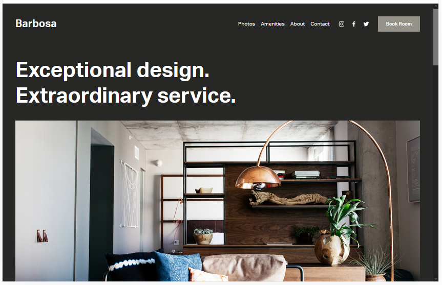
Barbosa
Best for Hotels and Luxury Hospitality ✓ Pros
- Cinematic dark layout with bold typography creates an immediate sense of luxury that matches the ambition of boutique hotel brands.
- Full-width photography sections let interior design, architecture, and property atmosphere sell the experience without relying on heavy copy.
- Minimalist navigation keeps the guest journey clean - from first impression to booking in the fewest possible clicks.
- Built-in testimonial sections let guest reviews reinforce the premium positioning naturally within the dark design.
- Strong mobile performance ensures the dark aesthetic translates perfectly for travelers browsing on their phones.
✗ Cons
- The moody, dark palette is purpose-built for urban and contemporary properties - rustic or farmhouse-style hotels will feel mismatched.
- No native booking engine means you need third-party tools like Acuity Scheduling or Cloudbeds for reservations.
- The editorial layout depends heavily on professional photography - average images undercut the premium feel immediately.
Barbosa is the dark Squarespace template that treats your hotel website like a brand editorial rather than a booking form. The high-contrast palette and cinematic layout create an experience where guests feel the atmosphere of your property before they check a single rate. For boutique hotels, urban stays, and design-forward hospitality brands, Barbosa delivers a dark website design that matches the ambition of the interiors. If your property's identity is built on atmosphere and intention, this is the dark template that brings it online.
Hidano
Best for Real Estate and Interior Design ✓ Pros
- Clean, grid-based dark layout presents property listings and design portfolios with gallery-level precision and visual clarity.
- Neutral dark palette lets architectural photography and interior shots command attention without competing with the background.
- Fast-loading structure performs well on mobile, which matters for clients browsing listings between property viewings.
- Content sections accommodate floor plans, neighbourhood details, and property specifications without visual clutter.
- Flexible color system adapts to any real estate brand identity from monochrome minimalism to accent-driven sophistication.
✗ Cons
- The functional, minimal dark design can feel impersonal for businesses that rely on warmth and personal connection.
- Grid layout requires consistent, uniform photography across all listings to look cohesive against the dark background.
- Less visual drama than full-bleed templates - may undersell luxury properties that need cinematic presentation.
Hidano is the dark Squarespace template for professionals who let the work speak for itself. The grid-based dark layout strips away visual noise so properties, interiors, and design portfolios take center stage. For real estate agents and interior designers competing in markets where visual credibility determines who gets the listing, Hidano delivers a dark website design that says "we are serious about what we do" without wasting a single pixel on decoration.
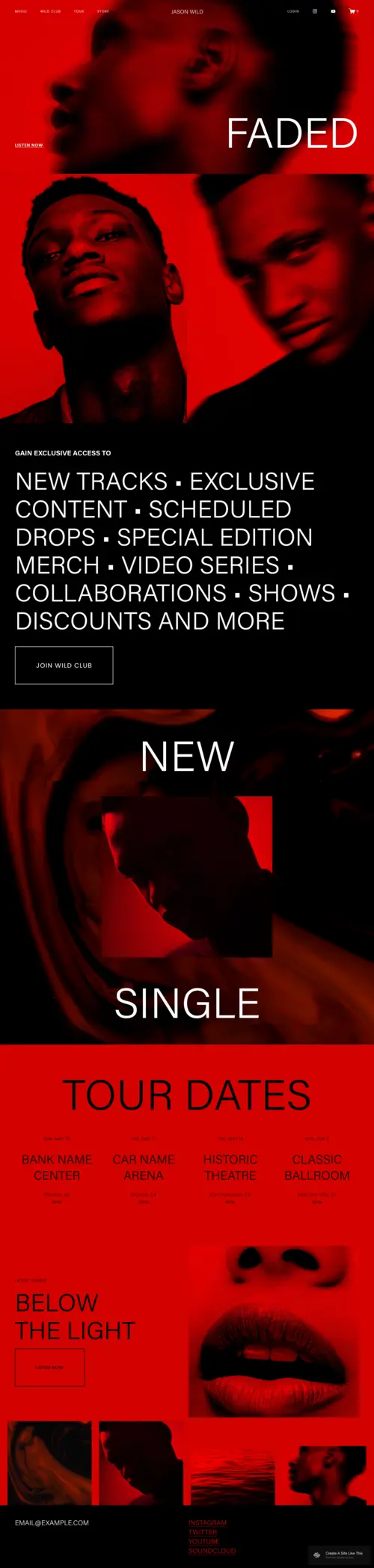
JasonWild
Best for Musicians and Creative Artists ✓ Pros
- Bold, unapologetic dark aesthetic that matches the energy and attitude musicians and creative artists need from their online presence.
- Large hero sections and full-width media blocks showcase album art, live photography, and video content with maximum visual impact.
- Built-in music and media integration works naturally for embedding tracks, tour dates, and streaming platform links.
- Strong typographic hierarchy makes artist bios, press quotes, and release announcements readable against the dark background.
- The dark design creates a stage-like atmosphere - visitors feel like they are experiencing the artist's world, not just reading about it.
✗ Cons
- The bold, dramatic dark layout is built for artists with strong visual identities - emerging musicians without professional photography may struggle to fill it.
- Not suited to corporate or commercial music industry sites that need a more structured, professional tone.
- Content-heavy pages like full discographies or extensive tour histories can feel dense against the dark background without careful formatting.
JasonWild turns a website into a stage. The dark Squarespace design wraps everything in atmosphere - album artwork glows, live photos hit harder, and the entire browsing experience feels like stepping into the artist's world rather than reading a biography page. For musicians, bands, and creative artists who need their site to carry the same energy as their work, JasonWild is the dark template that delivers. If you are building a musician website on Squarespace, this should be on your shortlist.
Kitui
Best for Music Promotion and Event Announcements ✓ Pros
- High-energy dark layout built for urgency - event dates, ticket links, and featured artists are immediately visible and impossible to miss.
- Visual hierarchy prioritizes upcoming events and announcements, making it the strongest dark Squarespace template for time-sensitive content.
- Dark background makes neon accents, event flyers, and promotional graphics pop with nightclub-level visual intensity.
- Flexible content blocks handle recurring events, artist lineups, venue information, and ticket integrations without cluttering the design.
- Mobile-first layout ensures event details and ticket links are accessible for audiences discovering events on their phones.
✗ Cons
- The event-focused dark design requires frequent content updates - an outdated event listing undermines the template's energy.
- Less suited to portfolio or long-form content sites that need a more editorial or storytelling-driven layout.
- The high-contrast dark aesthetic works best for nightlife and music events - daytime, family, or corporate events may feel tonally mismatched.
Kitui is the dark Squarespace template that operates like a digital marquee. Everything about the layout is built to answer one question fast: what is happening and when can I get tickets? The dark background creates the nightclub atmosphere that music promoters and event brands need, while the content structure keeps event details, lineups, and ticket links front and center. For anyone promoting live music, DJ sets, or nightlife events, Kitui is the dark website design that matches the energy of the room. Pair it with a strong musician template for your artist pages.
Malcolm
Best for Weddings and Personal Celebrations ✓ Pros
- Elegant dark palette creates a romantic, editorial atmosphere that elevates wedding photography and personal storytelling beyond typical bright templates.
- Typography-forward design makes couple names, event details, and save-the-date information feel like magazine editorial rather than a template fill-in.
- Full-width photo sections showcase engagement and wedding photography with cinematic drama that light-colored templates cannot match.
- RSVP and event detail sections integrate naturally into the dark layout, keeping practical information accessible without breaking the mood.
- The dark aesthetic works beautifully for evening, winter, and moody-romantic wedding themes that are increasingly popular with modern couples.
✗ Cons
- The dark, moody aesthetic is not suited to bright, cheerful, or pastel-themed celebrations - it works best for couples who want drama and sophistication.
- Guest-facing information like travel details and accommodation links need careful formatting to remain readable against the dark background.
- Limited post-wedding utility - the template's event-focused structure does not adapt as well to ongoing personal blogs or family sites.
Malcolm proves that wedding websites do not have to be soft, pastel, and predictable. The dark Squarespace design gives couples a canvas for the kind of cinematic, editorial-quality presentation that turns a wedding site into something guests genuinely want to browse. For evening receptions, winter weddings, moody-romantic aesthetics, and any couple who wants their website to feel as intentional as their venue choice, Malcolm is the dark template that delivers. If you are exploring Squarespace wedding templates, Malcolm stands apart from the traditional options.
How to Choose the Right Dark Squarespace Template
Align the Dark Aesthetic With Your Brand Identity
A dark website template is a visual commitment that sends a specific message. Barbosa communicates luxury and editorial sophistication for hospitality brands. JasonWild channels creative intensity for musicians and artists. Malcolm delivers romantic drama for weddings. Before choosing, ask whether your brand's personality naturally fits a dark palette. If your business thrives on warmth, brightness, or casual approachability, a dark template may create the wrong first impression. But if your brand is built on atmosphere, exclusivity, or creative edge, a dark Squarespace design amplifies everything you already stand for. For a broader overview of how Squarespace templates handle design and layout, start there before committing to a dark palette.
Evaluate Your Photography for Dark Backgrounds
Dark templates are unforgiving with mediocre photography. Images that look acceptable on a white background can appear muddy, underexposed, or poorly lit against dark tones. Every template on this list rewards high-contrast photography with strong lighting and clean composition. Barbosa needs crisp architectural interiors. JasonWild demands striking live performance shots or bold album artwork. Malcolm requires romantic photography with intentional mood lighting. Before selecting a dark Squarespace template, honestly assess your existing imagery. If your photos are not ready for a dark canvas, invest in a professional shoot first - the template will only perform as well as the visuals inside it.
Prioritize Readability and Contrast
The most common mistake with dark website templates is sacrificing readability for aesthetics. White or light text on dark backgrounds can strain readers if the contrast ratio is too low or the font weight is too thin. Every template here uses strong typographic hierarchy to maintain readability, but customization can introduce problems. When adjusting fonts, colors, or text sizes, test every page on both desktop and mobile to confirm that body text, navigation labels, and CTA buttons remain easy to read. A dark Squarespace design that looks beautiful but forces visitors to squint defeats its own purpose.
Test the Mobile Experience on Dark Screens
Dark templates look dramatically different on mobile devices, especially in varying lighting conditions. A dark layout that feels cinematic on a large desktop monitor can appear almost black on a phone screen in a brightly lit room. All five templates on this list are fully responsive, but the mobile dark experience depends on screen brightness, ambient light, and image loading speed. Test your dark Squarespace template on an actual phone in multiple environments - indoors, outdoors, and in dim lighting - before launching. Pay special attention to text legibility, button tap targets, and image loading times on cellular connections.
Frequently Asked Questions
What is a dark Squarespace template?
Are dark website templates good for SEO?
Which dark Squarespace template is best for a portfolio website?
Can I make any Squarespace template dark?
Do dark Squarespace templates work well on mobile phones?
Are dark website templates harder to read than light ones?
Which dark Squarespace template is best for a wedding website?
How We Evaluate Templates
Conclusion: Make a Bold Statement With Dark Squarespace Templates
Dark Squarespace templates are not for every brand - and that is exactly what makes them powerful. The five dark website templates reviewed here each serve a distinct purpose: Barbosa brings cinematic luxury to hospitality, Hidano delivers clean precision for real estate and design, JasonWild creates stage-worthy presence for musicians, Kitui builds nightclub energy for event promoters, and Malcolm turns wedding sites into editorial experiences. The common thread is commitment - these templates reward brands that lean fully into the dark aesthetic rather than treating it as a novelty.
Pick the dark Squarespace template that matches your brand's personality, fill it with photography that earns the dark background, and let the design do what light templates cannot - make your visitors feel something the moment they arrive.
* Read the rest of the post and open up an offer