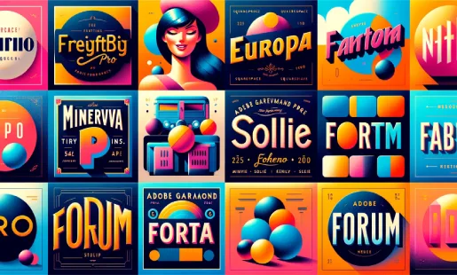
Did you know there is a vast choice of fonts available on Squarespace? Knowing which Squarespace font to use can be challenging. Even knowing what is available can be challenging because there are so many options.
Yet having the right font can be very important. Visitors to your website can make judgments about your business based on the font that you use. It can tell the audience whether you’re a fun company, professional, serious, modern, classic, or something else.
Therefore, you mustn’t forget to have the best Squarespace fonts on your website. So in this article, let's look at the 6 best font pairings that you can use to make it look the best.

FreightBig Pro + Europa
Those looking to create that sense of inviting the audience to learn more, yet showcasing a professional polish should consider these two together. The title font is large and can be more expressive than others might prefer and the body font is more understated and legible, but the combination works perfectly for many brands.
Those who are looking to evoke soft, rounded, wide, honest, and trustworthy feelings should try this font.
Poppins + Soleil
Those who want to stand out in a crowd with a modern and approachable font combination should consider these two elements. The two combined create a playful and personable brand presence. The combination does have one downside, the scalability is poor but the body font certainly makes up with a legibility that is one of the best on the market.
Those who are looking to use clean, playful, modern, and friendly feelings on their website should consider these two fonts working together.
Minerva Modern + Lato
This is a polished and chic font grouping that is more about being sleek and feminine. While the title font exudes character, the body is understated and fine. The high-contrasting pair is perfect for numerous eCommerce business websites, such as those selling fashion or more artistic websites. However, it has been used numerous times by high-fashion brands on their website.
Those looking to use a font that is ideal for feminine, chic, modern, sleek, and fashion products/services should consider this combination.
Forum
This option is perfect for those who want to have a tidy but friendly website design. Both the fonts used in this pairing look like they’re from the same font family, and the title is scalable.
Those looking for a trustworthy website design should seriously consider this option.
DIN 2014 + Adobe Garamond Pro
An unlikely combination here is perfect for brands of both modern and traditional website designs. The title font is more about linear and modern elements while the body font is about being classic and traditional.
Those using this will have a timeless website that is refined, modern, and traditional.
Acumin Pro + Helvetica Neue
A pairing that is highly structured and authoritative. Those businesses that want to showcase that they’re an established brand might want to use these. The title font is perfect with its thicker stroke, the body text has an increased letter spacing.
The font combination is perfect for those looking to showcase expertise and clean and authoritative themes.
Enhancing Website Aesthetics with Squarespace Fonts
Selecting the Ideal Font
Understanding the impact of font choice on your website's aesthetic is crucial. The right font can elevate your brand's perception, enhancing professionalism and readability. Consider fonts that align with your brand's personality, ensuring they are not only visually appealing but also functional across various devices and screen sizes.
To further refine your site's design, explore Squarespace Templates Design and Layout to gain additional insights into creating a cohesive and visually appealing online presence.
Font Pairing Strategies
Mastering the art of font pairing can significantly improve your site's visual harmony. A combination of a robust serif with a clean sans-serif can create a dynamic yet cohesive look. Experiment with contrasting styles, like a bold headline font paired with a more subdued body font, to draw attention effectively.
Font Customization Techniques
Customizing fonts adds a unique touch to your site. Adjusting font weights, sizes, and colors can make your content stand out. Utilize Squarespace's customization options to tweak these elements, ensuring your fonts are not only beautiful but also enhance the user experience.
Optimizing Squarespace Fonts for User Engagement
Readability and User Experience
Prioritize readability to ensure a seamless user experience. Fonts should be easy to read and accessible, enhancing the overall usability of your site. Consider the legibility of your chosen fonts, especially in longer paragraphs, to keep your audience engaged.
Impact on SEO and Performance
Fonts can influence your site's loading times and SEO performance. Opt for web-optimized fonts that don't compromise your site's speed. Efficient font choices contribute positively to search engine rankings and user retention.
Analyzing Font Trends
Stay updated with the latest font trends in web design. Incorporating contemporary fonts can give your site a modern edge. However, balance trendiness with timelessness to ensure your site's typography remains relevant and appealing in the long run.
Conclusion: What are the Best Squarespace Fonts?
Above are 6 of the best Squarespace fonts that you can use on your website, each with its options. What combination would you use?
* Read the rest of the post and open up an offer
