Editor's Picks
| # | Name | Best For | Price | Rating | Image | |
|---|---|---|---|---|---|---|
| 1 | Personal, lifestyle, and conversational podcasts | Free | 4.6/5 |
|
More Info | |
| 2 | Interview shows, creative industry podcasts, and guest-driven content | Free | 4.4/5 |
|
More Info | |
| 3 | Technology, science, and future-focused podcasts | Free | 4.3/5 |
|
More Info | |
| 4 | Business, education, and production-quality podcasts | Free | 4.5/5 |

|
More Info |
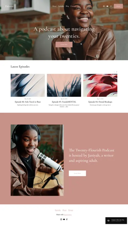
Paloma
Best for Personal & Lifestyle Podcasts ✓ Pros
- Warm, inviting design with soft tones that immediately sets a conversational mood - perfect for podcasters who build relationships with their audience.
- Integrated blog sections let you publish show notes, behind-the-scenes stories, and companion content alongside your episodes.
- Layout naturally encourages visitors to explore beyond the latest episode, increasing time on site and listener engagement.
- Newsletter signup placement works well for podcasters who run an email list or weekly digest alongside their show.
- Responsive design feels just as welcoming on mobile, where most podcast listeners first discover new shows.
✗ Cons
- The warm, cozy aesthetic may feel too casual for business-focused or hard-news podcast brands that need sharper authority.
- Blog-forward layout can push your episode player lower on the page if you don't structure sections carefully.
- Limited visual punch for podcasters who want bold, attention-grabbing hero sections to stop the scroll.
Paloma has that "come sit down, let's chat" energy that's hard to resist. The warm tones and inviting layout make it the perfect fit for personal or lifestyle podcasts that thrive on creating a sense of connection with the audience. It doesn't just showcase your episodes - it encourages visitors to dig deeper, with integrated blog sections where you can share personal thoughts or behind-the-scenes insights. Paloma is ideal for podcasters who run a blog or newsletter alongside their show, creating a full-circle experience for listeners. It feels like a home for your podcast - personal, friendly, and designed to keep the conversation going even after the episode ends. If you want your audience to feel welcome the moment they land on your site, this Squarespace podcast template delivers that warmth naturally.
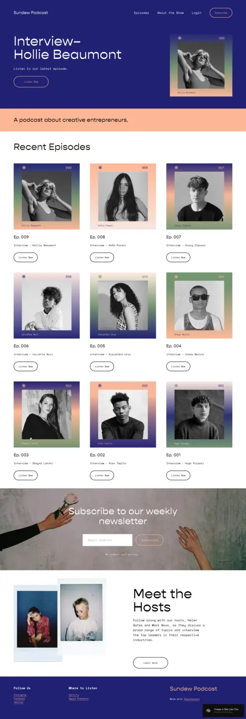
Sundew
Best for Interview & Guest-Focused Podcasts ✓ Pros
- Bold colors and modern aesthetic make your podcast website look as fresh and current as your content sounds.
- Guest showcase sections put your interviewees in the spotlight, which helps attract higher-profile guests who want visibility.
- Built-in newsletter integration encourages visitors to subscribe between episodes, keeping engagement high during off-weeks.
- Intuitive layout lets listeners jump between episodes effortlessly without getting lost in cluttered navigation.
- Strong visual hierarchy works well for podcasts that feature rotating guests, season-based content, or themed episode arcs.
✗ Cons
- The trendy, bold design may feel too busy for minimalist podcast brands that prefer a stripped-back, content-first approach.
- Requires strong photography of guests and recording sessions - the template loses impact without quality visuals to fill its image blocks.
- Color-forward design may need careful customization to match your existing podcast cover art and brand palette.
Sundew is the template for creators who want their podcast website to look as trendy as their content sounds. The design feels fresh, with bold colors and a modern aesthetic that's perfect for podcasts focusing on creative industries. Whether you're interviewing artists, entrepreneurs, or influencers, Sundew showcases your guests just as much as your episodes. One standout feature is the newsletter integration, encouraging visitors to subscribe and stay in the loop between episodes. This keeps engagement high and ensures your audience is always updated with the latest content. The layout is intuitive, letting visitors jump from one episode to another effortlessly. If your show focuses on interviews or features a rotating lineup of guests, this Squarespace podcast template puts them in the spotlight while keeping navigation smooth.
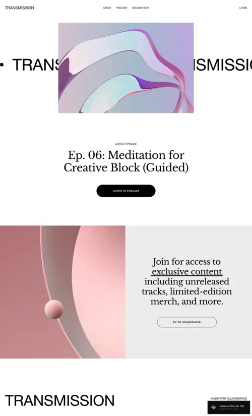
Transmission
Best for Tech & Forward-Thinking Podcasts ✓ Pros
- Sleek, futuristic design with high-impact visuals that make a statement before anyone even presses play on your podcast.
- Episodes are front and center in the layout, with clear navigation that helps listeners find specific topics or seasons fast.
- Strong call-to-action placement for memberships, merch, and exclusive content - built for podcasters who monetize beyond ads.
- Community-building layout encourages listeners to sign up, engage, and become part of something bigger than a weekly download.
- High-contrast design elements make text and buttons pop, which improves conversion rates on subscribe and support CTAs.
✗ Cons
- The futuristic aesthetic is a strong stylistic choice that won't suit lifestyle, comedy, or storytelling podcasts with a warmer tone.
- Heavy reliance on visuals and graphics means you'll need custom images or artwork - default placeholder content won't cut it.
- The bold design can feel overwhelming for podcast websites with a simple episode archive and not much supplementary content.
Transmission looks and feels like the future. With its sleek lines and futuristic design, it's the ideal Squarespace podcast template for tech shows or podcasts that lean into forward-thinking topics. The visuals are stunning, with high-impact graphics that make a statement before anyone even listens to the first episode. Beyond the aesthetics, the layout is intuitive and simple to navigate. Episodes sit front and center, but there's also a clear call-to-action encouraging listeners to sign up for exclusive content, memberships, or merch. This template is designed to build a community around your podcast, keeping listeners engaged and coming back for more. If your show pushes boundaries, Transmission gives your podcast website the same cutting-edge energy.
Forma
Best for Professional & Content-First Podcasts ✓ Pros
- Clean, professional layout that keeps all attention on your content - no visual distractions competing with your episodes.
- Straightforward episode listings with space for guest images, descriptions, and teasers for upcoming shows.
- Intuitive to update on a regular publishing schedule, whether you release weekly, biweekly, or in seasonal drops.
- Sophisticated typography and whitespace give your podcast a high-quality, polished feel before a listener hits play.
- Flexible content blocks work well for podcasters who also publish transcripts, resources, or downloadable guides alongside episodes.
✗ Cons
- The minimalist design may feel too understated for podcasters who want a bold, personality-driven website with lots of visual flair.
- Limited built-in interactivity - if you want comment sections, live chat, or community features, you'll need third-party integrations.
- The clean layout can look sparse if you only have a handful of episodes - it works best once you've built a library of content.
Forma feels like the website equivalent of a well-produced podcast episode. It's smooth, professional, and effortlessly clean. Everything about this Squarespace podcast template points to one thing: keeping the focus on your content without distractions. The layout is straightforward but sophisticated, making it a strong match for podcast creators who care about presentation as much as audio quality. The beauty of Forma is in its simplicity. You have space to highlight episodes, feature guest images, and tease upcoming shows - all without making the site feel cluttered. It's easy to navigate for listeners, and intuitive to update as a creator. Whether you're pushing new content weekly or dropping seasons, Forma ensures every episode gets the clean spotlight it deserves. No frills, no fluff - just a polished site that gets straight to the point.
How to Choose the Right Squarespace Podcast Template
Match the Template to Your Podcast's Tone
Your podcast website should feel like a visual extension of your show. A casual, conversational podcast about life and relationships fits Paloma's warmth naturally. An interview show with high-profile guests needs Sundew's bold, guest-forward layout. A tech or futurism podcast demands Transmission's cutting-edge design. A business or education podcast benefits from Forma's clean professionalism. Pick the template that sounds like your show looks.
Consider How Listeners Discover Your Show
If most of your new listeners come from Google searches for podcast topics, you need a template with strong content structure and space for show notes that rank - Forma and Paloma handle this well. If your growth comes from social media and guest cross-promotion, Sundew's visual guest showcases and shareable layouts give you more to work with. Think about your actual listener funnel and pick the template that supports it.
Plan for Monetization and Community
Podcasters who monetize through memberships, exclusive content, or merch need a template with clear CTA placement and conversion-focused layout. Transmission is built for this with its prominent calls to action and community-building sections. If your monetization is simpler - maybe a Patreon link and a newsletter - Paloma or Forma handle that without the extra visual weight.
Think About Your Content Beyond Episodes
Some podcasters publish episodes and nothing else. Others run blogs, newsletters, resource libraries, and guest directories alongside their show. If you create companion content, Paloma's blog integration and Forma's flexible content blocks give you room to grow. If you keep it simple, Transmission's focused episode layout won't overwhelm your site with sections you'll never fill.
Frequently Asked Questions
What is the best Squarespace template for a podcast website?
Can I embed podcast episodes directly on a Squarespace website?
How much does Squarespace cost for a podcast website?
Does Squarespace have a built-in podcast hosting feature?
Can I switch Squarespace podcast templates after building my site?
What should I include on my podcast website besides episodes?
Are Squarespace podcast templates mobile-friendly?
Can I use Squarespace to build a podcast network website with multiple shows?
How We Evaluate Templates
Conclusion: Give Your Podcast the Website It Deserves
Your podcast is more than just the sound of your voice - it's an experience, and part of that experience lives on your website. The right Squarespace podcast template turns a casual visitor into a subscribed listener. Paloma brings warmth for personal shows - and if you want a deeper look at what it offers, our full Paloma Squarespace template review covers its features, customization options, and who it works best for. Sundew highlights your guests, Transmission builds community around forward-thinking content, and Forma delivers clean professionalism for content-first creators.
Pick the template that matches your podcast's vibe, drop in your episodes and show notes, and let your site start working as hard as you do behind the mic. Your voice deserves a stage that looks as good as it sounds.
* Read the rest of the post and open up an offer