
Editor's Picks
| # | Name | Best For | Price | Rating | Image | |
|---|---|---|---|---|---|---|
| 1 | Versatile travel bloggers who mix stories, guides, and merchandise | Free | 4.4/5 |
|
More Info | |
| 2 | Travel bloggers with strong photography and multimedia content | Free | 4.3/5 |
|
More Info | |
| 3 | Full-time travel and food bloggers who post frequently | Free | 4.5/5 |
|
More Info | |
| 4 | Travel bloggers who prefer clean, minimalist design | Free | 4.1/5 |
.png)
|
More Info | |
| 5 | Travel bloggers focused on visual storytelling and photo essays | Free | 4.2/5 |
|
More Info | |
| 6 | Travel bloggers who write detailed guides and practical content | Free | 4.3/5 |
|
More Info | |
| 7 | Travel bloggers who build their audience through social media | Free | 4.2/5 |
.png)
|
More Info | |
| 8 | Travel bloggers monetizing through products, guides, or affiliate content | Free | 4.2/5 |
|
More Info | |
| 9 | Travel bloggers who prioritize speed and SEO performance | Free | 4.1/5 |
.jpg)
|
More Info | |
| 10 | Travel bloggers and photographers with a creative, portfolio-driven approach | Free | 4.0/5 |

|
More Info |
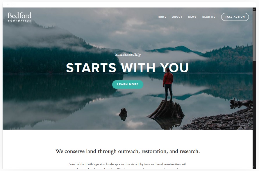
Bedford
Best for Versatile Travel Bloggers ✓ Pros
- Sidebar navigation keeps your blog categories accessible without cluttering the main content area - perfect for organizing destinations by region or travel style.
- Scrolling index page lets readers browse your travel posts in a visually rich feed, making content discovery feel natural rather than forced.
- Full-width banners with built-in CTA support are ideal for promoting travel guides, affiliate partnerships, or your own travel merchandise.
- Handles mixed content well - blog posts, image galleries, and video embeds all sit comfortably within the same layout without competing for attention.
- Built-in commerce features let you sell travel merchandise, presets, or affiliate products directly from your blog without needing a separate shop page.
✗ Cons
- The sidebar layout feels slightly dated compared to more modern full-width Squarespace travel blog templates.
- Image-heavy travel posts can slow down page loads if you don't optimize your photos before uploading.
- Requires thoughtful content organization - without clear categories, the scrolling index can feel overwhelming for first-time visitors.
Bedford is the Swiss army knife of Squarespace travel blog templates. It doesn't specialize in one thing - it handles everything. Destination guides, photo essays, gear reviews, affiliate content, even a small merch shop. If your travel blog covers multiple formats and you don't want to compromise on any of them, Bedford gives you the flexibility to grow without outgrowing your template.
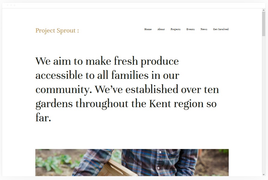
Kent
Best for Media-Rich Travel Content ✓ Pros
- Attractive, clean design that puts your travel photography front and center without any visual distractions pulling attention away from your images.
- Portfolio page layouts work beautifully for organizing travel content by destination, letting readers browse your trips like a visual gallery.
- Supports cover pages, blog posts, event pages, and album layouts - every content format a travel blogger actually needs in one template.
- Blog layout balances images and text cleanly, so your destination guides read well even when packed with practical details and tips.
- Built-in commerce support lets you sell travel prints, digital guides, or branded merchandise alongside your blog content.
✗ Cons
- The clean, minimal aesthetic can feel too restrained for travel bloggers who want a bold, adventurous visual personality.
- Portfolio-style layouts work best with consistent, high-quality photography - mixed image quality becomes more obvious here.
- Navigation can feel thin if you have dozens of destination categories that need clear wayfinding.
Kent treats your travel content like an exhibition. Every photo gets room to breathe, every blog post feels intentional, and the overall impression is that of a curated travel journal rather than a cluttered blog. If you're the kind of travel blogger who shoots as much as you write, Kent makes sure your images carry the weight they deserve.
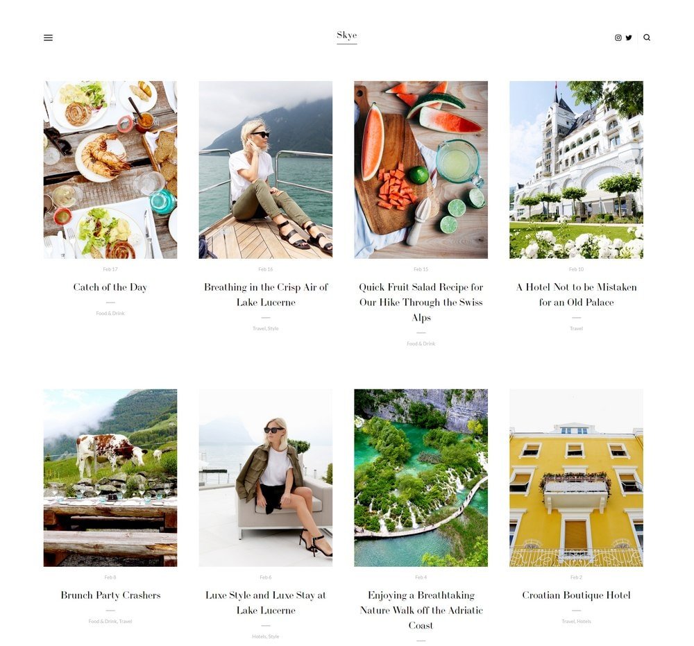
Skye
Best for Dedicated Travel Bloggers ✓ Pros
- Grid-based blog layout is purpose-built for frequent posting - your latest travel stories display in a visual grid that makes every post feel like a new discovery.
- Large image support means your travel photography dominates the page, creating the immersive feel that travel blog readers expect.
- Fullscreen image capabilities let you create hero sections that transport readers to a destination before they've read a single word.
- Mobile-responsive design looks excellent on phones and tablets, which matters because most travel blog readers browse on mobile.
- Natural fit for both travel and food bloggers - the grid layout handles restaurant reviews, street food guides, and destination posts equally well.
✗ Cons
- The grid layout can feel repetitive if all your travel posts use similar cover images or color palettes.
- Long-form travel guides need careful formatting - the template favors visual posts over text-heavy destination breakdowns.
- Limited sidebar or widget options for displaying popular posts, email signup forms, or social feeds alongside your blog grid.
Skye was practically made for travel bloggers. The grid layout turns your blog feed into something that looks like a Pinterest board of destinations, and every post opens into a fullscreen, image-forward reading experience. If you post regularly and your travel blog lives on photography as much as writing, Skye is the Squarespace travel blog template that keeps up with your pace.
Sofia Pazari
Best for Minimalist Travel Blogs ✓ Pros
- Clean, minimalist layout gives your travel stories room to breathe - no visual clutter competing with your photography or writing.
- Two side-by-side image layout creates a magazine-style feel that works beautifully for before-and-after destination comparisons or photo pairs.
- Top-right menu keeps navigation accessible without taking up valuable screen space that should belong to your content.
- Easy to customize with minimal design experience - swap colors, fonts, and images without needing to understand complex layout systems.
- The restrained aesthetic makes your travel content feel curated and intentional, which builds authority with readers who value thoughtful recommendations.
✗ Cons
- The minimalist approach may feel too sparse for travel bloggers who want a bold, energetic visual identity.
- Side-by-side image layout doesn't work well on narrow mobile screens - images stack vertically and lose the paired effect.
- Limited space for sidebar elements like recent posts, social feeds, or newsletter signups without disrupting the clean layout.
Sofia Pazari is for the travel blogger who believes less is more. It strips away everything unnecessary and lets your destinations speak for themselves. The paired image layout adds a subtle editorial quality that makes even a simple weekend getaway post feel like a feature in a travel magazine. If you're drawn to white space and quiet confidence, this is your Squarespace travel blog template.
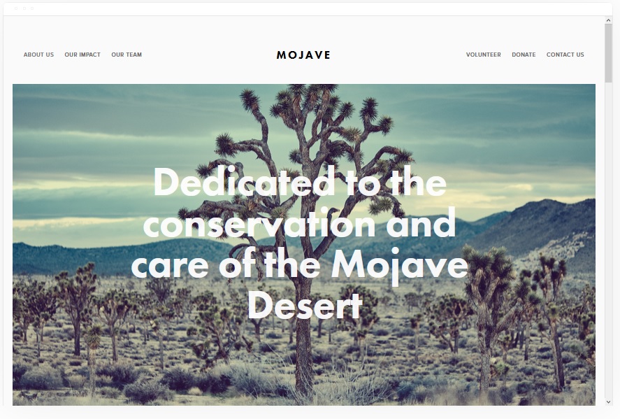
Mojave
Best for Visual Storytelling ✓ Pros
- Striking scrolling effect creates a cinematic experience - readers feel like they're scrolling through a travel documentary rather than reading a blog post.
- Built-in social share buttons make it easy for readers to share your travel content, which drives organic traffic from platforms where travel content thrives.
- Full-width banner sections give your best travel photos the dramatic presentation they deserve, especially landscapes and cityscapes.
- Clean white background keeps the focus entirely on your images and text without any design elements competing for attention.
- Works exceptionally well for long-form travel narratives where the scrolling effect pulls readers deeper into the story with each section.
✗ Cons
- The scrolling effect can feel slow for readers who want to quickly scan a destination guide for specific practical information.
- Heavy reliance on large images means page load times can suffer if your photos aren't properly compressed and optimized.
- The linear scrolling format doesn't lend itself well to quick-reference content like packing lists or budget breakdowns.
Mojave turns your travel blog into something closer to a visual essay. The scrolling effect creates momentum - readers don't just read your content, they move through it. That's a powerful feeling when you're describing a winding coastal road in Portugal or a sunrise over Angkor Wat. If your travel content is more about the experience than the logistics, Mojave is the Squarespace travel template that matches your storytelling style.
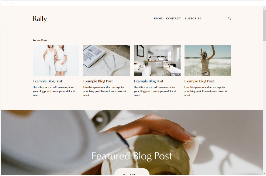
Rally
Best for Content-Focused Travel Blogs ✓ Pros
- Streamlined layout with smooth scrolling makes long travel guides feel effortless to read, keeping visitors engaged through thousands of words of destination content.
- Top-right menu paired with social links gives your travel blog a professional, magazine-like header that readers trust immediately.
- Blog-first design means your travel content is the centerpiece - no fighting with portfolio grids or product showcases for attention.
- Social media integration in the header drives followers to your Instagram, YouTube, or TikTok where your travel content lives between blog posts.
- Clean, modern typography makes even dense travel information - flight details, accommodation tips, budget breakdowns - feel readable and well-organized.
✗ Cons
- The streamlined design may feel too simple for travel bloggers who want dramatic visual impact on their homepage.
- Limited visual variety in post layouts - every post follows the same format, which can feel monotonous over dozens of entries.
- Social links in the header can pull readers away from your blog content toward your social platforms before they've finished reading.
Rally is the no-nonsense Squarespace travel blog template. It doesn't try to dazzle you with effects or impress with dramatic layouts. Instead, it makes your travel content the entire show. If you write 3,000-word destination guides, budget breakdowns, and detailed itineraries, Rally keeps readers focused on your words and photos without a single distraction pulling them away.
Native
Best for Social-First Travel Bloggers ✓ Pros
- Strong social media integration makes Native ideal for travel bloggers who drive traffic from Instagram, TikTok, or YouTube to their blog.
- Rounded thumbnail design gives your blog feed a friendly, approachable look that matches the casual tone most travel audiences prefer.
- Location-tagged blog posts let you organize travel content geographically, so readers can browse by destination rather than scrolling chronologically.
- Smooth scrolling keeps the reading experience fluid, which matters for travel posts that mix text, images, and embedded social content.
- The overall aesthetic bridges the gap between social media and traditional blogging - familiar enough for Instagram users, structured enough for serious travel content.
✗ Cons
- Rounded thumbnails can crop travel photos awkwardly, especially wide landscape shots that lose their impact in circular or rounded frames.
- The social-first design may feel too casual for travel bloggers positioning themselves as professional writers or destination experts.
- Location tagging requires consistent effort - if you don't tag posts regularly, the geographic browsing feature adds no value.
Native is the Squarespace travel blog template for creators who live on social media and want their blog to feel like an extension of their feed. The rounded thumbnails, social integration, and location-based organization create a browsing experience that feels natural to anyone who already follows you on Instagram. It's not the most traditional blog layout, but for social-first travel creators, that's exactly the point.
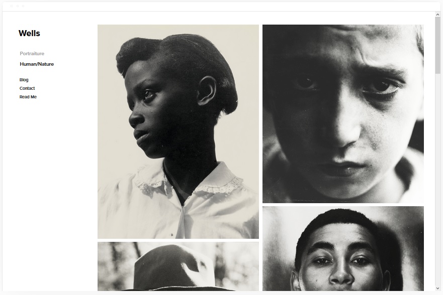
Wells
Best for Travel Bloggers Who Sell ✓ Pros
- Visual showcase layout highlights both your travel content and any products you sell - digital guides, presets, or travel gear - in one cohesive design.
- Built-in eCommerce features let you sell travel-related products directly from your blog without redirecting readers to a separate storefront.
- YouTube video integration via URL makes it easy to embed travel vlogs and destination videos alongside your written blog content.
- Social media integration keeps your travel community connected across platforms, driving traffic between your blog and your social channels.
- Clean product-and-content hybrid layout means readers can go from reading your Bali travel guide to purchasing your Bali preset pack in one click.
✗ Cons
- The commerce-forward layout can make your travel blog feel like a shop if you don't carefully balance product pages with editorial content.
- Video embedding via YouTube URL only - no native video hosting, which means your travel vlogs always carry YouTube branding.
- Requires more content to fill effectively - empty product sections or sparse blog feeds make the template look incomplete.
Wells is the Squarespace travel blog template for bloggers who've moved past "hobby" and into "business." It handles the transition from pure content to content-plus-commerce better than any other template here. Your travel guides, preset packs, digital itineraries, and affiliate recommendations all live under one roof without the site feeling like it lost its editorial identity.
Avenue
Best for Fast-Loading Travel Blogs ✓ Pros
- Minimalist grid layout loads fast, which is critical for travel blog SEO - page speed directly affects how well your destination guides rank on Google.
- Clean grid design organizes your travel posts visually without heavy design elements that slow down page rendering.
- Product page support lets you build dedicated landing pages for affiliate travel gear, booking links, or sponsored destination features.
- Mobile performance is strong - the lightweight design means readers on slow hotel Wi-Fi or mobile data abroad can still browse your content quickly.
- Simple structure makes it easy to maintain consistent formatting across dozens or hundreds of travel posts as your blog grows.
✗ Cons
- The minimalist grid doesn't create the visual drama that travel photography often demands - your best shots may feel undersized.
- Limited layout customization compared to more feature-rich Squarespace travel templates in this list.
- The simplicity that makes it fast can also make it feel generic if you don't invest in strong branding and distinctive photography.
Avenue is the practical choice. It won't win awards for visual drama, but it loads fast, ranks well, and presents your travel content in a clean grid that readers can scan in seconds. If your travel blog strategy is built on SEO and organic search traffic - where page speed and clean structure actually move the needle - Avenue is the Squarespace travel blog template that does the unglamorous work that matters.
Carson
Best for Creative Travel Portfolios ✓ Pros
- Unique static page design with hover-activated backgrounds creates an immediately memorable first impression that sets your travel blog apart.
- Hidden menu keeps the homepage completely focused on visuals - perfect for travel photographers who want their images to do all the talking.
- Portfolio-style layout works brilliantly for organizing travel content by destination, with each location getting its own visual entry point.
- The hover effect turns your homepage into an interactive experience, making visitors curious enough to click through and explore your travel content.
- Stands out dramatically from typical blog templates, which helps your travel site be memorable in a crowded niche.
✗ Cons
- The portfolio-first layout prioritizes visual browsing over blog discoverability - readers may not realize how much written content you have.
- Hidden navigation is a usability risk - first-time visitors may not immediately know how to find your blog, about page, or contact info.
- The hover background effect doesn't translate to mobile, where the experience becomes a simpler static page.
Carson is the wildcard. It breaks every convention of what a travel blog "should" look like, and that's exactly why it works for the right creator. If your travel blog is as much a visual portfolio as it is a written journal, Carson gives you a homepage that no one scrolls past. The hover effect is a statement - it says this isn't just another travel blog, and the content inside backs that up.
How to Choose the Right Squarespace Template for Your Travel Blog
Match the Template to Your Content Style
The most important decision is whether your travel blog is photo-driven, writing-driven, or a mix. If your Instagram-worthy travel photography is your biggest asset, templates like Skye, Mojave, and Carson put images first. If you write detailed destination guides and practical travel tips, Rally and Bedford give your text the structure it needs. Most travel bloggers fall somewhere in between - Kent and Sofia Pazari handle that balance well.
Think About How You Monetize
If your travel blog earns through affiliate links and product sales, Wells gives you built-in eCommerce alongside your content. Bedford also handles merchandise and affiliate content naturally. If you monetize through sponsored posts and brand partnerships, a visually impressive template like Mojave or Carson helps you pitch to brands with a portfolio they can immediately see the value in.
Consider Your Posting Frequency
Travel bloggers who post weekly need a template that makes a growing archive feel organized, not overwhelming. Skye's grid and Bedford's scrolling index handle high-volume posting well. If you publish less frequently but go deep on each destination, Mojave's cinematic scrolling and Sofia Pazari's minimalist layout make every post feel like an event rather than one entry in a long feed.
Plan for Mobile Readers
Most travel blog traffic comes from mobile devices - people browsing on planes, in hostels, or during layovers. Every template here is responsive, but some translate better than others. Skye and Rally look excellent on phones. Carson's hover effects don't work on mobile, so if your audience is heavily mobile, factor that into your decision. Avenue's fast load times are a major advantage for readers on slow connections abroad.
Frequently Asked Questions
What is the best Squarespace template for a travel blog?
How much does it cost to start a travel blog on Squarespace?
Can I use Squarespace for a travel blog with lots of photos?
Is Squarespace good for travel blog SEO?
Can I make money from a Squarespace travel blog?
Can I switch my Squarespace travel blog template later?
Do Squarespace travel blog templates work well on mobile?
How do I add a travel blog to my Squarespace website?
How We Evaluate Templates
Conclusion: Pick Your Squarespace Travel Blog Template and Start Publishing
Your travel stories deserve a website that makes readers feel like they're already there. Skye is the top pick for most travel bloggers thanks to its grid layout and fullscreen photography support. Bedford handles everything from blog posts to merch sales. Mojave turns your content into cinematic visual essays. And if you want to stand out completely, Carson gives you a homepage no one forgets.
Pick the Squarespace travel blog template that matches your content style, drop in your best destination photos, and start building the travel blog you've been planning since your last trip. The world isn't going to write about itself.
* Read the rest of the post and open up an offer