Editor's Picks
| # | Name | Best For | Price | Rating | Image | |
|---|---|---|---|---|---|---|
| 1 | Mobile eCommerce stores and product-based businesses | Free | 4.5/5 |
|
More Info | |
| 2 | Product and service businesses needing fast mobile performance | Free | 4.5/5 |
|
More Info | |
| 3 | Businesses wanting strong mobile CTAs and bold design | Free | 4.4/5 |
|
More Info | |
| 4 | Restaurants, cafes, and food businesses on mobile | Free | 4.3/5 |
.webp)
|
More Info | |
| 5 | Professional businesses and content creators on mobile | Free | 4.2/5 |
|
More Info | |
| 6 | Hotels, salons, restaurants, and rental businesses on mobile | Free | 4.3/5 |

|
More Info | |
| 7 | Photographers, creatives, and visual brands on mobile | Free | 4.2/5 |
|
More Info | |
| 8 | Wellness, yoga, and mindfulness businesses on mobile | Free | 4.2/5 |
|
More Info | |
| 9 | eCommerce and lead generation businesses on mobile | Free | 4.3/5 |
.webp)
|
More Info | |
| 10 | Restaurants, food blogs, and menu-driven businesses on mobile | Free | 4.2/5 |
|
More Info |
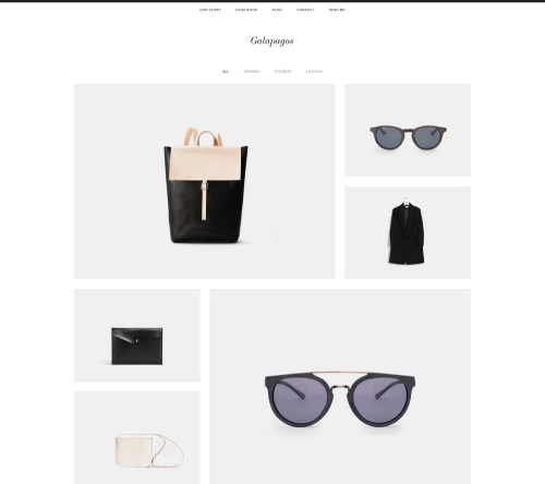
Galapagos
Best for Mobile eCommerce ✓ Pros
- Sleek, sophisticated design that translates perfectly to mobile screens without losing its visual impact or brand polish.
- Quick view popup lets mobile shoppers preview product details without leaving the page, reducing friction in the buying process.
- Squarespace shopping cart integration works seamlessly on mobile, keeping the checkout flow smooth and secure on any device.
- Minimalist layout means fewer elements competing for screen space, which directly translates to faster mobile load times.
- Clean navigation structure adapts well to hamburger menus on mobile, so shoppers always know where they are on your site.
✗ Cons
- The minimalist aesthetic may feel too stripped-back for brands that want a content-rich, visually busy mobile storefront.
- Product-focused layout is less suited to service businesses or blogs that need more text-heavy mobile pages.
- Limited built-in customization for mobile-specific layouts beyond what Squarespace's Fluid Engine provides by default.
Galapagos is built for mobile shopping. The design is modern and sophisticated without being heavy, which means your product pages load quickly even on slower cellular connections. The quick view popup is a standout feature for mobile users - instead of navigating to a full product page, shoppers can tap to see details and add items to their cart in fewer steps. If you are running an eCommerce store and your analytics show heavy mobile traffic, Galapagos handles that reality better than most Squarespace templates for mobile.
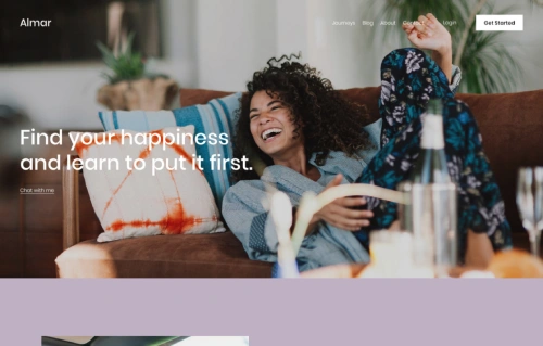
Almar
Best for Fast-Loading Mobile Sites ✓ Pros
- One of the fastest-loading Squarespace templates, which directly improves mobile user experience and search engine rankings.
- Clean, ready-made design requires minimal customization to look professional on both mobile and desktop screens.
- Strong call-to-action placement throughout the template, keeping mobile visitors engaged and moving toward conversions.
- Works well for both product catalogs and service listings, giving you flexibility regardless of your business type.
- Appointment booking integration loads smoothly on mobile, letting clients schedule directly from their phones without friction.
✗ Cons
- The straightforward design may feel generic if you are in a creative industry that demands a more distinctive mobile presence.
- Limited visual flair compared to templates with parallax effects or animation - prioritizes speed over spectacle.
- Smaller product catalogs may leave the mobile layout feeling sparse without enough content to fill the sections.
Almar is the template you pick when mobile speed is your top priority. It loads fast because the design is clean and efficient - no unnecessary scripts or heavy visual effects dragging things down. The layout adapts naturally to mobile screens, with CTAs that remain prominent and easy to tap. Whether you sell products or services, Almar gives mobile visitors a straightforward path from landing to converting. If you have been losing mobile visitors to slow load times, this Squarespace mobile template is a strong reset.
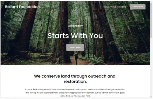
Bailard
Best for Bold Mobile First Impressions ✓ Pros
- Two strategically placed CTAs - one centered on the hero image, one in the top-right menu - both translate well to mobile tap zones.
- Lazy loading for images means mobile users only download what they can see, keeping page speed fast on cellular connections.
- Bold, minimalist design creates strong visual impact on small screens without overwhelming mobile visitors with clutter.
- One of the most popular Squarespace templates, meaning strong community support and plenty of customization guides available.
- Responsive typography scales cleanly across screen sizes, so headings and body text remain readable on any phone.
✗ Cons
- The bold design style may not suit brands that prefer a softer, more understated mobile presence.
- Dual CTA placement requires careful thought on mobile - two competing buttons can confuse visitors if not labeled clearly.
- Image-heavy hero section still needs properly optimized photos to avoid slowing down mobile load times.
Bailard is one of the most popular Squarespace templates for good reason - it makes a strong first impression and backs it up with smart mobile performance. The lazy loading feature is particularly valuable for mobile users, since it prevents the browser from downloading every image on the page at once. On a phone with a mediocre connection, that difference is noticeable. The dual call-to-action setup works well on mobile because both buttons sit in natural tap zones. If you want a mobile responsive Squarespace template that looks bold and loads fast, Bailard delivers on both.
Tremont
Best for Mobile Food and Restaurant Sites ✓ Pros
- Large, high-quality images that scale beautifully on mobile screens, making food photography look appetizing on any device.
- Static homepage design loads predictably on mobile without complex animations that can stutter on older phones.
- ChowNow integration lets mobile visitors order food directly, and Squarespace Scheduling handles reservations from any device.
- Mobile-responsive layout adapts the large image grid into a clean vertical stack that feels natural to scroll through on a phone.
- Multiple CTA opportunities throughout the page keep mobile visitors engaged and moving toward ordering or booking.
✗ Cons
- The food-industry focus means non-food businesses will need more customization to make the template feel appropriate on mobile.
- Large images, while beautiful, require careful compression to avoid slow mobile load times on cellular data.
- The static homepage layout may feel less dynamic on mobile compared to templates with scrolling or slideshow effects.
Tremont was designed with food businesses in mind, and that focus shows on mobile. When someone is searching for a restaurant on their phone - which is how most diners find new places - Tremont puts your best food photography front and center. The images scale down cleanly without losing their impact. ChowNow integration means mobile visitors can go from browsing your menu to placing an order without leaving your site. If you run a restaurant, cafe, or food truck, this mobile friendly Squarespace template handles the full journey from discovery to ordering.
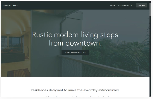
Bryant Hill
Best for Professional Mobile Portfolios ✓ Pros
- Scrolling page layout feels natural on mobile - visitors can swipe through your entire story without tapping through multiple pages.
- Bold, clean design translates well to smaller screens, maintaining visual hierarchy and readability on phones.
- Sidebar navigation condenses into a clean mobile menu, keeping all your pages accessible without cluttering the screen.
- Email marketing and social media integrations work smoothly on mobile, letting visitors subscribe or follow in one tap.
- Supports images, videos, and audio content that all play natively on mobile devices without requiring additional plugins.
✗ Cons
- The scrolling page format can feel long on mobile if you include too many sections without clear visual breaks.
- Sidebar-to-hamburger menu transition may lose some navigation context that desktop visitors benefit from.
- Less suited to eCommerce-focused mobile sites - better for content and services than product catalogs.
Bryant Hill is the professional's mobile template. The scrolling page design works in your favor on phones because mobile users are already conditioned to swipe vertically through content. Your services, portfolio, testimonials, and contact information flow in one continuous stream. The email marketing integration is a nice touch for mobile - visitors can subscribe to your list right from their phone without being redirected to a clunky form. If you are a consultant, freelancer, or creative professional whose audience checks your site on their commute, Bryant Hill handles that moment well.
Suffolk
Best for Service Businesses on Mobile ✓ Pros
- Clean, traditional design builds immediate trust on mobile - important for service businesses where credibility drives bookings.
- Sticky menu with smooth animations remains accessible as mobile visitors scroll, eliminating the need to swipe back to the top.
- Appointment setting functionality integrates naturally on mobile, letting clients book services directly from their phone.
- Works across multiple service niches - hotels, salons, rentals, and restaurants all fit the template's versatile layout.
- Hero image with dual CTA buttons creates a strong mobile landing experience that guides visitors toward action immediately.
✗ Cons
- The traditional design aesthetic may feel too conservative for modern brands targeting younger, mobile-first audiences.
- Sticky menu takes up screen space on smaller phones, which can reduce the visible content area while scrolling.
- Animation effects on the sticky menu may cause minor performance dips on older mobile devices.
Suffolk is built for service businesses that get booked from mobile phones. The sticky menu is the feature that makes the difference here - when someone is scrolling through your salon services or hotel rooms on their phone, they never lose access to the navigation or booking button. It stays right there at the top of the screen. The clean, traditional design reads as trustworthy on mobile, which matters when visitors are deciding whether to hand over their credit card or personal information. If your business depends on mobile bookings, Suffolk keeps that path open at all times.
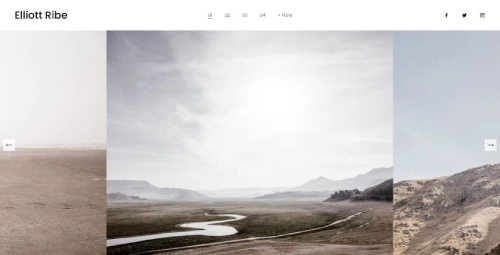
Elliott
Best for Mobile Visual Storytelling ✓ Pros
- Fast-loading template that prioritizes performance on mobile, so image-heavy pages do not bog down on cellular connections.
- Slideshow gallery homepage creates an engaging swipe experience that feels native to mobile interaction patterns.
- Horizontal images with embedded CTAs work well on mobile landscape viewing and adapt cleanly to portrait orientation.
- Mobile-friendly navigation keeps the focus on visual content rather than cluttering the screen with menus and text.
- Clean page structure makes it easy to build out About, Portfolio, and Contact pages that all render well on phones.
✗ Cons
- The gallery-focused homepage may not suit businesses that need text-heavy content visible on the first mobile screen.
- Slideshow navigation can feel finicky on some mobile devices if images are not properly sized for touch swiping.
- Less effective for eCommerce or service businesses that need product grids or booking forms front and center on mobile.
Elliott is the mobile template for people whose work speaks through images. The slideshow gallery homepage translates beautifully to mobile - swiping through full-width images on a phone feels natural and immersive. The template loads fast despite being image-focused, which means your portfolio does not punish mobile visitors with long wait times. CTAs embedded within the slideshow keep viewers engaged as they browse, turning passive scrolling into active exploration. If you are a photographer, designer, or any visual creative whose audience browses on mobile, Elliott gives your work the stage it deserves.
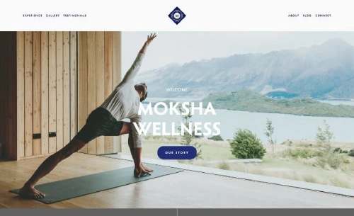
Moksha
Best for Wellness and Mindfulness on Mobile ✓ Pros
- Calming design aesthetic that feels intentional and peaceful on mobile screens - exactly the tone wellness brands need.
- Parallax scrolling effects create depth and engagement on mobile without requiring heavy processing power.
- Full-width hero image with centered messaging creates a focused, distraction-free mobile landing experience.
- Split menu centered on your logo creates balanced white space that prevents mobile screens from feeling crowded.
- Image compression built into the design philosophy keeps mobile load times fast despite the visual richness.
✗ Cons
- The calming, spacious design means fewer content blocks visible on mobile screens at once - more scrolling required.
- Parallax effects may not render smoothly on all mobile browsers, particularly older Android devices.
- The wellness-focused aesthetic requires more customization if used for non-wellness businesses on mobile.
Moksha is the template that makes your mobile visitors take a breath. The calming design is not just aesthetic - it is functional. On a phone, where screens are small and attention is fragmented, Moksha's generous white space and focused layout guide visitors instead of overwhelming them. The parallax scrolling adds visual interest as people swipe through your content, while image compression keeps everything loading smoothly. If you run a yoga studio, meditation practice, wellness coaching business, or any brand centered on mindfulness, this mobile responsive Squarespace template matches your energy.
Alameda
Best for Conversion-Focused Mobile Sites ✓ Pros
- Clean, modern layout that eliminates visual noise on mobile screens, keeping visitors focused on products and CTAs.
- Quick view option lets mobile shoppers check product details without navigating away from the shop page.
- Lazy loading ensures mobile pages load progressively, so visitors see content immediately rather than waiting for everything.
- Built-in blogging functionality works well on mobile, supporting content marketing efforts that drive organic traffic.
- Conversion-focused design places purchase and signup opportunities where mobile visitors naturally look and tap.
✗ Cons
- The conversion-focused layout may feel too sales-oriented for portfolio or personal brand sites on mobile.
- Featured product sections require strong product photography to maintain visual appeal on small screens.
- The clean design relies on quality content - sparse or weak copy will be more noticeable on mobile where every element counts.
Alameda is the template that turns mobile browsers into buyers. Every design decision points toward conversion - the quick view feature, the featured product placement, the strategically positioned CTAs. On mobile, where attention spans are even shorter than on desktop, that focus pays off. Lazy loading keeps the experience snappy, and the blogging functionality gives you a way to attract mobile visitors through search and then guide them toward your products. If your primary goal is selling on mobile, Alameda removes the barriers between "just looking" and "add to cart."
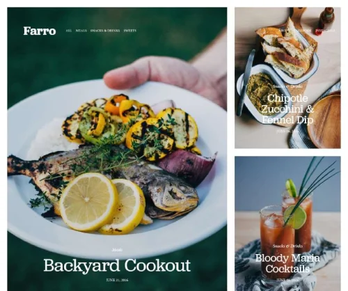
Farro
Best for Mobile Restaurant and Menu Sites ✓ Pros
- Magazine-style layout adapts beautifully to mobile, creating a content-rich browsing experience that feels like flipping through a publication.
- Menu display functionality lets restaurant visitors browse your offerings on their phone, which is how most diners check menus.
- Online ordering integration means mobile visitors can go from reading your menu to placing an order in a few taps.
- Clean, minimalist design keeps mobile pages uncluttered while still showcasing food photography effectively.
- Highly customizable layout lets you adapt the food-focused design for blogs, magazines, or content-driven businesses on mobile.
✗ Cons
- The magazine-style layout can feel content-heavy on mobile if you do not curate which sections appear on your homepage.
- Menu display requires careful formatting to remain readable on smaller phone screens without excessive scrolling.
- Less suited to businesses that need prominent booking or appointment features on their mobile homepage.
Farro turns your mobile site into a menu that sells. The magazine-style layout works surprisingly well on phones - content blocks stack naturally, images scale cleanly, and the overall browsing experience feels intentional rather than cramped. For restaurants, the menu display feature is the standout. Mobile visitors can scroll through your dishes, see prices, and move straight to ordering without hunting through cluttered pages. The template also works well for food blogs and recipe sites where mobile readers want a clean, scannable format. If your business revolves around food and your customers are checking their phones before they walk through your door, Farro meets them there.
How to Choose the Right Squarespace Template for Mobile
Prioritize Load Speed Over Visual Complexity
Mobile visitors are impatient. If your site takes more than three seconds to load on a phone, most people will leave before they see your content. Templates like Almar and Elliott prioritize speed through clean code and efficient image handling. Before choosing a template for its looks, check how it performs on mobile speed tests. A fast, simple Squarespace mobile template will always outperform a slow, visually complex one.
Match the Template to Your Mobile Visitor's Goal
Think about what your mobile visitors are trying to do. If they want to buy something, Galapagos and Alameda are built for mobile shopping. If they want to book a service, Suffolk and Tremont put scheduling front and center. If they want to browse your portfolio, Elliott gives images room to breathe on small screens. The best mobile responsive Squarespace template is the one that makes your specific visitor's task easiest.
Test Navigation on Actual Phones
Desktop navigation menus collapse into hamburger menus on mobile, and not all templates handle this transition equally well. Suffolk's sticky menu keeps navigation always accessible. Bryant Hill's sidebar converts cleanly to a mobile menu. Before committing to a template, preview it on your actual phone - not just the desktop mobile preview. Tap through every page and check that buttons are large enough, links are spaced properly, and nothing overlaps. For more on how templates handle layout differences, see our guide on Squarespace Templates Design and Layout.
Consider Your Image Strategy
Images are the biggest factor in mobile page speed. Templates like Bailard use lazy loading to defer image downloads, while Moksha builds compression into its design philosophy. Whatever template you choose, plan to optimize every image before uploading. Serve images at the right dimensions for mobile screens rather than relying on the browser to resize them. A mobile friendly Squarespace template can only perform as well as the media you put into it.
Frequently Asked Questions
What is the best Squarespace template for mobile devices?
Are all Squarespace templates mobile responsive?
How do I make my Squarespace site load faster on mobile?
Can I customize how my Squarespace template looks on mobile?
Which Squarespace mobile template is best for a restaurant website?
Does mobile responsiveness affect my Squarespace site's SEO ranking?
How do I test if my Squarespace template is truly mobile friendly?
Can I switch Squarespace templates if my current one is not mobile friendly enough?
How We Evaluate Templates
Conclusion: Best Squarespace Templates for Mobile in 2026
Your mobile visitors are making decisions in seconds. The right Squarespace template for mobile gives them fast load times, clean layouts, and clear paths to action - whether that means buying a product, booking a service, or browsing your portfolio on a five-inch screen.
Galapagos and Alameda lead for mobile eCommerce. Suffolk and Tremont handle mobile bookings and service businesses. Elliott and Moksha give visual and wellness brands a polished mobile presence. Pick the template that matches what your mobile visitors actually need to do, optimize your images, and let the design do the rest.
* Read the rest of the post and open up an offer