Editor's Picks
| # | Name | Best For | Price | Rating | Image | |
|---|---|---|---|---|---|---|
| 1 | Fine artists and painting contractors who want a fast, portfolio-focused site | Free | 4.4/5 |
|
More Info | |
| 2 | Painters who sell artwork, prints, or painting services directly from their site | Free | 4.3/5 |
|
More Info | |
| 3 | Painters who use content marketing, blogging, and social media to attract clients and collectors | Free | 4.2/5 |
|
More Info | |
| 4 | Painting contractors, residential painters, and service-based painting businesses | Free | 4.4/5 |
|
More Info | |
| 5 | Painters who want to highlight their professional background, training, and range of services | Free | 4.3/5 |
|
More Info | |
| 6 | Painters who drive traffic from social media and want a clean, modern website to convert that audience | Free | 4.1/5 |
.png)
|
More Info | |
| 7 | Fine artists selling paintings online and painters who want eCommerce and video integration | Free | 4.3/5 |
|
More Info | |
| 8 | Painters who want a distinctive, unconventional website that stands out from standard portfolio sites | Free | 4.0/5 |

|
More Info | |
| 9 | Painters who want a clean, minimalist portfolio that loads fast and ranks well on Google | Free | 4.4/5 |
.jpg)
|
More Info | |
| 10 | Painters who want a striking, dramatic website with bold visual effects and social sharing | Free | 4.2/5 |
|
More Info |
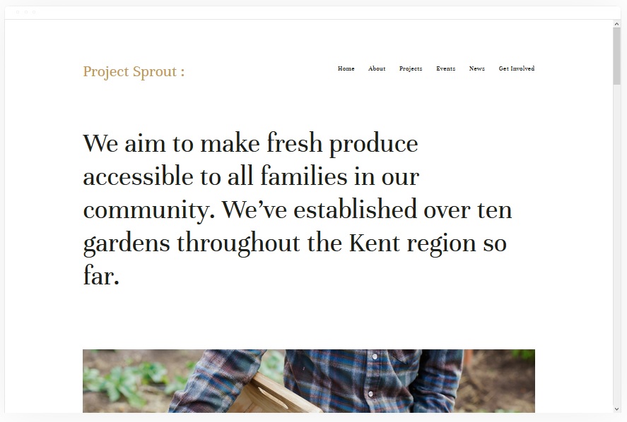
Kent
Best for Fast-Loading Painter Portfolios ✓ Pros
- Fast-loading design ensures your paintings and project photos appear instantly - visitors judging visual work won't wait for slow pages, and Kent eliminates that risk entirely.
- Dedicated portfolio pages let you organise work by medium, style, or project type so visitors can find exactly the kind of painting they are looking for.
- Cover pages, blog, event, and album page types give painters flexible ways to promote exhibitions, document processes, and share news alongside their main portfolio.
- Built-in service selling features let painting contractors list services and accept bookings directly, turning the site into a lead generation tool rather than just a gallery.
- Clean, minimal layout puts every painting in a distraction-free frame - the design stays out of the way so the art does the talking.
✗ Cons
- The minimal design relies heavily on strong imagery - painters with inconsistent or low-resolution portfolio photos will find the layout exposes those gaps rather than hiding them.
- Limited built-in e-commerce emphasis means fine artists who sell prints or originals heavily may want to pair Kent with additional commerce configuration.
- The streamlined structure works best for painters with a focused body of work - those with very large, diverse portfolios may find the navigation needs extra organisation.
Kent is the template that loads before your visitor has time to second-guess clicking. For painters, that speed matters - someone browsing artist websites or comparing painting contractors is making snap judgments, and Kent makes sure your work is the first thing they see, not a loading spinner. The portfolio pages are built for visual work, and the clean frame around every image gives each piece the breathing room it deserves.
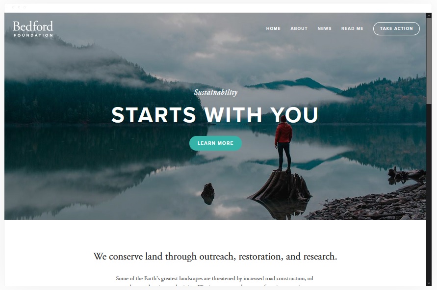
Bedford
Best for Painters Selling Products and Services ✓ Pros
- Built-in product and service selling makes Bedford a natural fit for fine artists selling originals or prints and painting contractors offering service packages.
- Image and video support lets painters showcase work in multiple formats - walk-through videos of completed rooms, time-lapse painting processes, or high-resolution gallery images all work within the layout.
- Sidebar navigation keeps your menu accessible without cluttering the main content area, giving paintings and project photos maximum visual space on every page.
- Scrolling index page creates a smooth, gallery-like browsing experience that keeps visitors moving through your work naturally instead of clicking through disconnected pages.
- Banner sections with call-to-action buttons let you promote current exhibitions, seasonal painting specials, or commission availability right at the top of the page.
✗ Cons
- The sidebar navigation style feels slightly unconventional for visitors expecting a top menu - some painting clients may need an extra moment to orient themselves.
- The scrolling index layout works best with consistent image quality across all sections - a mix of professional and casual photos can feel uneven.
- Bedford's feature-rich structure means more setup time compared to simpler templates - painters who want a quick launch may find the configuration takes longer than expected.
Bedford turns a painter's website into a working storefront. Whether you are selling original canvases, limited-edition prints, or residential painting packages, the built-in commerce features handle the transaction side while the visual layout keeps your work looking its best. The sidebar navigation is distinctive - it keeps the eye on the art instead of a menu bar, which is exactly what a painter's portfolio needs.
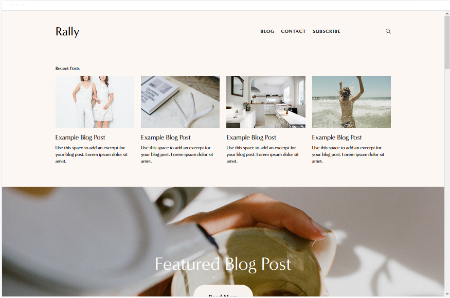
Rally
Best for Painters Who Blog and Build an Audience ✓ Pros
- Streamlined layout with top-right menu and social media links makes it easy for visitors to navigate the site and follow you on other platforms in the same session.
- Built-in blog gives painters a dedicated space for process posts, project write-ups, and painting tips - content that attracts search traffic and builds trust with potential buyers or clients.
- Smooth scrolling creates a fluid browsing experience that keeps visitors engaged as they move through your portfolio and content pages.
- Mobile-optimised design ensures your paintings look sharp on phones and tablets - critical for painters whose audience discovers them through Instagram or social media shares.
- Social media integration throughout the template helps fine artists and painting contractors drive traffic between their website and social channels, building a larger audience over time.
✗ Cons
- The blog-forward structure works best for painters who commit to regular content - an empty or sparse blog section undermines the template's strengths.
- The streamlined design is less suited to painters with very large portfolios who need extensive gallery and filtering options.
- Rally's social media emphasis may feel unnecessary for painting contractors whose clients come primarily through local referrals rather than online discovery.
Rally is for the painter who understands that getting found online is half the battle. The blog draws in search traffic from people looking for painting inspiration, technique guides, or contractor advice - and the portfolio converts that traffic into inquiries and sales. The smooth scrolling and social media integration keep visitors moving through your content instead of bouncing after a single page. If you treat your website as a marketing channel, Rally gives you the tools to make it work.
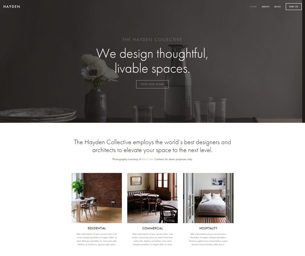
Hayden
Best for Painting Contractors and Service Providers ✓ Pros
- Professional design communicates reliability and competence - exactly what homeowners and property managers look for when hiring a painting contractor.
- Portfolio section lets painting contractors showcase completed projects with descriptions, giving potential clients a clear picture of the quality and scope of your work.
- Built-in booking system makes it easy for visitors to request quotes or schedule painting services directly from your website, shortening the path from discovery to hire.
- Sticky top-right menu stays visible as visitors scroll, so the contact button and navigation are always one click away - no scrolling back to the top to reach out.
- Blog section supports painting contractors who want to publish content about colour selection tips, surface preparation advice, or project case studies to attract local search traffic.
✗ Cons
- The professional, service-oriented layout is designed more for contractors than fine artists - painters focused on gallery-style presentation may find it too corporate.
- The booking system is functional but basic - painting contractors with complex scheduling needs may want to integrate a third-party booking tool for more flexibility.
- The sticky menu, while useful, takes up a small amount of screen space that could otherwise display portfolio imagery on smaller screens.
Hayden is the template that works like your best estimator: it shows up looking professional, presents your past work clearly, and makes it easy for the prospect to say yes. The booking system turns your website into a 24/7 quote request machine, and the sticky navigation means a visitor is never more than one click from getting in touch. For painting contractors who need a site that generates leads, Hayden delivers.
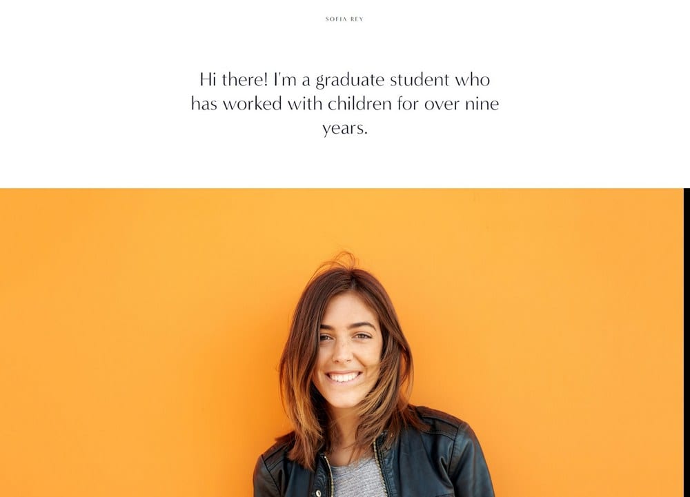
Sofia Rey
Best for Showcasing Skills, Services, and Experience ✓ Pros
- Dedicated sections for skills, services, and client reviews give painters a structured way to present everything a potential client or collector needs to make a decision.
- Resume section lets painters display their education, training, exhibitions, or years of contracting experience - adding credibility that a portfolio alone cannot provide.
- Vibrant, sleek, and professional design strikes a balance between artistic expression and business polish - equally suited to fine artists and painting contractors who take their brand seriously.
- Top-left menu with social media links in the top-right keeps navigation clean while giving visitors quick access to your Instagram, YouTube, or other visual platforms.
- Review showcase section lets satisfied clients speak for you - testimonials from homeowners, gallery owners, or collectors carry more weight than any self-written sales copy.
✗ Cons
- The resume-forward layout works best for painters with genuine credentials to display - emerging artists or new contractors may find the section feels thin without exhibition history or years of experience to list.
- The structured format can feel restrictive for painters who want a more freeform, experimental website design that reflects their artistic style.
- The vibrant design aesthetic may not match every painter's brand - those aiming for a muted, minimalist presence might find Sofia Rey too energetic.
Sofia Rey is the template for painters who have earned their credentials and want them front and centre. The resume section, the review showcase, the structured service presentation - this is a site that says "I know what I am doing, and here is the proof." Fine artists can list exhibitions, awards, and training. Painting contractors can highlight years of experience, certifications, and client testimonials. Either way, visitors leave knowing they are dealing with a professional.
Native
Best for Painters with a Strong Social Media Presence ✓ Pros
- Strong social media integration makes Native ideal for painters who already have a following on Instagram, TikTok, or Pinterest and need a website that extends that presence into a professional portfolio.
- Rounded thumbnail galleries give portfolio images a distinctive, modern look that stands out from the standard grid layout most artist websites use.
- Blog with location tags lets painters document where they worked - useful for muralists tagging cities, fine artists noting gallery locations, or painting contractors listing service areas.
- Scrolling, clean, modern design keeps visitors moving through your content naturally, creating an experience that feels more like browsing a curated feed than clicking through a traditional website.
- Mobile-first design philosophy ensures the site looks and performs beautifully on phones, where most social media traffic will land.
✗ Cons
- The rounded thumbnail galleries are a distinctive style choice that won't suit every painter's aesthetic - those who prefer sharp, traditional gallery framing may find the look too casual.
- The social media-forward design works best when you actually have active social channels to link to - painters without a social presence will have empty integration points.
- The scrolling layout prioritises browsing over structured navigation, which may frustrate visitors looking for specific information like pricing or service areas quickly.
Native is for painters who have already built an audience somewhere else and need a home base to send them to. The social media integration is genuine - not just icons in a footer, but a design philosophy that treats your website as the professional extension of your social presence. The location-tagged blog is a standout feature for painters who work across multiple locations, letting you build local search visibility for every city or neighbourhood you have painted in.
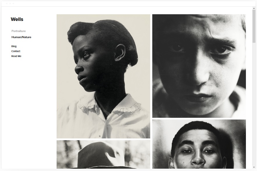
Wells
Best for Painters Who Sell Online ✓ Pros
- Image-forward layout showcases past work with the visual impact that paintings deserve - large, clean image sections let colours, textures, and details come through without compression or clutter.
- Built-in eCommerce features let fine artists sell original paintings, prints, and merchandise directly from the site without needing a separate online store.
- Video integration via YouTube URL embedding lets painters share process videos, studio tours, or project walkthroughs - content that builds connection and drives sales.
- Squarespace link page gives painters a single URL to share across platforms, directing followers to the most important pages on their site - portfolio, shop, or contact form.
- Social media integration keeps your website connected to the platforms where visual artists naturally build their audience, creating a seamless loop between discovery and purchase.
✗ Cons
- The eCommerce focus means Wells is built more for selling than for pure portfolio presentation - painters who do not sell online may find features they do not need.
- Video integration relies on YouTube URLs, so painters who host videos elsewhere or prefer not to use YouTube will need a workaround.
- The selling-oriented layout may feel too commercial for fine artists who want their website to feel like a gallery rather than a shop.
Wells is where art meets commerce. For painters who sell their work - whether original canvases, limited-edition prints, or commissioned pieces - this template makes the buying process as visually compelling as the art itself. The image quality is excellent, the eCommerce is built in, and the video integration adds a dimension that static galleries cannot match. If you want visitors to leave your site having purchased something rather than just admired something, Wells is the template that closes that gap.
Carson
Best for Painters Who Want a Unique First Impression ✓ Pros
- Unusual static page design with a background that changes on hover creates an immediately memorable first impression - visitors know within seconds that this is not a generic template site.
- Portfolio pages let painters organise work into collections, with the hover-effect homepage serving as a striking gateway to deeper content.
- Hidden menu keeps the interface clean and uncluttered, giving paintings and visual work maximum screen space without navigation elements competing for attention.
- The unconventional design signals creativity and originality - for fine artists, this aesthetic statement tells visitors something about your artistic sensibility before they see a single painting.
- Simple underlying structure means Carson is easier to set up than it looks - the dramatic visual effects are built into the template, not custom-coded.
✗ Cons
- The hidden menu and hover-based navigation can confuse visitors who expect standard website navigation - painting contractors whose clients are less tech-savvy may lose prospects who cannot find the contact page.
- The static page design with hover effects is visually distinctive but not suited to every painter's brand - those who prefer a straightforward, professional presentation may find it too experimental.
- Mobile devices do not support hover interactions, so the signature homepage effect is lost on phones and tablets where a significant portion of traffic arrives.
Carson is the painter's wildcard. The hover-activated backgrounds, the hidden menu, the unconventional structure - this template makes a statement before a single painting is viewed. For artists whose work challenges convention, Carson's design philosophy matches that energy. It is not for every painter, but for the right one, it creates a website experience that feels like entering a gallery where even the walls are part of the exhibition.
Avenue
Best for Minimalist Painter Portfolios ✓ Pros
- Minimalist portfolio design puts every painting in a clean, distraction-free frame - the whitespace and simplicity let colours, composition, and detail speak without visual competition.
- Before-and-after project image support is excellent for painting contractors who want to show transformations, and for fine artists documenting work-in-progress stages.
- Project description sections let painters add context to each piece or project - materials used, inspiration, dimensions, pricing, or scope of work for contractor projects.
- Easy to customise without design skills - Avenue's straightforward structure means painters can update their portfolio, add new projects, and adjust content without touching code.
- Fast-loading, mobile-optimised design helps with Google ranking - painters competing for local search terms like "painting contractor website templates" benefit from Avenue's clean, efficient code.
✗ Cons
- The minimalist design may feel too simple for painters who want their website to make a bold visual statement or reflect an energetic artistic personality.
- Limited built-in features for selling - fine artists who want to sell directly from their site will need to configure eCommerce as an addition rather than a core feature.
- The clean, understated aesthetic works best with high-quality photography - Avenue's simplicity means there is nowhere for mediocre images to hide.
Avenue is the template that believes less is more - and for many painters, that philosophy is exactly right. The minimalist layout gives every painting room to breathe. The before-and-after image support is a genuine differentiator for painting contractors. And the fast load times and clean code contribute to better Google rankings, which means more people find your site in the first place. Avenue does not try to impress with design tricks - it impresses by making your work look its absolute best.
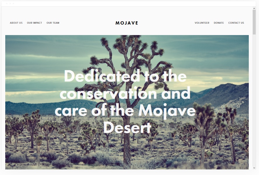
Mojave
Best for Painters Who Want Visual Drama ✓ Pros
- Striking appearance with bold scrolling effects creates a dramatic browsing experience - for painters whose work is large-scale, vivid, or emotionally charged, Mojave matches that energy from the first scroll.
- Banner sections with video and image support let painters create immersive hero sections featuring studio footage, painting processes, or full-bleed images of their most impressive work.
- Built-in social share buttons make it easy for visitors to share your paintings or project photos directly to their own networks, extending your reach without any effort on your part.
- The scrolling parallax effect adds visual depth that standard templates lack - paintings and project photos feel like they are part of an experience rather than items in a catalogue.
- Full-width layout gives large-scale paintings and wide-angle project photos the display space they deserve, without cropping or compression that diminishes impact.
✗ Cons
- The dramatic scrolling effects and large media files can slow load times on older devices or slower connections - speed-conscious painters may need to optimise images carefully.
- The bold, dramatic design is a strong aesthetic commitment - painters whose work is subtle, delicate, or minimalist may find Mojave's visual energy overwhelming rather than complementary.
- The parallax and scrolling effects are less impactful on mobile devices, where a significant portion of traffic arrives - the desktop experience is notably stronger than the mobile one.
Mojave is for painters who want their website to feel like walking into a gallery where the walls themselves are moving. The scrolling effects, the full-width banners, the dramatic presentation - this template turns a portfolio visit into an experience. For painters working on large canvases, bold murals, or striking residential transformations, Mojave's visual drama matches the scale and emotion of the work itself. The social sharing buttons are a practical bonus - every shared image is free marketing.
How to Choose the Right Squarespace Template for Your Painter Website
5 Must-Haves for a Painter's Website
Every painter's website - whether you are a fine artist or a painting contractor - needs five core elements to convert visitors into clients, collectors, or fans. First, a visual portfolio that loads quickly and displays your work at high quality without cropping or compression. Second, an About page that tells your story, your training, and what makes your approach different. Third, clear service descriptions or pricing information so visitors know what you offer and what it costs. Fourth, a contact form or booking system that makes it easy to reach out - every extra click between "I want to hire this painter" and actually sending a message is a lost opportunity. Fifth, social media integration that connects your website to the platforms where you are already building an audience.
Why Painters Need a Website
Social media profiles and word-of-mouth referrals are valuable, but they are not enough on their own. A website gives painters a professional home base that they fully control - no algorithm changes, no platform shutdowns, no competing content in the feed. For fine artists, a website is your permanent online gallery where collectors can browse at their own pace and inquire about purchases. For painting contractors, a website is your most powerful lead generation tool - it shows up in local search results when homeowners search for "painting contractor website templates" or "painters near me," and it gives them everything they need to decide you are the right hire.
What Types of Painters Are Building Websites?
The Squarespace templates for painters on this list serve a broad range of painting professionals. Fine artists use them to display canvases, sell prints, and promote exhibitions. Muralists use them to document large-scale public and private commissions with location-tagged project pages. Painting contractors - residential and commercial - use them to showcase before-and-after transformations, list service areas, and capture quote requests. Commission artists use them to display past commissions, explain their process, and provide pricing guidance. Each of these painter types has different priorities, which is why this list includes ten templates rather than three - the right choice depends on your specific business model.
Tips for Choosing the Best Template
Keep the design visual - your paintings and project photos should dominate the page, not text blocks or decorative elements. Choose clean layouts with generous whitespace that let each image breathe. If your business depends on trust and reputation, prioritise templates with strong testimonial and review sections like Sofia Rey or Hayden. If you publish content regularly, pick a template with a solid blog like Rally or Native. Make mobile-friendliness non-negotiable - more than half of your visitors will arrive on a phone, and a painter's website that looks clumsy on mobile loses credibility instantly. Finally, consider load speed: templates like Kent and Avenue prioritise fast performance, which directly affects both user experience and Google ranking.
Famous Painters Who Got Their Websites Right
Some of the most recognised names in painting have invested in strong web presences. Banksy's site is famously minimal - just the art, no clutter, no unnecessary navigation. Zaria Forman's website presents her hyperrealistic pastel works in large, high-resolution formats that do justice to the detail in each piece, with clean navigation and a clear path to her exhibitions and press coverage. Benjamin Moore - while a paint brand rather than an individual painter - demonstrates how a painting-related website can combine visual impact with practical tools like colour selectors and project inspiration galleries. The common thread: they all let the visual work lead and keep everything else secondary.
Frequently Asked Questions
What is the best Squarespace template for a painter website?
Can I sell my paintings directly through a Squarespace website?
Do I need a website as a painter if I already use Instagram?
How much does a Squarespace painter website cost?
What should a painter include on their website?
Is Squarespace good for painting contractor websites?
Can I add a booking system to my painter Squarespace website?
How do I make my painter website show up on Google?
How We Evaluate Templates
Conclusion: Pick the Squarespace Template That Puts Your Painting Work First
Every painter needs a website that does justice to their work - whether that work hangs in galleries or transforms living rooms. Kent delivers speed and clean portfolio presentation. Bedford and Wells handle selling. Rally and Native build audiences through content and social integration. Hayden and Sofia Rey serve painting contractors and credentialed professionals. Carson makes a bold creative statement. Avenue keeps things minimal and fast. Mojave adds drama that matches large-scale, vivid work.
Choose the template that fits how you work and who you serve, upload your strongest portfolio images, and make the path from "I love this" to "I want to hire you" as short as possible. Your paintings already do the hard work - your website just needs to get out of the way and let them.
* Read the rest of the post and open up an offer