
Best 3 Squarespace Templates for UX Designers 2026
Editor's Picks
| # | Name | Best For | Price | Rating | Image | |
|---|---|---|---|---|---|---|
| 1 | Solo UX designers presenting detailed case studies | Free | 4.9/5 |
|
More Info | |
| 2 | UX designers showcasing interactive and multimedia work | Free | 4.7/5 |
|
More Info | |
| 3 | Data-driven UX designers with extensive case study libraries | Free | 4.8/5 |
.webp)
|
More Info |
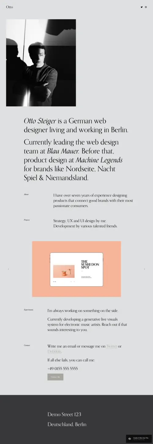
Otto
Best for Solo UX Portfolios & Case Study Narratives ✓ Pros
• Minimalist layout with generous whitespace that mirrors UX best practices and lets your process documentation breathe without visual competition• Linear scroll structure guides visitors through your case studies the way you'd walk a stakeholder through a design review
• Typography-forward design emphasizes your written rationale, research insights, and strategic recommendations over decorative elements
• Mobile-responsive framework ensures your portfolio demonstrates the cross-device thinking you'd apply to any product
• Subtle animations and transitions feel intentional rather than gratuitous, reflecting the restraint good UX requires
✗ Cons
• Limited visual impact for designers who rely heavily on motion design, prototypes, or animated interactions in their work• Single-column focus may feel restrictive if you need to display comparative research data, A/B test results, or side-by-side iterations
• Not ideal for UX generalists who also showcase brand identity, illustration, or visual design work alongside product thinking
Otto is UX thinking built into a template. It doesn't compete with your work-it frames it. The layout feels like a well-organized case study deck: clear sections, logical flow, and enough negative space to let each insight land. If you're the kind of designer who writes detailed problem statements, documents your research methodology, and walks clients through every decision, Otto gives your process the room it needs. No visual noise. Just your thinking, presented cleanly.
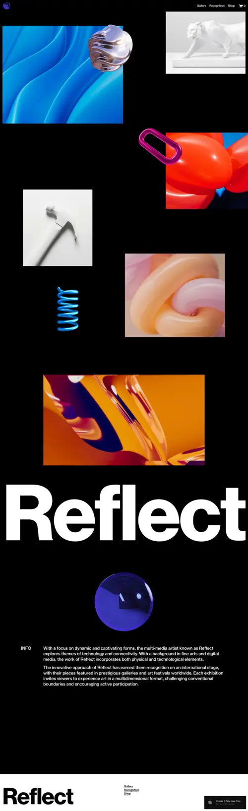
Reflect
Best for Multidisciplinary UX & Interactive Portfolios ✓ Pros
• Dynamic grid layout accommodates diverse project types from mobile apps to service design ecosystems to physical-digital experiences• Full-bleed imagery and video support lets you embed prototype walkthroughs, user testing clips, and interaction demos directly in case studies
• Bold visual hierarchy captures attention immediately, ideal for designers whose work spans UX, UI, motion, and creative technology
• Flexible section blocks allow you to build immersive project narratives that feel more like product experiences than static pages
• Gallery-style presentation works well for showing design system components, icon sets, or interface pattern libraries
✗ Cons
• Visual density may overwhelm visitors looking for quick portfolio scans or executive summaries of your work• Requires strong photography and high-resolution assets to maintain the premium feel the template promises
• Less suited for research-heavy UX roles where written documentation and methodology matter more than visual impact
Reflect is for the UX designer whose work refuses to stay in one lane. If you're designing conversational interfaces one week and spatial computing experiences the next, this template keeps up. The layout treats each project like its own world. You can build immersive scroll experiences that take visitors from problem discovery through shipped product, with room for video prototypes, interaction recordings, and the kind of visual storytelling that static mockups can't capture.
Avenue
Best for Research-Focused UX & Content-Heavy Portfolios ✓ Pros
• Grid-based navigation creates clear information architecture, letting visitors self-select which projects match their interests or industry• Fast load times and clean code structure demonstrate the performance optimization mindset UX professionals should embody
• Strong SEO foundation helps hiring managers and potential clients find your portfolio when searching for specialized UX skills
• Scalable layout accommodates growing portfolios without requiring structural redesigns as you add new case studies
• Card-based project previews allow you to display project type, industry, methods used, and outcomes at a glance before visitors click through
✗ Cons
• Grid uniformity can feel rigid for designers who want each project to have a distinct visual identity or narrative structure• Less immersive than full-bleed templates, which may undersell work that relies on visual or interactive impact
• Minimal animation options limit your ability to demonstrate motion design skills or micro-interaction expertise
Avenue is the template for UX designers who think in systems. If your portfolio includes dozens of projects spanning multiple industries, methods, and outcomes, Avenue gives you the structure to organize it all without overwhelming visitors. The grid isn't just aesthetic-it's functional. Visitors can scan, filter mentally, and explore exactly what interests them. For UX researchers, strategists, and designers with content-heavy portfolios, this clarity is everything.
How to Choose the Right Squarespace Template for Your UX Portfolio
Consider Your Primary UX Discipline
Your template should match how you work. If you're a UX researcher or strategist, you need room for written analysis, methodology documentation, and data visualization-Otto and Avenue handle this well. If you're more visual, working in interaction design or UI, Reflect gives you the canvas to show rather than tell. Pick the template that emphasizes your strongest deliverable type.
Match the Template to Your Target Audience
Who reviews your portfolio matters. Hiring managers at product companies often skim quickly, looking for clear problem-outcome structures-Avenue's grid lets them self-navigate. Agency recruiters may want to see range and creativity-Reflect showcases versatility. Freelance clients often read deeper, wanting to understand your process-Otto's narrative flow builds trust. Choose based on who you're trying to reach.
Plan for Case Study Depth
Some UX work needs extensive documentation: research synthesis, journey maps, wireframe iterations, usability findings, and shipped results. If your case studies run long, Otto's linear structure or Avenue's expandable grid handle depth gracefully. If your projects are more visual and your explanations brief, Reflect's immersive format keeps momentum without requiring heavy reading.
Account for Portfolio Growth
Your portfolio will evolve. If you're early in your career with three to five projects, any template works. But if you anticipate building a library of fifteen or more case studies across industries and methods, Avenue's scalable grid prevents the overwhelm that single-scroll templates can create. Think about where you'll be in two years, not just today.
Frequently Asked Questions
What makes a Squarespace template good for UX designer portfolios?
Can I show interactive prototypes in my UX designer Squarespace portfolio?
How much does Squarespace cost for a UX designer portfolio website?
Should my UX portfolio website include a blog section?
Can I switch Squarespace templates after building my UX designer portfolio?
How do I make my UX designer portfolio stand out on Squarespace?
Is Squarespace mobile-responsive for UX designer portfolios?
Can I password-protect case studies on my UX designer Squarespace site?
How We Evaluate Templates
Conclusion: Build a Portfolio That Practices What You Preach
Your UX portfolio should feel like good UX-clear navigation, intentional hierarchy, and a structure that guides visitors without friction. Otto, Reflect, and Avenue each deliver that in different ways depending on whether your work is process-heavy, visually immersive, or research-driven. Pick the template that matches how you think, customize it to reflect your methodology, and let your case studies do the convincing. The best portfolio isn't the flashiest-it's the one that helps the right people understand how you solve problems.
* Read the rest of the post and open up an offer