
Editor's Picks
| # | Name | Best For | Price | Rating | Image | |
|---|---|---|---|---|---|---|
| 1 | Holistic chiropractors, acupuncture-integrated practices, and wellness-focused clinics | Free | 4.8/5 |
|
More Info | |
| 2 | Solo chiropractors, small practices, and mindfulness-integrated chiropractic services | Free | 4.7/5 |
|
More Info | |
| 3 | Chiropractors who combine care with coaching, blogging, online content, or lifestyle wellness | Free | 4.6/5 |

|
More Info | |
| 4 | Upscale chiropractic clinics, urban wellness centres, and premium deep-tissue or advanced spinal therapy practices | Free | 4.9/5 |

|
More Info | |
| 5 | Holistic chiropractic clinics, wellness centres, and practices emphasising patient environment and experience | Free | 4.7/5 |
|
More Info |
Our Picks: The Best Squarespace Chiropractor Website Templates
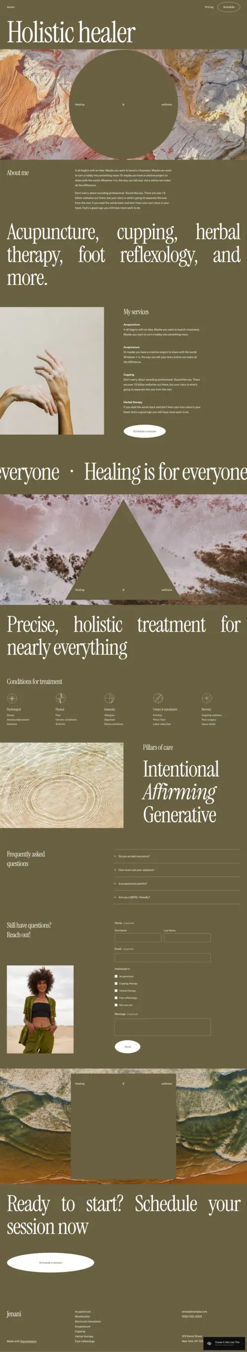
Jenani
Best for Holistic Wellness Chiropractors & Practitioners Who Lead With Trust ✓ Pros
- Earthy, soothing colour palette instantly communicates holistic care and wellbeing - patients arriving in pain respond to visual warmth before they process a word of copy, and Jenani's aesthetic triggers the right emotional response at first scroll.
- Well-placed "Schedule a Session" CTA reads like an invitation rather than a demand, reducing the conversion friction that clinical-feeling chiropractor website templates often create through overly transactional booking prompts.
- Minimalist white space approach lets your services, philosophy, and credentials breathe - a design principle that communicates precision and intentionality, exactly the professional signals chiropractic patients need to feel reassured.
- Clear FAQ section structure allows you to proactively address the questions new patients ask before calling - reducing phone tag and pre-qualifying visitors so the patients who do book are already informed and committed.
- Pillars-of-care layout translates naturally into a breakdown of chiropractic specialties - spinal adjustment, soft tissue work, postural correction, rehabilitation - giving you a structured way to communicate scope of practice without overwhelming new visitors.
✗ Cons
- The minimalist aesthetic requires strong, professionally shot photography - chiropractic clinics using stock images or phone-camera shots will find Jenani's design exposes the gap between the template's premium feel and low-quality imagery.
- Not the right fit for high-volume multi-practitioner clinics that need robust staff directory pages, multiple booking calendars, or complex service menu architecture beyond what the streamlined layout accommodates.
- The earthy, holistic visual tone may not resonate with patients specifically seeking a clinical, sports medicine-adjacent chiropractic experience - it's calibrated for wellness, not performance recovery or injury rehabilitation positioning.
Jenani is the chiropractor website template that earns trust through visual restraint. The earthy tones, the precise white space, the invitation-style booking CTA - every element is calibrated to make a patient feel they've arrived somewhere safe and competent. For holistic practitioners who want their website to mirror the care and attention they bring to their practice, this is the design that does that work before you've typed a word.
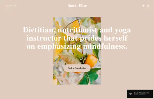
Randi
Best for Solo Practitioners & Booking-First Chiropractic Websites ✓ Pros
- Single-page simplicity eliminates the navigation confusion that causes prospective patients to lose their way on multi-page chiropractic websites - every visitor arrives at the same place and follows the same clear path toward booking.
- "Book a Consultation" button positioned front and centre removes every possible layer of hesitation between a visitor's decision to proceed and the action that matters - for solo practitioners who depend on appointment volume, this conversion architecture is the right priority.
- Soft pastel colour palette creates an immediate sense of relaxation that primes anxious or pain-distracted visitors for the kind of trusting engagement a first-time chiropractic patient needs to feel before committing to an appointment.
- Distraction-free layout keeps the clinical scope clear - patients understand exactly what you offer, what they need to do, and how to reach you without wading through competing content sections that slow the decision process.
- Clean, light aesthetic is adaptable to multiple wellness sub-niches - spinal care, acupuncture, mindfulness-integrated chiropractic, or postural coaching - without requiring significant restyling between service types.
✗ Cons
- The single-page format limits the depth of content you can publish - chiropractors who rely on blog content for organic search traffic or want to build condition-specific landing pages will outgrow Randi's architecture quickly.
- Soft pastel palette reads as feminine and gentle - practices targeting performance athletes, injury recovery, or male-skewed patient demographics may find the aesthetic tone doesn't match their intended audience's expectations.
- Limited sections for credentials, team bios, or patient testimonials make it less suitable for practices where social proof and professional authority are primary conversion drivers - the simplicity serves some practice types and undersells others.
Randi is the chiropractor website template for practitioners who understand that simplicity is a service. Not every chiropractic website needs depth - some practices convert best when they remove every possible layer between "I need help" and "I've booked." For solo practitioners and small chiropractic offices where a single practitioner and a single CTA are the whole story, Randi delivers exactly what patients need to take the next step.
Myhra
Best for Multi-Service Chiropractic Practices & Lifestyle-Integrated Clinics ✓ Pros
- Multi-section architecture comfortably accommodates a diverse service offering - spinal adjustment, nutrition coaching, at-home stretch programmes, and online consultations can each have dedicated sections without the layout feeling cluttered or unfocused.
- Integrated blog structure gives chiropractors who invest in content marketing a proper home for articles on spinal health, posture tips, and patient education - the kind of content that builds search visibility and positions you as the authority before a patient picks up the phone.
- Dynamic CTA buttons throughout the template let you direct different visitor segments to different actions - new patients to a consultation booking, existing patients to an exercise library, blog readers to a newsletter sign-up - improving conversion across multiple visitor intents simultaneously.
- Visual vitality of the layout communicates active, positive health outcomes rather than reactive pain management - an important positioning distinction for chiropractors who want to attract wellness-minded patients rather than only those in acute pain.
- Recipe and resource section integration is immediately repurposable as a patient education hub - post-adjustment care guides, anti-inflammatory meal ideas, and mobility routines all fit naturally into the template's existing content architecture.
✗ Cons
- The depth and breadth of the layout demands consistent content investment - a Myhra-style site with empty blog sections or placeholder service descriptions looks more incomplete than a simpler template would, because the structure makes gaps visible.
- Multi-section navigation can overwhelm patients in acute pain who need a direct booking path, not a content discovery experience - the layout rewards engaged, researching visitors but may lose the visitor who arrived with one urgent question.
- The broad, multi-purpose design may dilute your practice's perceived specialisation - chiropractors who want to be known as the go-to expert in a specific area (sports injury, prenatal care, paediatric chiropractic) may find Myhra's generalist architecture works against focused positioning.
Myhra is the chiropractor website template for practitioners who have outgrown the idea that a chiropractic website is just a booking page. If your practice blends spinal care with lifestyle coaching, if you publish content that educates your patients between visits, if you run online programmes alongside in-clinic appointments - Myhra gives all of that a professional home under one cohesive design. It's built for the chiropractor who is also an educator, a guide, and a whole-health practitioner.
Florence
Best for Premium Urban Chiropractic Clinics & High-End Wellness Practices ✓ Pros
- Spa-like visual language - impactful hero image, refined typography, and restrained colour palette - positions a chiropractic practice in the premium tier before a price or service list is visible, which is critical for clinics where perceived value drives both patient attraction and retention.
- Minimalist layout creates an immediate sense of calm and control that communicates professional mastery - the kind of first impression that tells a high-value patient "this practitioner has the expertise to solve my problem" without requiring credentials to be listed above the fold.
- Simple, direct navigation architecture ensures patients with busy schedules and high standards can find booking information, service details, and clinic location in seconds - every unnecessary click is a conversion risk that Florence's streamlined design removes.
- Strong hero CTA placement converts informed visitors - patients who have already decided they want premium chiropractic care and are simply evaluating which clinic earns the appointment - at the highest possible rate by removing friction at the decision point.
- Clean, modern aesthetic scales beautifully for clinic expansion - adding new practitioners, service lines, or locations to a Florence-based site maintains visual coherence in a way that more complex, personality-heavy templates don't accommodate as cleanly.
✗ Cons
- The polished, premium aesthetic creates a high baseline expectation - patients who book through a Florence-style website arrive expecting a clinic experience that matches the website's quality, and any gap between the two erodes trust faster than a modest-looking site would.
- Limited space for personal storytelling or practitioner personality means Florence works best for clinics where brand authority comes from credentials and outcomes rather than the warmth and approachability of the individual practitioner's presence.
- The spa-adjacent visual tone may not align with chiropractic practices that want to communicate sports performance, rehabilitation intensity, or clinical rigour - it's calibrated for luxury wellness, not high-performance injury recovery positioning.
Florence is what a premium chiropractic website design looks like when it's fully committed to the quality it promises. Every element - the spa-like imagery, the controlled typography, the unfussy navigation - is telling the same story: this clinic operates at the highest standard, and your care here will reflect that. For urban practitioners serving a discerning, results-focused clientele, Florence is the template that earns the appointment before the consultation begins.
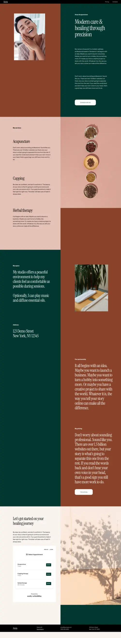
Anza
Best for Holistic Wellness Centres & Chiropractors With a Strong Visual Brand ✓ Pros
- Earthy, warm tones and highly visual layout create an immediate emotional connection with wellness-minded patients - people seeking holistic chiropractic care are often making values-based decisions, and Anza's visual language resonates with those values before a service description is read.
- Built-in appointment system integration is clean and intuitive, allowing patients to move from browsing to booked without leaving the site or navigating to an external scheduling tool - reducing drop-off at the exact point where most chiropractic websites lose warm visitors.
- Heavy visual emphasis lets practice owners showcase their clinic environment, equipment, and team in ways that text descriptions can't replicate - for holistic practitioners where the physical space and sense of safety are major selling points, this is a conversion advantage.
- Professional and personal aesthetic balance communicates both competence and approachability - a pairing that is especially important for chiropractic practices that treat patients with anxiety around clinical environments or first-time healthcare decisions.
- Warm welcome aesthetic reduces the intimidation factor for first-time chiropractic patients who are hesitant or unsure about care - the design signals "you'll be looked after here" in a way that directly increases first-appointment booking rates for new patient acquisition campaigns.
✗ Cons
- The visual-first layout requires a substantial library of high-quality practice photographs to perform at its best - a new clinic without professional imagery will struggle to fill Anza's visual sections convincingly, and placeholder or stock images undermine the warmth the design is built to create.
- The warm, earthy wellness aesthetic is a specific visual commitment - chiropractic brands built around clinical precision, sports performance, or evidence-based positioning may find the template's tone too lifestyle-forward for their target patient demographic.
- Limited architectural depth for service-rich practices - clinics offering a wide range of treatments, multiple practitioners, or complex service tiers may find Anza's warmth-first design insufficient for communicating the full scope of what they offer.
Anza is the chiropractor website template that understands why patients choose holistic care in the first place. The earthy tones, the welcoming imagery, the intuitive booking system - it's built for the practitioner whose clinical environment is itself part of the patient experience. If your practice's physical space is warm, considered, and designed to put people at ease, Anza is the template that brings that same quality to your digital presence.
How to Choose the Right Squarespace Chiropractor Website Template
Match Your Template's Aesthetic to Your Patient Profile
You want to design a professional Squarespace website for your chiropractic practice - one that builds patient trust the moment they land on it. The challenge isn't finding templates; it's choosing templates and design principles that communicate clinical expertise while staying warm and approachable. This guide walks you through the best Squarespace templates for chiropractors and the design decisions that actually convert skeptical new patients into booked appointments.
Prioritise Online Booking Above Everything Else
The single most important technical decision in a chiropractor website design is how directly and frictionlessly it moves a visitor toward booking an appointment. Patients researching chiropractic care often arrive motivated - they're in pain, they've decided to act, and they're comparing a shortlist of practitioners. The practice that makes booking easiest captures that patient. Every extra click, every form submission that ends in "we'll be in touch," and every booking system that opens a new browser tab introduces friction that costs you appointments. Randi's front-and-centre booking CTA and Anza's integrated appointment system both address this priority directly. For any template you choose, connect it to a live scheduling tool (Squarespace Scheduling, Acuity, or Calendly) so patients can confirm a slot in real time - not after a 24-hour email exchange.
Consider How Much Content Your Practice Will Publish
Content depth is a meaningful differentiator between chiropractic website templates. Randi and Florence are designed for practices that communicate clearly and concisely - a strong hero, three to five service descriptions, and a direct booking path are the whole site. Myhra is architected for practices that publish: blog posts on spinal health, patient education guides, condition-specific resources, and exercise tutorials. The right choice depends on your actual content strategy, not your aspirational one. If you have the capacity to publish two to four blog posts per month, Myhra's content architecture will build compounding search visibility over time. If you don't, an empty blog section on any template signals an unfinished or neglected site - which costs you patient trust in a category where credibility is everything.
Think About Your Practice's Stage of Growth
A solo practitioner building their first Squarespace chiropractic website has different needs from a multi-practitioner clinic expanding to a second location. Randi's simplicity and Jenani's focused elegance are ideal for sole operators who need a professional, conversion-ready presence without the content overhead of a larger site. Florence and Anza scale gracefully as a practice grows - they're architecturally clean enough to add new pages, service lines, and team members without visual disruption. Myhra suits the practitioner who has been in practice long enough to have built a content library and service repertoire worth showcasing in depth. Match the template's complexity to where your practice actually is, not where you hope it will be in five years - you can always migrate to a more expansive template as your practice grows.
Frequently Asked Questions
What is the best Squarespace template for a chiropractor website?
Do I need a special Squarespace plan to add online booking to my chiropractic website?
What pages should a chiropractic website include?
How much does a Squarespace chiropractic website cost?
Can I add patient testimonials to a Squarespace chiropractic website?
Is Squarespace HIPAA compliant for chiropractic websites?
Can I switch Squarespace chiropractor templates after my site is built?
What makes a good chiropractic website design?
How We Evaluate Templates
Conclusion: Squarespace Chiropractor Website Templates That Build Trust and Fill Your Schedule
The right chiropractor website template doesn't just represent your practice online - it works as your most consistent patient acquisition tool, making the case for your expertise and approachability every hour of every day. Jenani builds trust through holistic warmth. Randi earns it through simplicity and directness. Myhra creates it through depth and educational authority. Florence signals it through premium visual restraint. Anza communicates it through environment and welcome.
Every patient who lands on your chiropractic website is asking whether they can trust you with their health. The template you choose is your first answer to that question. Choose one that matches the specific way your practice earns that trust - and then make sure the booking path from that first impression is as short and frictionless as possible.
Didn't find exactly the right fit? We've got you covered with more hand-selected wellness designs: explore our picks for spa studio templates, therapist templates, and nutritionist templates - all chosen with the same priority: helping health and wellness practitioners build websites that earn patient trust and drive bookings.
* Read the rest of the post and open up an offer