Editor's Picks
| # | Name | Best For | Price | Rating | Image | |
|---|---|---|---|---|---|---|
| 1 | Rural and countryside B&Bs, farmhouse accommodation, and properties with strong natural or heritage character | Free | 4.8/5 |

|
More Info | |
| 2 | Urban boutique B&Bs, contemporary design-led properties, and city-centre accommodation with a modern aesthetic | Free | 4.7/5 |

|
More Info | |
| 3 | Family-oriented B&Bs, community-focused properties, and hosts who lead with warmth, accessibility, and the personal touches of genuine hospitality | Free | 4.6/5 |
|
More Info | |
| 4 | Destination B&Bs with strong location appeal, scenic-view properties, and accommodation that sells on its surroundings as much as its rooms | Free | 4.7/5 |

|
More Info | |
| 5 | Boutique luxury B&Bs, premium lifestyle properties, and high-end accommodation where the guest experience is central to the brand | Free | 4.9/5 |

|
More Info |
Our Picks: The Best Squarespace Bed and Breakfast Website Templates
Suffolk
Best for Rustic, Countryside & Farmhouse Bed and Breakfasts ✓ Pros
- Warm, rustic visual aesthetic immediately communicates the countryside B&B experience, guests searching specifically for a rural escape recognise the visual language of Suffolk before reading a room description, which dramatically shortens the evaluation journey for this guest type.
- Spacious layout with generous image sections lets the visual quality of your property do the selling, for countryside B&Bs where the views, the garden, the exposed beams, or the surrounding landscape are the primary draw, this image-first hierarchy is the right conversion approach.
- Pre-designed sections for rates, amenities, and booking create a clear guest journey from first impression to reservation without requiring complex custom page building, everything a prospective B&B guest needs to make a booking decision is accommodated in the template's existing structure.
- Gallery integration provides dedicated space for property photography, local attraction imagery, and the seasonal visual content that keeps a B&B website feeling current and gives returning visitors a reason to browse before rebooking.
- Mobile-responsive design handles the growing share of accommodation searches done on smartphones, travellers increasingly browse and book B&B accommodation on mobile while planning trips, and Suffolk's clean mobile layout maintains the warm impression across all device sizes.
✗ Cons
- The rustic, country aesthetic is a specific visual commitment, boutique urban B&Bs, contemporary design-led properties, or city-centre accommodation will find the template's rural character creates a strong mismatch with their actual property and guest expectations.
- The warmth-focused design is optimised for properties with genuine rustic character, B&Bs that lack the photography assets (original features, garden views, countryside surroundings) to populate Suffolk's visual sections will find the template's promise exceeds their delivery.
- Limited architecture for multi-room properties with distinct room types, B&Bs with four or more individually styled rooms that need separate room pages, individual pricing, and custom photography for each may find Suffolk's layout structure insufficient for that level of complexity.
Suffolk is the bed and breakfast website template that wraps guests in the warmth of what they came looking for. The spacious layouts, the gallery sections, the rustic visual palette, every design element is calibrated for the guest who chose a B&B over a hotel because they wanted to feel somewhere specific, not just somewhere comfortable. For countryside properties with genuine character, Suffolk translates that character to the screen with the faithfulness it deserves.
Hidano
Best for Modern, Boutique & Urban Bed and Breakfasts ✓ Pros
- Clean monochromatic design and modern typography immediately communicate the boutique urban B&B aesthetic, guests seeking design-conscious city accommodation recognise this visual language as the sign of a considered, premium experience rather than a standard guesthouse offering.
- Streamlined, clutter-free layout directs guest attention to the information that drives booking decisions: room availability, amenities, and how to reserve, a user experience priority that suits the time-efficient decision-making of urban travellers who are comparing multiple properties in quick succession.
- Clear header navigation ensures that guests who arrive knowing what they want, availability, pricing, location, neighbourhood information, can find it immediately without navigating a content-rich homepage that slows the booking path.
- Seamless booking integration supports the efficient, low-friction reservation experience that urban B&B guests expect, particularly business travellers and design-conscious guests who hold the online booking experience to the same standard as the property itself.
- Flexibility of the minimalist design system allows boutique B&B owners to inject their property's individual personality through colour palette customisation, typography choices, and imagery without being constrained by a template aesthetic that fights their brand identity.
✗ Cons
- The minimalist design requires strong, consistent property photography to maintain its premium impression, urban boutique B&Bs without professional interior and lifestyle photography will find Hidano's minimal layout makes the absence of visual quality very visible rather than concealing it.
- The restrained, modern aesthetic communicates sophistication but not warmth, B&Bs that distinguish themselves through host personality, genuine homeliness, or the personal touches that make guests feel like family may find Hidano's clean corporate lines understate those qualities.
- Limited visual capacity for showcasing neighbourhood attractions, local recommendations, and the "this is what it's like to stay here" content that personal B&B stays depend on for return visits and word-of-mouth recommendations.
Hidano is the bed and breakfast website template for the B&B that wants to be taken as seriously as the best boutique hotels. The monochromatic elegance, the clean navigation, the efficiency of the layout, it signals that your property makes no compromises on design, experience, or guest convenience. For urban B&Bs competing in a market where guests also consider boutique hotels and Airbnb, Hidano is the template that ensures you're compared on equal footing from the first scroll.
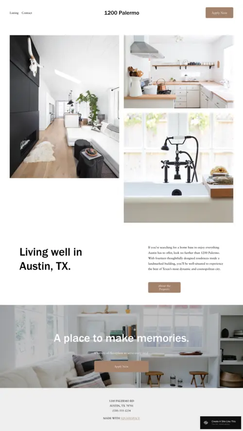
Palermo
Best for Family-Friendly, Welcoming & Community-Focused B&Bs ✓ Pros
- Light-filled, airy layout creates an immediate sense of openness and welcome, communicating the approachable, family-friendly hospitality that distinguishes the best personal B&Bs from both hotel chains and the more reserved boutique accommodation market.
- Built-in call-to-action buttons create clear booking and enquiry paths throughout the template so that guests who are ready to act at any point in their browsing journey can do so without backtracking to find a contact link or booking form.
- Visual warmth of the colour palette and design communicates the personal, host-centred experience that family travellers and guests seeking genuine connection specifically look for when they choose a B&B over hotel accommodation.
- Approachable design tone reduces the intimidation factor for guests who are unfamiliar with B&B accommodation, families booking a first B&B stay or travellers accustomed to hotels need reassurance that the experience will be comfortable and welcoming, and Palermo's design provides that reassurance before a description is read.
- Mobile-responsive design handles the device range typical of family travel planning, where one person might research on a laptop while another browses on a phone, consistently communicating the same warm first impression across both screen sizes.
✗ Cons
- The friendly, light aesthetic is calibrated for warmth and approachability rather than premium positioning, B&Bs competing on luxury, design quality, or premium pricing may find Palermo's wholesome aesthetic undersells the level of experience they actually deliver.
- The airy, minimal design works best with a curated selection of high-quality property images, B&Bs with limited photography assets or inconsistent image quality will find the light, open layout more exposing of visual gaps than a warmer, texture-rich template design would be.
- Limited depth for properties with complex room configurations, multiple rate tiers, or extensive amenity lists, large B&Bs with multiple room categories that each need individual presentation may find Palermo's simplified layout architecture insufficient for their booking complexity.
Palermo is the bed and breakfast website template for B&Bs where the host is the hospitality. The warm, airy layout, the open invitation of the design, the CTAs that feel like offers rather than commands, it's built for properties where guests come back not just because the bed was comfortable but because the welcome was genuine. If your B&B runs on personal connection and the kind of hospitality that earns five-star reviews from guests who feel like family, Palermo is the template that communicates that from the first click.
Sellwood
Best for Picturesque, Location-Driven & Destination B&Bs ✓ Pros
- Full-screen image backgrounds create the most powerful location-selling tool available in a bed and breakfast website template, for properties where the view from the window, the surrounding countryside, or the historic setting is the primary draw, Sellwood's full-bleed imagery communicates that appeal at maximum visual impact.
- Bold visual hierarchy puts the property's most photogenic asset front and centre without competition, destination B&B guests are often making location-based decisions as much as accommodation decisions, and the ability to open with an unmissable location shot is a critical conversion advantage.
- Clear booking CTAs and streamlined layout convert the warm traffic that destination B&Bs attract, guests who find you through a location search or travel recommendation are already partially sold; Sellwood's direct booking path captures that momentum before they navigate elsewhere.
- Email newsletter integration allows destination B&Bs to build a returning guest list and communicate seasonal availability, last-minute offers, and local events, a valuable retention mechanism for properties in locations with strong repeat visitor patterns.
- Flexible page architecture supports both the simple homepage booking journey for first-time visitors and the deeper content (local attraction guides, seasonal itineraries, local restaurant recommendations) that encourage extended stays and return visits.
✗ Cons
- The full-screen image approach is entirely dependent on location-quality photography, a destination B&B without dramatic exterior, landscape, or view photography will find Sellwood's full-bleed design actively exposes this gap rather than compensating for it.
- The location-first design hierarchy may undersell properties whose primary appeal is interior quality, host character, or specific amenity sets rather than external landscape or scenic surroundings.
- The visually dominant homepage design leaves less room for the personal host narrative and property story that many B&B guests specifically value, properties where the host or the history of the building is the differentiation factor may find Sellwood's location-forward layout insufficient for that storytelling.
Sellwood is the bed and breakfast website template for properties where the first view stops a guest mid-scroll. If your B&B commands a hillside panorama, sits beside a working harbour, overlooks a walled garden, or occupies a building with genuine photographic presence, Sellwood is the template that does justice to those assets. For destination B&Bs that earn their bookings on the strength of where they are as much as what they offer, this is the design that sells the location before a guest reads the room description.
Barbosa
Best for Boutique Luxury & Premium Lifestyle Bed and Breakfasts ✓ Pros
- Contemporary design and well-structured layout communicate boutique luxury positioning, for B&Bs competing with premium hotels and high-end Airbnb properties for the same discerning guest, Barbosa's design places you in the right tier from the first impression without requiring a designer budget to achieve it.
- Amenity and service showcasing sections are precisely structured for the content that high-value B&B guests base their decisions on, the gourmet breakfast, the curated room welcome, the locally sourced products, the personalised touches that justify a premium rate.
- Built-in testimonial sections are positioned where they drive the highest conversion, luxury accommodation guests are highly responsive to social proof from peers who can validate that the experience matches the premium price, and Barbosa's testimonial architecture leverages this at the key decision point.
- "Plan a Stay" CTA creates a higher-intent booking journey than a generic "book now" approach, inviting guests to plan rather than simply transact communicates the personalised, experience-focused service they'll receive, and pre-qualifies visitors who understand and appreciate the premium offer.
- Design scalability accommodates the content depth that premium B&Bs need to justify higher rates, room-by-room descriptions, curated experience packages, local itineraries, seasonal offerings, and host-recommended dining can all coexist in Barbosa's flexible layout without the site feeling cluttered.
✗ Cons
- The boutique luxury aesthetic creates a high bar for the actual guest experience, guests who book through a Barbosa-level premium website arrive with premium expectations, and any gap between the website's promise and the property's delivery damages reviews more severely than a more modest-looking site would.
- The sophistication of the design requires professionally shot interior photography, Barbosa communicates luxury through visual quality, and properties relying on self-taken or poorly lit room photos will find the template actively undermines the premium positioning it was chosen to create.
- The depth and richness of the content architecture demands genuine investment in copy, vague amenity descriptions, thin room introductions, and generic "we look forward to hosting you" language will not perform in a template designed for the discerning guest who expects substance behind the style.
Barbosa is the bed and breakfast website template for B&Bs that understand luxury is a feeling, not just a price point. The contemporary design, the amenity showcasing, the testimonial sections, the "Plan a Stay" CTA, every element is calibrated for the guest who is buying an experience, not just a room. If your B&B delivers the kind of stay that guests write about long after they've left, Barbosa is the website that sets that expectation from the moment they arrive.
How to Choose the Right Squarespace Bed and Breakfast Website Template
Match Your Template's Tone to Your Property's Character
The most important decision in choosing a bed and breakfast website template is visual alignment with your property's actual character. Suffolk's rustic warmth works beautifully for countryside farmhouses and heritage properties with exposed beams and garden views, but it will look incongruous on a contemporary urban townhouse. Hidano's clean minimalism suits design-led boutique properties in city centres where the aesthetic is itself an attraction, but it will feel cold and clinical for a family-run country B&B whose appeal is personal warmth. Barbosa's luxury positioning earns its premium rates for properties that genuinely deliver a high-end experience, but deploying it on a modest property creates a trust gap that negative reviews will quickly expose. Choose the template that matches your property as it actually is, and you attract the guests who will love it most.
Make Online Booking the Simplest Thing on Your Website
For every B&B template you consider, ask one question before anything else: how many clicks does it take for a guest to reach a live booking calendar from the homepage? The answer should be one. Every additional step in the booking journey, a contact form that ends in "we'll email you back," a phone number that requires a call during business hours, a booking link buried in the footer, is a booking you've lost to a property that made it easier. All five templates reviewed here support booking integration through Squarespace Scheduling or third-party tools like Little Hotelier, BookingSync, or a simple Calendly embed. Whichever template you choose, make booking integration the first technical decision you implement, before photography, before copy, before anything else.
Think About What Your Guests Need to See Before They Book
Different types of B&B guests need different information to convert from browsers into bookers. First-time B&B guests often need reassurance that the experience will be comfortable and welcoming, the host photo, the guest reviews, the "what to expect" section. Return guests and experienced B&B travellers are often deciding between specific properties and need comparative information: room details, rate breakdown, cancellation policy, and exact availability. Location-driven guests need the surrounding area story, nearby walks, attractions, restaurants, and what's unique about where you are. Before finalising your template choice, list the three most common conversion blockers your potential guests face and verify the template architecture supports answering all three clearly and without friction.
Invest in Photography Before You Invest in Anything Else
Of all the decisions that determine whether a B&B website converts, none matters more than photography quality, and it's the decision most B&B owners underinvest in. All five templates reviewed here are designed to showcase high-quality property imagery, and all five perform significantly below their potential with poor photography. For B&Bs, a one-day professional photography session covering rooms, common areas, breakfast, exterior, and surroundings provides assets that will drive bookings for three to five years. The cost is almost always recovered in additional bookings within the first month. If professional photography is genuinely not possible right now, choose a simpler, more text-forward template layout (Hidano or Palermo) over the full-screen image templates (Sellwood, Suffolk) until your photography library matches the visual demands of the design.
Frequently Asked Questions
What is the best Squarespace template for a bed and breakfast website?
How do I add online booking to a Squarespace B&B website?
What pages should a bed and breakfast website include?
Should a B&B website include guest reviews?
Can I use Squarespace for a B&B with multiple rooms?
Can I use a Squarespace template for a vacation rental website?
How We Evaluate Templates
Conclusion: Squarespace Bed and Breakfast Website Templates That Fill Your Rooms
The right bed and breakfast website template doesn't just represent your property online, it makes potential guests picture themselves there. Suffolk creates the warmth of arriving at a countryside retreat. Hidano earns the trust of guests expecting boutique precision. Palermo extends the welcome of a family host before a guest has knocked at the door. Sellwood sells the location before the room. Barbosa earns the premium rate before the guest has seen the rate.
Choose the template that matches your property's genuine character, invest in the photography that brings it to life, and make the booking path as direct and frictionless as possible. Every guest who lands on your B&B website has already decided they want an experience like yours, the template you choose is what convinces them yours is the right one.
Looking for more hospitality and accommodation templates? Explore our picks for real estate templates, small business templates, and events and services templates, each chosen to help you build a professional online presence that matches the quality of the experience you deliver.
* Read the rest of the post and open up an offer