Editor's Picks
| # | Name | Best For | Price | Rating | Image | |
|---|---|---|---|---|---|---|
| 1 | Contemporary menswear brands with clean product photography | Free | 4.8/5 |
|
More Info | |
| 2 | Luxury menswear brands, leather goods, premium tailoring, and dark editorial fashion | Free | 4.9/5 |
|
More Info | |
| 3 | Men's fashion brands running limited drops, seasonal launches, and pre-launch campaigns | Free | 4.7/5 |
|
More Info | |
| 4 | Menswear brands with video content, collabs, and media-rich brand storytelling | Free | 4.6/5 |

|
More Info | |
| 5 | Streetwear brands, bold menswear labels, and statement accessory stores | Free | 4.7/5 |
|
More Info |
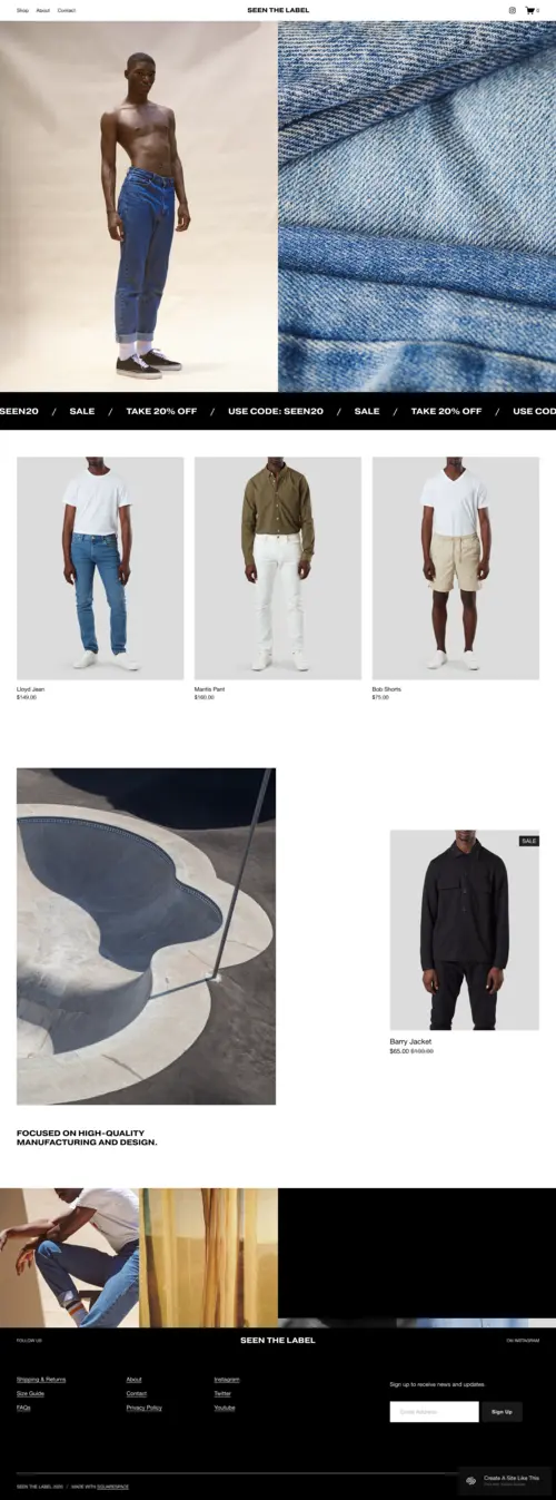
Seen
Best for Contemporary Menswear & Clean Product Presentation ✓ Pros
- Full-screen hero imagery makes an instant first impression, giving contemporary menswear brands the canvas to lead with their strongest campaign shot before a visitor scrolls past the fold.
- Clean, uncluttered navigation keeps the focus entirely on products - no distractions, no competing design elements, just the clothing front and center exactly where menswear shoppers expect it.
- Image grid layout organises collections in a visual hierarchy that lets you surface bestsellers, seasonal drops, or new arrivals without requiring visitors to dig through categories.
- Product spotlight sections let you break the grid rhythm to feature a hero piece, a collaboration, or a limited release with dedicated visual real estate that signals it matters.
- Minimalist typography and whitespace approach communicates brand restraint - a design choice that reads as premium in the menswear space, where less has always said more.
✗ Cons
- The clean, minimal aesthetic requires consistently strong product photography - low-quality or inconsistent imagery will expose the simplicity of the layout rather than benefit from it.
- Not built for deep catalog browsing - if your menswear line spans multiple categories with 50+ SKUs, Seen's streamlined layout can make navigation cumbersome without additional customisation.
- Limited built-in storytelling sections make it a weaker fit for menswear brands whose founding narrative or values are central to the buying decision.
Seen is the template for menswear brands that understand restraint is a flex. There's no noise here - just space, product, and the quiet confidence that your work speaks for itself. For contemporary menswear that earns its price point through quality and presentation, this is the layout that lets both do the talking.
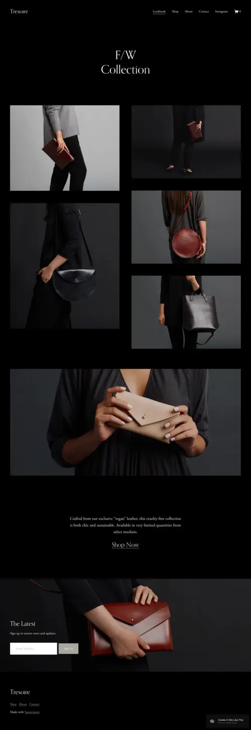
Tresoire
Best for Luxury Menswear & Editorial Dark Aesthetics ✓ Pros
- Dark, lookbook-style homepage layout positions your menswear brand in the luxury tier before a price tag is visible - a critical advantage for brands where perceived value drives purchasing decisions.
- Editorial product gallery showcases leather goods, tailored pieces, and premium accessories with the gravitas they deserve, rather than the clinical presentation of a standard eCommerce grid.
- Instagram integration built into the navigation bar keeps social proof immediately accessible, creating a seamless bridge between your feed - where menswear audiences discover brands - and your store, where they buy.
- The polished, modern layout handles both the browse-to-buy experience and brand storytelling in equal measure, giving luxury menswear customers the time they need to invest emotionally before committing to a purchase.
- Newsletter and About sections support the brand narrative depth that luxury menswear customers expect - they're buying into a world, not just a product, and Tresoire gives you space to build it.
✗ Cons
- The dark, monochrome visual identity is a strong commitment - menswear brands with warm, earthy, or heritage colour palettes will need significant restyling before Tresoire's aesthetic works in their favour.
- Lookbook-first structure works best for visually cohesive collections - if your menswear line spans different aesthetics or categories, the editorial layout can feel fragmented rather than curated.
- The high visual intensity of the template demands equally high-quality photography - mediocre product shots in a Tresoire layout undermine the premium positioning the design was built to create.
Tresoire is what a men's fashion website looks like when it fully commits to luxury. The dark homepage, the lookbook structure, the editorial gallery - every element is sending the same signal: this brand is serious, this collection is intentional, and your time here is worth it. It's a top pick for premium menswear and old money aesthetic brands where confidence is the whole point.
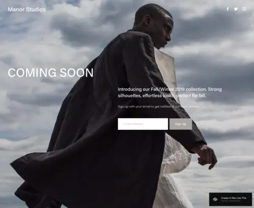
Manor
Best for Product Launches, Limited Drops & Pre-Launch Campaigns ✓ Pros
- Hero-driven homepage with countdown timer functionality is purpose-built for building hype around limited-edition menswear drops - the format turns scarcity into a design feature rather than an afterthought.
- RSVP and waitlist sign-up integrations let menswear brands start building their audience before a product ships, converting pre-launch interest into a warm email list that's ready to buy on release day.
- Clean, uncluttered design keeps the visual focus entirely on the upcoming product or collection - no competing sections distract from the one action you want visitors to take.
- Bold hero visuals give menswear brands the space to tease a collection's aesthetic without revealing everything - the strategic preview format that drives the highest pre-launch conversion rates.
- Simple yet impactful layout loads fast and performs well on mobile, where most menswear drop audiences are browsing and signing up in the minutes after a social media announcement goes live.
✗ Cons
- Optimised for pre-launch and drop moments rather than ongoing eCommerce - once the launch is live and the hype fades, Manor's single-focus structure becomes limiting for day-to-day browsing and purchasing.
- Limited multi-product browse architecture makes it a poor fit for menswear brands with large catalogues who need customers to explore and discover beyond a hero product.
- The countdown and RSVP features are most effective for brands with an established audience - without existing traffic to drive to the page, the launch mechanics work best alongside an active social or email strategy.
Manor is a specialist tool, and the best menswear brands will use it like one. This isn't your everyday eCommerce template - it's built for the drop moment, the launch week, the campaign that needs one page to do all the work. If your men's fashion brand releases in drops rather than always-on inventory, Manor turns a URL into an event.
Otroquest
Best for Media-Forward Menswear & Collaborative Brand Storytelling ✓ Pros
- Featured video integration lets menswear brands move beyond static photography and bring collection campaigns, brand stories, or behind-the-scenes content directly into the homepage experience.
- Merch and apparel integration supports brands that operate at the intersection of menswear and culture - whether that's music, sport, art, or community - allowing product and identity to coexist in the same layout.
- Dynamic, high-energy visual structure matches the elevated pace of the streetwear and contemporary menswear market where brands compete on cultural relevance as much as product quality.
- Stream schedule and event sections create dedicated space for menswear brands to announce collaborations, pop-ups, or launch events - turning the website into an ongoing brand platform rather than a static store.
- Bold, media-rich layout appeals to the younger menswear audience who expects brands to communicate through content and culture, not just product listings and price points.
✗ Cons
- The media-heavy layout requires consistent content production to stay fresh - menswear brands without a regular video or content output will quickly find Otroquest's dynamic sections looking static and incomplete.
- The interactive, high-energy aesthetic is a strong stylistic commitment that doesn't suit heritage, classic, or quietly luxurious menswear brands whose identity relies on restraint.
- eCommerce architecture is secondary to the content experience - menswear brands whose primary goal is efficient product browsing and purchase conversion will find other templates better optimised for that outcome.
Otroquest is for the menswear brand that's also a media brand. If your product exists inside a larger world of music, sport, culture, or community - and your audience follows that world as much as they follow the clothing - this template gives your brand the stage to live in both at once. It's not just about selling a piece; it's about selling the scene it belongs to.
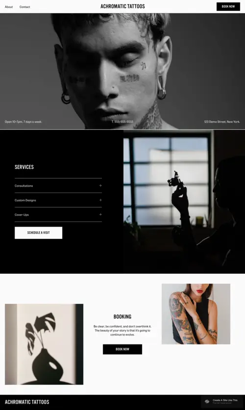
Achromatic
Best for Streetwear & Bold Statement Menswear Brands ✓ Pros
- Dark monochromatic theme delivers the visual authority that streetwear and statement menswear brands need - the aesthetic does the positioning work before a visitor reads a product name or price.
- Bold hero visuals command attention instantly, making Achromatic the right choice for menswear brands whose identity is built around attitude, edge, and the confidence to be unmissable.
- Modern product grid keeps the shopping experience clean and organised despite the high-energy aesthetic - bold design and functional eCommerce working together rather than at odds.
- Customisable service and product sections give streetwear brands the flexibility to feature limited drops, custom designs, and accessories alongside core apparel without the layout feeling cluttered.
- Strong, clean typography choices complement the monochromatic design without competing with product photography - a critical balance for menswear brands where the clothes need to own the visual hierarchy.
✗ Cons
- The monochrome, dark aesthetic is designed for bold menswear identities - classic, heritage, or colour-forward men's fashion brands will find the template fights their visual language rather than supports it.
- Best suited for brands with a tight, identity-driven product range - if your menswear store spans multiple very different aesthetics or target audiences, Achromatic's strong visual POV can feel narrow.
- The dark, high-contrast design requires product photography that pops against dark backgrounds - light-background studio shots that work beautifully on white-background templates can disappear in Achromatic's layout.
Achromatic is for the menswear brand that's not asking for permission. The monochrome palette, the bold grid, the dark energy - this template says what your brand says before you've typed a word. If your men's fashion label is built around an attitude as much as a product, Achromatic is the template that wears it correctly.
How to Choose the Right Men's Fashion Website Template
Match the Template's Aesthetic to Your Brand's Visual Identity
The most critical decision in choosing a men's fashion website template isn't features - it's visual alignment. Seen's clean minimalism speaks to contemporary menswear buyers who make decisions based on product quality and brand restraint. Tresoire's dark, editorial lookbook targets the luxury menswear customer who expects a premium digital experience before opening their wallet. Achromatic's monochromatic boldness connects with the streetwear and statement fashion audience who respond to attitude before product. And Manor and Otroquest serve specialised needs: launch moments and media-rich brand storytelling, respectively. Picking a template that contradicts your brand's visual language creates immediate distrust - visitors leave not because your products are wrong, but because the template's design sent the wrong signal on your behalf.
Consider Whether You're Selling Always-On Inventory or Drops
Men's fashion eCommerce splits roughly into two business models: always-on inventory (a continuous catalogue of products available to buy at any time) and the drop model (limited releases that sell out fast and drive urgency). Seen, Tresoire, Achromatic, and Otroquest are all well-suited to always-on eCommerce, with browse-and-buy architecture that supports ongoing product discovery. Manor is specifically built for the drop model - its countdown timer, RSVP sign-up, and hero-first structure are designed to build hype and capture pre-launch demand. If you run a hybrid model, consider using Manor for launch campaigns and switching to Seen or Achromatic as your primary eCommerce home once inventory is live.
Think About Your Customer's Discovery Journey
Where your menswear customers come from shapes which template serves them best. Instagram-first audiences arrive primed by visual content and expect the website to maintain that visual energy - Tresoire's Instagram integration and Otroquest's media-forward layout bridge that gap well. Search-driven audiences landing from Google want fast product access and clean navigation - Seen's minimalist structure handles that journey most efficiently. Email-driven audiences arriving from a launch announcement are already bought in - Manor's focused layout with one clear CTA converts that warm traffic at the highest rate. Understanding your traffic source helps you pick the template that honours the journey your customer has already started before they arrived.
Factor in Your Content Production Capacity
Some templates perform on a single strong hero image. Others need consistent content to stay alive. Seen and Manor work with minimal content - a strong photo, a clean copy line, and a product grid are enough. Tresoire benefits from regular collection photography but doesn't require constant updates. Otroquest, however, is designed around ongoing content: videos, event announcements, and collaboration reveals. If you have the production capacity to keep an Otroquest-style site fresh, it pays dividends. If you're a smaller menswear brand without a content team, Seen or Achromatic will serve you better without demanding content you can't consistently produce.
Frequently Asked Questions
What is the best Squarespace template for a men's fashion eCommerce store?
Can I sell men's clothing on Squarespace?
How much does a Squarespace men's fashion website cost?
What makes a good men's fashion website template?
Is Squarespace good for men's fashion brands?
Can I switch Squarespace templates after building my men's fashion store?
What pages should a men's fashion website include?
Do men's fashion Squarespace templates work on mobile?
How We Evaluate Templates
Conclusion: Men's Fashion Website Templates That Work as Hard as Your Brand Does
The right men's fashion website template doesn't just look good - it positions your brand instantly, presents your products with authority, and makes buying the obvious next move. Seen earns trust through restraint. Tresoire earns it through luxury. Achromatic earns it through attitude. Manor builds it before a product is even live. Otroquest builds it through culture and content.
Choose the template that matches your menswear brand's visual identity, lead with your strongest photography, and let your Squarespace site make the first impression at scale. For the full range of options, explore our complete guide to Squarespace fashion website templates - or if your brand lives in the secondhand and vintage space, our vintage clothing templates guide has you covered.
* Read the rest of the post and open up an offer