Editor's Picks
| # | Name | Best For | Price | Rating | Image | |
|---|---|---|---|---|---|---|
| 1 | High-end brands with curated, limited collections | Free | 4.9/5 |
|
More Info | |
| 2 | Minimalist fashion brands with refined essentials | Free | 4.8/5 |
.webp)
|
More Info | |
| 3 | Fashion brands building anticipation for exclusive releases | Free | 4.7/5 |
|
More Info | |
| 4 | Artisan fashion labels emphasizing quality and provenance | Free | 4.8/5 |

|
More Info | |
| 5 | Fashion brands blending commerce with editorial content | Free | 4.7/5 |

|
More Info |
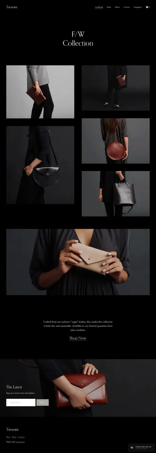
Tresoire
Best for Monochromatic Luxury Collections ✓ Pros
• Black-and-white palette creates instant sophistication, perfect for heritage-inspired fashion houses that avoid trend-driven colors • Full-screen product photography commands attention the way a well-tailored suit commands a room - quietly, confidently • Minimalist navigation keeps the focus on your pieces rather than cluttered menus, mirroring the old money principle of "less is more" • Typography choices feel editorial and refined, lending your brand the gravitas of a luxury magazine spread • Clean product grids allow each piece to breathe, ideal for showcasing investment-worthy garments and accessories✗ Cons
• The stark black-and-white aesthetic may feel too severe for brands incorporating warm neutrals like camel, cream, or burgundy • Limited color customization options if your brand identity relies on subtle heritage hues like navy or forest green • Image-heavy layout requires professional photography - casual product shots will undermine the luxurious feelTresoire does not try to impress you. It simply is impressive. The restraint here is the point - every element feels deliberate, like a perfectly knotted silk tie or an heirloom timepiece. If your brand sells pieces meant to be passed down, not replaced next season, this template understands the assignment. For fashion houses channeling Ralph Lauren's Polo heritage or the quiet confidence of The Row, Tresoire provides the digital equivalent of a private fitting room.
Alameda
Best for Capsule Wardrobes and Minimalist Brands ✓ Pros
• All-white canvas creates a gallery-like atmosphere where tailored blazers and cashmere knits become the art • Subtle serif typography evokes established fashion houses without feeling dated or overly traditional • Grid-based product layouts maintain visual order, reflecting the disciplined approach of curated capsule collections • Seamless e-commerce integration handles transactions with the discretion expected by discerning clientele • Generous white space between sections allows each collection to make its statement without visual competition✗ Cons
• The pristine white palette requires flawless product photography - any imperfections will be magnified • May feel too minimal for brands with rich storytelling or extensive heritage narratives to share • Limited dramatic impact for brands wanting to create editorial moments or campaign-style presentationsAlameda is the cashmere turtleneck of Squarespace templates - timeless, versatile, and quietly expensive-looking. It does not compete with your products; it lifts them. The white space here is not empty; it is intentional, creating the visual equivalent of a hushed, well-appointed boutique. This template understands that old money style is about reduction, not addition. Perfect for brands selling investment pieces meant to anchor a wardrobe for decades.
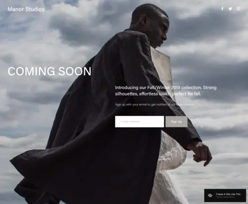
Manor
Best for Exclusive Launches and Private Collections ✓ Pros
• Muted, sophisticated color palette immediately signals exclusivity and considered taste • Bold hero imagery creates the sense of unveiling something significant - perfect for seasonal collection drops • Minimal text forces every word to carry weight, mirroring how old money communicates: sparingly and with intention • "Coming soon" functionality builds anticipation the way private trunk shows and invitation-only events do • Strong visual hierarchy guides visitors exactly where you want them without cluttered calls-to-action✗ Cons
• Designed primarily as a launch page, requiring adaptation for full e-commerce functionality • Limited product showcase options in its default configuration - better for teasing than selling • May feel incomplete for established brands with extensive catalogs needing immediate browsing capabilityManor operates on the principle that scarcity creates desire. It is the velvet rope of Squarespace templates - suggesting that what is behind it is worth waiting for. For fashion brands preparing a significant launch or repositioning toward the luxury market, this template communicates that something important is happening. The restraint here is strategic. You are not selling; you are inviting. And that distinction matters enormously to the old money sensibility.
Anise
Best for Heritage Brands with Craftsmanship Stories ✓ Pros
• Neutral earth tones and cream backgrounds evoke the patina of quality leather goods and natural fibers • Dedicated sections for brand storytelling let you share atelier processes, material sourcing, and heritage narratives • Built-in newsletter integration cultivates a loyal clientele who appreciate being kept informed, not marketed to • Product detail pages accommodate the extensive descriptions that investment pieces deserve • Visual balance between imagery and text suits brands where craftsmanship is as important as aesthetics✗ Cons
• Warmer neutral palette may not suit brands with cooler, more architectural aesthetics • Storytelling sections require thoughtful copywriting - empty or generic content will feel out of place • More content-forward than pure visual templates, which requires more upfront effort to populate effectivelyAnise understands that old money fashion is not just about how something looks - it is about where it came from, who made it, and why it matters. This template gives you room to share the provenance of your materials, the heritage of your techniques, and the philosophy behind your brand. For fashion houses with genuine stories to tell - family-owned mills, hand-stitched details, generational expertise - Anise provides the dignified stage those narratives deserve.
Hart
Best for Editorial Fashion and Personal Brand Storytelling ✓ Pros
• Black-and-white palette with editorial layout feels like a luxury fashion magazine translated to digital • Strong typographic hierarchy allows for longform content about collections, inspirations, and brand philosophy • Blog-friendly structure supports seasonal lookbooks, styling guides, and behind-the-scenes features • Clean lines and generous margins create reading experiences befitting serious fashion journalism • Versatile enough for brands selling products while building a content-driven audience✗ Cons
• Editorial focus requires ongoing content creation - static brands may find the blog sections feel neglected • Black-and-white aesthetic limits brands wanting to showcase color as a signature element • More suited to brands with strong written narratives than purely visual, product-forward approachesHart is for fashion brands that have something to say - and the vocabulary to say it well. The editorial structure here suggests a brand with perspective, one that understands fashion as cultural commentary rather than mere commerce. It is sophisticated without being pretentious, intellectual without being inaccessible. If your brand's voice matters as much as your visual identity - if you are as comfortable writing about why a collection matters as you are designing it - Hart provides the platform to do both with equal elegance.
Brands That Define Old Money Style (And Which Template Fits Each)
If you are launching or repositioning toward the old money aesthetic, the brands below are the reference points buyers and Google both recognize. Use them as a north star when choosing your template:
- The Row, Khaite, Toteme - minimalist, monochromatic, content-led. Closest match: Tresoire or Hart.
- Brunello Cucinelli, Loro Piana - heritage cashmere, earth tones, craftsmanship narrative. Closest match: Anise.
- Brandon Maxwell, Carolina Herrera - formal, refined, occasion-driven. Closest match: Alameda with editorial expansion.
- Hermès, Bottega Veneta - discreet luxury, symbolism over logos. Closest match: Manor for launches; Anise for ongoing collections.
- Ralph Lauren Purple Label - heritage Americana with editorial gravity. Closest match: Hart.
Visual Signature Quick-Reference Table
| Template | Palette | Typography | Best Fit |
| Tresoire | Black & white | Editorial serif | Curated capsule launches |
| Alameda | All-white canvas | Subtle serif | Minimalist essentials |
| Manor | Muted, dramatic | Bold display | Exclusive launches |
| Anise | Earth tones, cream | Warm serif | Heritage craftsmanship |
| Hart | Editorial B&W | Strong hierarchy | Storytelling brands |
How to Choose the Right Squarespace Template for Your Old Money Fashion Brand
Consider Your Brand's Visual Temperature
Old money aesthetics span from cool and architectural (think stark whites, blacks, and clean lines) to warm and inherited (creams, cognacs, and lived-in elegance). Tresoire and Hart suit cooler, more editorial brands, while Anise and Alameda accommodate warmer, heritage-focused aesthetics. Manor works across both but leans dramatic. Choose based on whether your brand feels more like a modern gallery or a family estate.
Match Your Content Strategy to Template Strengths
If your brand thrives on storytelling - atelier processes, material provenance, seasonal inspirations - templates like Anise and Hart provide the structure for that content. If your products speak for themselves and require minimal explanation, Tresoire and Alameda's visual-forward approaches serve better. Manor suits brands in transition or launching something significant.
Evaluate Your Photography Assets Honestly
These templates demand exceptional imagery. Tresoire's full-screen layouts and Alameda's white backgrounds will expose mediocre photography immediately. If your current assets are inconsistent, consider investing in professional shoots before launching - or choose Anise, which balances imagery with text and forgives slightly less polished visuals through its warmer, more textured aesthetic.
Plan for Your Brand's Evolution
A heritage fashion brand is not built overnight. Consider where you will be in two to three years. Hart's editorial structure accommodates brands growing into content marketing. Anise supports expanding product lines with storytelling. Tresoire and Alameda work best for brands confident in their curated, focused approach. Choose a template that fits not just who you are, but who you are becoming.
Frequently Asked Questions
What makes a Squarespace template suitable for old money aesthetic fashion brands?
Can I sell products directly through these old money fashion website templates?
How much does Squarespace cost for an old money aesthetic fashion website?
Can I switch Squarespace templates after building my old money fashion website?
Do these templates work well on mobile for luxury fashion shoppers?
Which old money fashion template is best for a brand just starting out?
How do I make my old money aesthetic fashion website feel authentic rather than imitative?
Can I integrate email marketing with these Squarespace fashion templates?
How We Evaluate Templates
Your Brand Deserves a Website That Whispers, Not Shouts
Old money style endures because it prioritizes substance over spectacle. The right template does not just display your products - it reinforces the values your brand represents: craftsmanship, restraint, and timeless appeal. Start with the template that matches your current collection and visual assets, customize it to reflect your unique perspective, and trust that the right clientele will recognize quality when they see it.
* Read the rest of the post and open up an offer