For bloggers and content creators, minimalist design is a strategic choice, not an aesthetic preference. Clean layouts improve readability and time-on-page. Fast-loading pages reduce bounce rates. Uncluttered navigation keeps readers moving through your archives. These Squarespace templates are built for creators who understand that every design element either serves the content or distracts from it-and they've eliminated the distractions.
Editor's Picks
| # | Name | Best For | Price | Rating | Image | |
|---|---|---|---|---|---|---|
| 1 | Podcasters & episode-driven content | Free | 4.8/5 |
|
More Info | |
| 2 | Modern blogs, digital magazines & thought leadership content | Free | 4.7/5 |
|
More Info | |
| 3 | Travel bloggers, food photographers & visual storytellers | Free | 4.8/5 |

|
More Info | |
| 4 | Recipe bloggers, food writers & culinary content creators | Free | 4.7/5 |

|
More Info | |
| 5 | Personal bloggers, essayists & intimate storytellers | Free | 4.6/5 |
|
More Info |
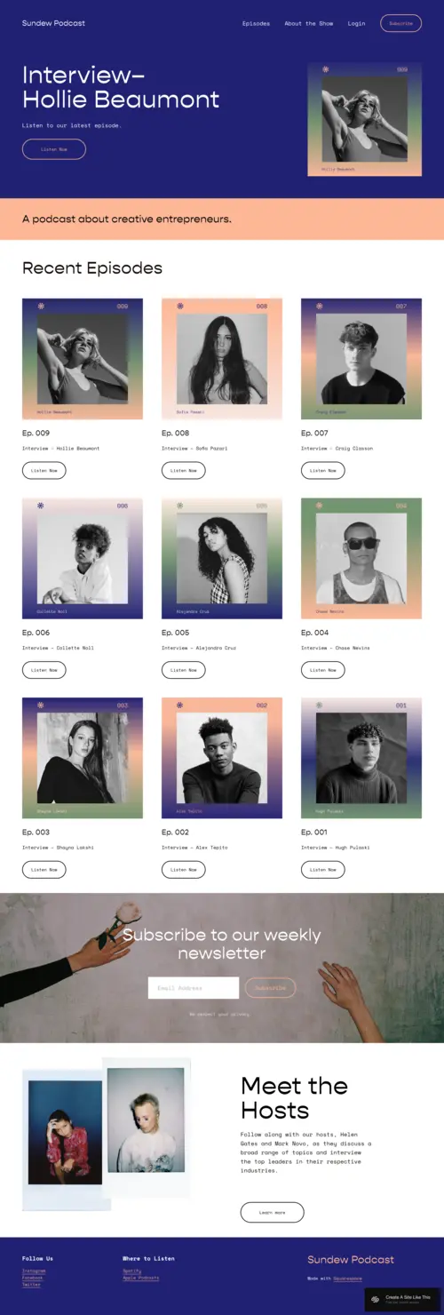
Sundew
Best for Podcasters & Audio Content Creators
✓ Pros
- Bold typography creates visual hierarchy that guides listeners to your latest episodes immediately
- Episode-focused layout organizes your catalog for easy browsing without overwhelming new visitors
- Newsletter integration captures email subscribers directly from your homepage
- Clean structure keeps social links and subscription buttons accessible without cluttering the design
- Gradient accents add visual interest while maintaining the minimalist foundation
✗ Cons
- Podcast-forward structure requires adaptation for bloggers without audio content
- Bold typography demands strong, concise headlines-verbose titles lose impact
- Gradient design elements may clash with brands requiring strictly monochromatic aesthetics
Sundew understands that podcast listeners want one thing: the next episode. The layout strips away everything else, making your catalog instantly scannable while still looking polished enough to attract sponsors and collaborators.
What makes Sundew work for podcasters is the balance between minimal and memorable. The bold typography gives your show name presence, while the clean episode grid makes binge-listening feel inevitable. It's a template that respects your listeners' time while keeping them engaged longer.
Use Sundew's newsletter section to offer a "best episodes" starter guide for new listeners-a curated list of your top five episodes delivered via email. This converts casual visitors into subscribers while helping new listeners skip directly to your strongest content.
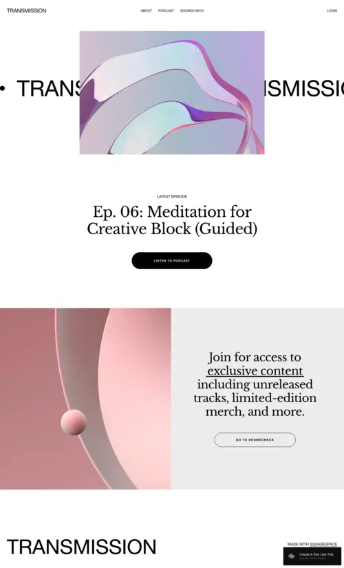
Transmission
Best for Modern Blogs & Digital Magazines
✓ Pros
- Geometric design accents add visual sophistication without sacrificing minimalist principles
- Hero section prominently features your latest or most important post above the fold
- Balanced text-to-visual ratio keeps readers engaged without overwhelming them
- Intuitive navigation helps visitors explore your archives naturally
- Futuristic aesthetic appeals to tech-savvy, design-conscious audiences
✗ Cons
- Modern, geometric aesthetic may feel too cold for warm, personal, or lifestyle-focused blogs
- Design-forward layout requires consistent visual content to maintain polished appearance
- Futuristic style might not age as gracefully as more timeless minimalist templates
Transmission proves that minimalist doesn't mean boring. The geometric accents and modern layout create visual interest while keeping focus exactly where it belongs-on your content. It's minimal design with a point of view.
For bloggers writing about technology, design, culture, or ideas, Transmission's aesthetic signals that you're someone worth paying attention to. The sophistication is subtle but unmistakable, positioning your blog as a destination rather than just another site in someone's feed.
Configure Transmission's hero section to rotate between your three pillar content pieces-the posts that best represent your blog's focus areas. This gives new visitors an immediate sense of what you cover while ensuring your strongest work gets consistent visibility.
Rivoli
Best for Visual Storytellers & Lifestyle Bloggers
✓ Pros
- Image-forward layout lets photography drive the narrative before readers encounter any text
- Warm, inviting aesthetic creates emotional connection with lifestyle and travel audiences
- Balanced visual-to-text ratio keeps posts scannable while supporting deeper reading
- Storytelling structure guides readers naturally from one piece to the next
- Cozy design feel differentiates from sterile, corporate-leaning minimalist templates
✗ Cons
- Photography-dependent layout requires consistently high-quality images to maintain visual appeal
- Warm aesthetic may not suit blogs with edgier, more dramatic, or tech-focused content
- Visual emphasis might underserve text-heavy blogs where words carry more weight than images
Rivoli feels like opening a beautiful coffee table book. The layout treats your photography with the respect it deserves, letting images establish mood before a single word is read. For travel and food bloggers, that visual-first approach is exactly how your audience wants to experience your content.
The warmth is what sets Rivoli apart from colder minimalist templates. It's minimal without being clinical-clean lines and breathing room, but with an inviting quality that keeps readers lingering rather than bouncing.
Create destination or category landing pages using Rivoli's visual grid-organize your travel content by location or your food content by cuisine type. These hub pages improve SEO for category keywords while giving readers an immersive way to explore your archives.
Stanton
Best for Recipe Bloggers & Food Content Creators
✓ Pros
- Readability-optimized layout keeps recipe instructions clear and easy to follow
- Clean post structure works perfectly for ingredient lists, steps, and cooking notes
- Integrated shop functionality lets you sell ebooks, meal plans, and digital products directly
- Blog-forward design prioritizes your content archive for returning readers and search traffic
- Versatile layout adapts to both quick weeknight recipes and elaborate cooking tutorials
✗ Cons
- Recipe-optimized structure may need adjustment for non-food content types
- Shop integration requires Commerce plan ($33+/month) to fully utilize
- Clean aesthetic demands quality food photography to avoid posts feeling sparse
Stanton knows what recipe readers actually need: clear instructions they can follow while cooking. The clean layout eliminates distractions, keeping ingredient lists readable and steps easy to track-even with flour-covered fingers scrolling on a phone.
The shop integration is where Stanton shines for food bloggers building businesses. Your recipe posts drive traffic, and the seamlessly integrated shop converts that traffic into ebook and meal plan sales. It's a content-to-commerce pipeline built into the template.
Add a "Recipe Index" page using Stanton's clean layout-organize recipes by meal type (breakfast, dinner, dessert), cuisine, or dietary restriction (vegetarian, gluten-free). This improves user experience for returning visitors and captures long-tail search traffic for specific recipe categories.
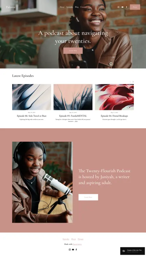
Paloma
Best for Personal Bloggers & Essay Writers
✓ Pros
- Soft, approachable aesthetic creates warmth that invites readers into personal stories
- Storytelling-focused layout guides readers naturally through your archive
- Simple navigation keeps attention on your writing rather than site features
- Intimate design feel matches the tone of personal essays, journals, and reflections
- Flexible structure works equally well for text-focused posts and image-heavy entries
✗ Cons
- Soft aesthetic may feel too gentle for blogs with bold, provocative, or edgy content
- Personal focus might undersell professional authority for business or expertise-driven blogs
- Intimate design requires consistent publishing to avoid feeling sparse or abandoned
Paloma feels like a friend's handwritten letter. The soft tones and thoughtful layout create space for vulnerability and connection-exactly what personal bloggers need to build the kind of reader relationships that keep people coming back.
For writers sharing personal essays, life updates, or reflective pieces, Paloma's warmth signals that this is a space for genuine connection. It's minimal without being cold, clean without being sterile. Your words feel at home here.
Create a "Start Here" page using Paloma's storytelling layout-curate your best and most representative posts for new readers discovering your blog. Include a brief personal introduction and email signup, turning first-time visitors into invested followers who understand what your blog is really about.
How to Choose the Right Minimalist Squarespace Template for Your Blog
Match the Template to Your Content Type
Podcasters need episode-focused layouts like Sundew that make audio content browsable. Recipe bloggers need readability-optimized structures like Stanton where instructions are easy to follow. Visual storytellers need image-forward templates like Rivoli. The best minimalist template for your blog is the one designed for how your audience actually consumes your content.
Consider Your Visual Assets
Image-forward templates like Rivoli require consistently high-quality photography to maintain their appeal. Text-focused blogs can thrive with typography-driven templates like Transmission or Paloma even without professional imagery. Be honest about your visual content capacity before choosing a photography-dependent design.
Think About Your Monetization Strategy
If you're selling digital products (ebooks, courses, meal plans), choose a template with seamless shop integration like Stanton. If you're building an email list for newsletter monetization, prioritize templates with prominent signup sections like Sundew. Your template should support how you plan to make money, not just how you want to look.
Plan for Long-Term Growth
As your archive grows, navigation becomes critical. Templates with category organization and archive-friendly structures keep older content discoverable. Minimalist design ages better than trendy alternatives, but choose a template that will still work when you have 500 posts, not just 50.
Frequently Asked Questions
Are minimalist blog templates good for SEO on Squarespace?
Yes. Minimalist templates often perform better for SEO because they load faster, have cleaner code, and create better readability signals. Search engines favor pages with clear content hierarchy and fast load times. Templates like Stanton and Transmission prioritize content structure, which helps search engines understand and rank your posts effectively.
How much does Squarespace cost for a minimalist blog website?
Squarespace plans start at $16/month for basic blogs, which works for most content creators focused on publishing and audience building. The Business plan ($27/month) adds features like promotional popups and advanced analytics. If you're selling digital products like ebooks or courses, Commerce plans start at $33/month.
Which minimalist Squarespace template is best for recipe bloggers?
Stanton is the strongest choice for recipe bloggers. Its readability-optimized layout keeps ingredient lists and cooking instructions clear and easy to follow. The integrated shop functionality lets you sell ebooks and meal plans directly, and the clean structure works for both quick recipes and elaborate cooking tutorials.
Can I add an email newsletter signup to a minimalist Squarespace blog template?
Yes. All Squarespace templates support email signup forms through native integrations with Mailchimp, ConvertKit, and other email marketing platforms. Templates like Sundew include prominent newsletter sections by default. Email capture should be a priority for any blog-your email list is the audience you actually own.
Do minimalist Squarespace templates work well on mobile for blog readers?
All Squarespace templates are fully responsive and mobile-optimized. Minimalist templates often perform even better on mobile because their clean layouts translate naturally to smaller screens. Templates like Paloma and Stanton maintain readability and navigation quality across all devices.
Which minimalist template is best for podcasters?
Sundew is ideal for podcasters. Its episode-focused layout organizes your catalog for easy browsing, while bold typography makes your show name memorable. The newsletter integration helps you build a subscriber list independent of podcast platforms, and the clean structure keeps listeners focused on your content.
Can I sell ebooks or digital products from a minimalist blog on Squarespace?
Yes. Squarespace Commerce plans support digital product sales, including ebooks, courses, templates, and meal plans. Templates like Stanton include integrated shop functionality that feels native to the blog experience. This is valuable for bloggers building passive income alongside their content.
Which minimalist Squarespace template is best for personal essays and journaling?
Paloma is the top choice for personal bloggers and essay writers. Its soft, approachable aesthetic creates warmth that invites readers into intimate stories. The storytelling-focused layout guides readers naturally through your archive, and the simple design keeps attention on your words rather than distracting site features.
How We Evaluate Templates
These templates were evaluated based on their effectiveness for content-focused blogs: readability and typography quality, page load speed, content organization structure, and long-term scalability. We tested each template's ability to keep readers engaged while maintaining the clean aesthetic that defines minimalist design-because the best blog templates get out of the way and let your content shine.
Conclusion: Less Design, More Impact
Minimalist templates aren't about having less-they're about eliminating everything that doesn't serve your reader. Whether you choose Sundew's podcast-perfect structure, Stanton's recipe-optimized layout, or Paloma's warm storytelling focus, each of these templates is built to amplify your content rather than compete with it. Pick the one that matches your content type, customize it to reflect your voice, and start publishing in a space where your words finally have room to breathe.
Still searching for the perfect fit? Explore our guides to journalist templates, writer templates, and author templates for more options to build the minimalist blog your content deserves.
* Read the rest of the post and open up an offer