Editor's Picks
| # | Name | Best For | Price | Rating | Image | |
|---|---|---|---|---|---|---|
| 1 | Freelance developers, tech consultants, and professionals showcasing a clean portfolio | Free | 4.8/5 |

|
More Info | |
| 2 | Coding consultants, technical agencies, and senior developers targeting corporate clients | Free | 4.7/5 |

|
More Info | |
| 3 | Freelance developers, designer-developers, and creative tech professionals building relationship-first practices | Free | 4.7/5 |
|
More Info | |
| 4 | Developer-educators, technical bloggers, coding content creators, and devs building a public-facing brand | Free | 4.6/5 |

|
More Info | |
| 5 | Developer-entrepreneurs, coding course creators, and coders building digital product businesses | Free | 4.7/5 |

|
More Info |
Carroll
Best for Clean, Professional Developer Portfolios ✓ Pros
- Clean, professional aesthetic communicates technical competence immediately - no visual noise competes with your project work, skills list, or contact information, which is exactly what a coder's portfolio visitor needs to find fast.
- Headline-forward layout leads with a clear professional statement - giving developers the opportunity to communicate their specific stack, speciality, or value proposition in the first five words a visitor reads.
- Customisable project sections work well for showcasing case studies, code repositories, or client work - each project can have its own dedicated section with screenshots, outcomes, and technology descriptions.
- Intuitive navigation ensures recruiters, clients, and technical evaluators can move between Portfolio, About, and Contact sections without any friction - a detail that matters when the person reviewing your site is working through ten portfolios in an afternoon.
- Smooth section transitions and clean typography create a sense of technical precision that mirrors the quality of the work you're presenting - design as proof of craft, not just decoration.
✗ Cons
- The clean, restrained design requires strong project documentation to fill - coders without detailed case studies, screenshots, or outcome metrics will find Carroll's professional layout looking sparse and unconvincing.
- Not designed for bold personality expression - developers who want their website to communicate creative energy, entrepreneurial spirit, or a distinctive brand persona will find Carroll too reserved for that positioning.
- The minimal aesthetic doesn't support heavy content volume - developers with 20+ projects or extensive blog archives may find Carroll's streamlined structure becomes difficult to navigate as content accumulates.
Carroll is the developer portfolio template that understands the assignment: make technical expertise legible to non-technical decision-makers without condescending to technical ones. The clean lines, the clear navigation, the headline-first structure - this is what confident, accomplished coders put forward when they know their work speaks for itself and just need a clear frame to speak through.
Corrigan
Best for Technical Consultants & Agency-Positioned Coders ✓ Pros
- Sophisticated, structured layout signals authority and seniority - for developers positioning as consultants or agency owners rather than individual contributors, Corrigan's design communicates that you operate at a strategic level, not just an execution level.
- Well-organised service sections make it easy to present consulting packages, technical audit offerings, or retainer arrangements in a format that corporate clients can evaluate and approve without technical background.
- Sharp typography and polished visual finish build instant credibility - for coders targeting enterprise clients or law-adjacent technical work, the professional aesthetic removes the doubt that a more casual design would create.
- Structured navigation makes it straightforward to separate different service lines - development consulting, code review, technical training, and project management can each have dedicated sections without the layout feeling fragmented.
- Large, eye-catching headings create visual hierarchy that keeps potential clients oriented as they move through your areas of expertise - a practical UX benefit for consultants with multi-faceted service offerings.
✗ Cons
- The corporate-facing aesthetic is purpose-built for consultants targeting enterprise or professional clients - freelance developers working with small businesses, startups, or individual creators will find Corrigan's authority-forward design sets the wrong expectations about their typical engagement size and budget.
- The formal, structured layout doesn't leave much room for personality - coders with distinctive personal brands or creative identities will feel constrained by Corrigan's professional formality.
- Best suited for developers with an established reputation and client base - new or early-career coders may find the senior consultant framing harder to credibly fill without the experience portfolio to back it up.
Corrigan is for the developer who has stopped pitching for jobs and started fielding clients. The structured layout, the authority-forward design, the polished typography - this is the template that says your coding expertise operates at a strategic level, not just a tactical one. If you're positioning yourself as a technical consultant rather than a contractor, Corrigan sets that frame before you introduce yourself.
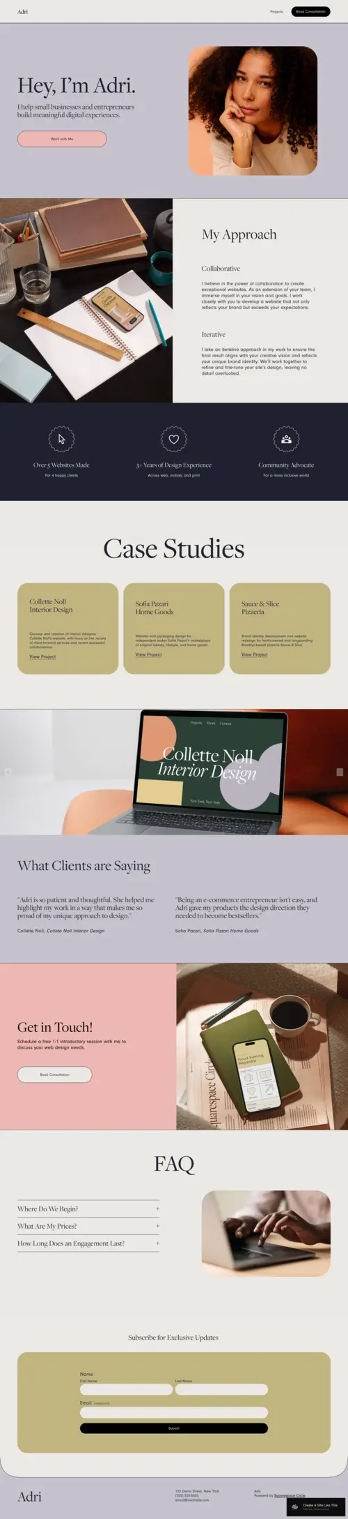
Adri
Best for Freelance Developers & Creative Tech Portfolios ✓ Pros
- Warm, inviting design differentiates freelance developers who build client relationships as much as they build software - the approachable aesthetic communicates that you're a person to work with, not just a vendor to transact with.
- Case study and testimonial sections are architecturally prioritised - making it easy for freelance developers to showcase specific project outcomes and client relationships that demonstrate both technical skill and collaborative approach.
- Pastel tones and smooth transitions create a polished but human aesthetic - the ideal positioning for creative developers, designer-developers, or front-end specialists where the visual quality of your website is itself a portfolio piece.
- Storytelling-forward layout supports the freelance developer who builds trust through personality and process explanation as much as through technical credentials - the design gives you space to explain how you work, not just what you've built.
- Intuitive customisation makes it straightforward to adapt Adri's colour palette and typography to match your personal brand - a front-end developer's Squarespace site should feel custom, and Adri makes that achievable without code.
✗ Cons
- The warm, approachable aesthetic may undersell seniority for experienced developers - clients looking for a senior technical consultant may initially underestimate expertise based on the friendly visual tone before reading your credentials.
- The pastel, soft design palette doesn't suit developers with a bold, high-contrast brand identity - coders who want their website to communicate intensity or technical edge will find Adri's warmth works against that positioning.
- The relationship-first layout is less efficient for purely transactional engagements - developers who take on high volumes of shorter, repeating project work may find the personal storytelling emphasis adds friction to a straightforward "here's what I do, here's my rate, let's work" communication.
Adri is for the developer who has figured out that the best clients don't hire based on a tech stack - they hire based on trust. The warm design, the case study focus, the approachable personality - this template is built for the freelance coder who leads with relationship and backs it up with results. If your best projects have come through referrals and long-term client partnerships, Adri reflects the practice that produced them.
Suhama
Best for Developer Content Creators & Technical Writers ✓ Pros
- Striking typography and bold visual design make written content impossible to ignore - for developers who build their reputation through technical writing, tutorials, or public-facing knowledge sharing, Suhama turns words into a design feature rather than an afterthought.
- Blog-forward layout is optimised for developers producing ongoing written content - code tutorials, engineering deep-dives, technical career advice, and case study narratives all have a natural home in Suhama's content architecture.
- Minimalist navigation keeps the focus on content discovery - visitors who arrive at a developer's Suhama site are there to read and learn, and the streamlined navigation honours that intent rather than distracting from it.
- Bold typography and intentional spacing create a reading experience that signals the content is worth the time investment - a credibility signal that generic blog layouts don't create for technical writers building an audience.
- Visual content organisation makes it easy to present a library of technical writing, project documentation, or developer resources in a format that grows as your content archive deepens.
✗ Cons
- Suhama is optimised for content-first developer brands - coders who want to lead with a project portfolio, services page, or hiring CTA will find the blog-forward structure puts those conversion elements in secondary position.
- The bold orange tones and striking typography are distinctive but specific - developers with brand identities built around different colour palettes or more reserved visual aesthetics will need significant restyling before Suhama fits.
- Best suited for developers who are already producing content consistently - a Suhama site with a sparse or inactive blog looks incomplete in a way that a portfolio-first template with fewer projects does not.
Suhama is for the developer who has figured out that writing about code builds the reputation that gets you the best clients - or the best job offers. The bold typography, the content-forward layout, the clean reading experience - this is the template for developers who understand that in public technical discourse, how clearly you explain your thinking is as impressive as what you've built.
Forma
Best for Bold Developer Entrepreneurs & Course Creators ✓ Pros
- High-contrast, bold visual design communicates entrepreneurial confidence - for developers who have moved beyond freelancing into building a brand, a course business, or a digital product, Forma's energy reflects the ambition of the business rather than the caution of a job seeker.
- Course and digital product sections give developer-educators the dedicated layout architecture to present paid learning products, technical workshops, or cohort programmes clearly and convincingly - with pricing, curriculum, and CTA all in the right sequence.
- Bold typography and interactive design elements guide visitors through a defined journey - from brand introduction to product or service to conversion - making Forma naturally suited to sales-focused developer brands with a clear offer.
- Endless customisation flexibility lets developer-entrepreneurs adapt Forma's bold palette and layout to their specific brand identity without breaking the visual system - ideal for coders who want their site to feel genuinely custom without a development project.
- High-energy, dynamic structure appeals to the developer audience that Forma targets - builders, entrepreneurs, and tech creators who expect a brand to show up with conviction and match the ambition they already have.
✗ Cons
- The bold, high-energy aesthetic is built for developer brands with a clear product or service to sell - coders building a passive portfolio to attract employment or freelance enquiries may find Forma's entrepreneurial energy creates the wrong expectations about their engagement model.
- The high-contrast, bold design requires an equally bold and consistent brand identity to fill - without a clear visual direction and confident copy, Forma's intense layout can feel overwhelming rather than authoritative.
- Best suited for developers at the product-building or business-building stage - early-career coders without a digital product, course, or established client base will struggle to fill Forma's high-intention layout with credible content.
Forma is for the developer who stopped trading time for money and started building leverage. The bold design, the course sections, the high-energy architecture - this is the template for the coder who has turned their technical expertise into a product, a programme, or a platform. If your biggest opportunity isn't the next client engagement but the next 1,000 people who could learn from your experience, Forma is the template built for that ambition.
How to Choose the Right Squarespace Template for Your Coder Website
Match the Template to Your Professional Positioning, Not Your Tech Stack
The biggest mistake coders make when choosing a website template is selecting based on how they see themselves (as a technical professional) rather than how their target audience needs to see them (as a credible, trustworthy solution to a specific problem). Carroll suits the clean-cut professional positioning that appeals to corporate and mid-market clients. Corrigan is built for the authority-first consultant targeting enterprise or agency clients. Adri works for the relationship-led freelancer who wins through trust and collaboration. Suhama is for the developer-educator building a public brand through content. Forma is for the developer-entrepreneur who sells a product rather than a service. Choose the template that positions you the way your best future clients or opportunities need to see you - then back it up with the right copy.
Decide Whether Your Site's Primary Goal Is Portfolio, Conversion, or Content
Developer websites serve different primary purposes, and the template needs to reflect that. If your site's job is primarily to showcase project work for a hiring manager or potential client who already knows who you are (portfolio mode), Carroll and Adri both give your work the right kind of visual space. If your site's job is to convert visitors who don't know you yet into leads, clients, or bookings (conversion mode), Corrigan and Forma's service-forward and product-forward structures handle that journey better. If your site's job is to build an audience through content and establish thought leadership (content mode), Suhama is specifically architected for that function. Be clear on the primary goal before choosing - trying to do all three equally often means doing none of them well.
Consider What Your Target Client or Employer Can Actually Evaluate
Non-technical clients can't read your GitHub repositories, review your pull requests, or evaluate your code quality - they can only judge the quality of your communication, the clarity of your thinking, and the credibility of your presentation. Technical hiring managers can do all of the above, but they first make a gut judgement about whether your site reflects the level of care you put into your work. Both audiences need your coder website template to communicate competence through design quality, navigation clarity, and content specificity. Carroll, Corrigan, and Adri all do this through professional presentation. Suhama does it through the quality of written explanation. Forma does it through the confidence of its sales structure. Choose based on which type of credibility signal matters most to the specific audience you're targeting.
Think About Where You Want to Be in Two Years, Not Just Today
A coder's website is a professional positioning document, not just a portfolio holder - and the template you choose signals where you're headed as much as where you are. Adri works for freelancers who want to grow through deeper client relationships. Corrigan works for those scaling toward agency or consultancy. Suhama supports the developer building thought leadership toward speaking, writing, or teaching roles. Forma is for the developer moving toward products, courses, or digital business. Choose the template that reflects your two-year goal, not just your current output - because the clients and opportunities that find you through your website will be calibrated to the positioning it creates.
Frequently Asked Questions
What is the best Squarespace template for a coder website?
Should a coder have a personal website?
What should a coder include on their website?
Is Squarespace good for developer websites?
How much does a coder website on Squarespace cost?
Can I showcase coding projects on Squarespace?
What do clients look for on a freelance developer website?
How do I make my coder portfolio stand out on Squarespace?
How We Evaluate Templates
Conclusion: Choose the Coder Website Template That Positions You for What's Next
The best developer portfolio isn't the most technically impressive - it's the one that makes the right person on the other side of the screen immediately understand what you do, why you're good at it, and how to work with you. Carroll makes that statement cleanly. Corrigan makes it authoritatively. Adri makes it warmly. Suhama makes it through the quality of explanation. Forma makes it with entrepreneurial conviction.
Pick the template that reflects your professional positioning two years from now, fill it with specific outcomes rather than generic credentials, and let your Squarespace coder website do the reputation-building work while you focus on the code. Didn't find the right fit here? Our guides to YouTuber templates and graphic designer templates cover adjacent creative-professional niches worth exploring.
* Read the rest of the post and open up an offer