
Editor's Picks
| # | Name | Best For | Price | Rating | Image | |
|---|---|---|---|---|---|---|
| 1 | Wedding photographers who prioritize romance, storytelling, client testimonials, and showcasing full gallery collections from past weddings | Free | 4.9/5 |

|
More Info | |
| 2 | Wedding photographers with a timeless, editorial aesthetic who want an ultra-clean portfolio where images command complete attention | Free | 4.8/5 |

|
More Info | |
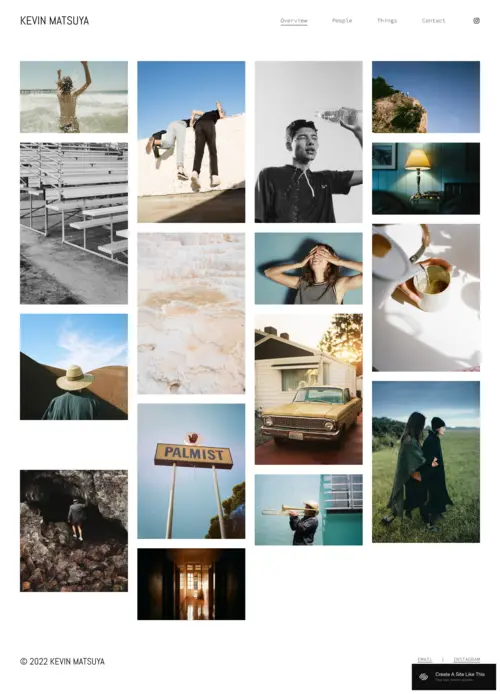
| 3 | Documentary, photojournalistic, and candid wedding photographers with large galleries who want a grid-style portfolio showcasing volume and story | Free | 4.7/5 |
|
More Info | |
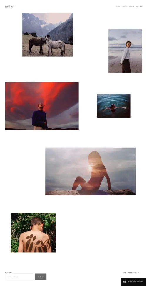
| 4 | Wedding photographers with an artistic, editorial, or fine art style who want full-screen imagery and an immersive, emotional portfolio experience | Free | 4.7/5 |
|
More Info | |
| 5 | Wedding photographers who shoot multiple styles, themes, or venue types and need a well-organized, category-navigable portfolio | Free | 4.6/5 |
.png)
|
More Info |
Our Picks: The Best Wedding Photography Website Squarespace Templates
Laurie
Best for Romantic, Story-Driven Wedding Photographers ✓ Pros
- Soft colors and warm typography create an immediately romantic atmosphere that resonates with engaged couples.
- The "Wedding Stories" gallery lets you organize past weddings as named, navigable collections rather than a flat grid.
- Testimonial sections are positioned within the page flow so social proof appears exactly when visitors are evaluating whether to trust you.
- The services and packages section makes it easy to present coverage options and pricing tiers in a polished, professional way.
- Every section follows the natural decision-making journey of a couple searching for a photographer, doing meaningful conversion work before you write a word of copy.
✗ Cons
- Photographers with dark, moody editing styles may find the soft default palette creates a visual disconnect with their images.
- The richly sectioned layout can feel dense if you don't have enough strong content to fill each area meaningfully.
- Copy quality matters more here than on purely image-led templates, so photographers uncomfortable with writing will need to invest in the words.
Laurie is the strongest all-around option for wedding photographers who want their website to tell a story, not just show photos. The Wedding Stories gallery, testimonials, and services section create a journey that naturally moves couples from admiring your work to booking a call. The soft, romantic design is strategically aligned with how engaged couples feel when searching for their photographer. If you want a template that balances beauty with genuine conversion capability, Laurie is the one to start with.
Quincy
Best for Minimalist Wedding Photographers Who Let Images Lead ✓ Pros
- Generous whitespace and minimal chrome let individual photographs carry the full emotional weight of every page.
- The timeless, editorial quality means the design ages gracefully alongside your portfolio rather than becoming dated.
- Call-to-action placement guides visitors naturally toward inquiry without heavy-handed buttons or interruptive pop-ups.
- The layout excels with large, horizontal image formats - wide-frame ceremony shots and grand venue compositions look stunning here.
- Strong mobile performance preserves the clean hierarchy and image quality of the desktop version on every device.
✗ Cons
- Fewer pre-built content sections mean photographers who want testimonials pages or pricing tables must build them from scratch.
- The reserved aesthetic can make warmer, personality-forward brands feel unintentionally distant.
- Inconsistencies in editing style or aspect ratios are more noticeable here than in busier templates, raising the bar for curation.
Quincy is the definitive choice for wedding photographers who believe their images should be the only thing a visitor notices - and who have the portfolio to back that up. Its editorial restraint creates a viewing experience that feels less like a commercial website and more like a curated exhibition. The template demands strong, consistent imagery but rewards it with a presentation that feels genuinely sophisticated. For photographers whose brand is built on image quality and timeless style, Quincy is as close to a perfect match as Squarespace offers.
Matsuya
Best for Documentary & Candid Wedding Photographers ✓ Pros
- The grid-style layout handles volume naturally, communicating comprehensive coverage rather than a curated handful of posed portraits.
- Evenly-spaced image tiles give spontaneous, candid shots the same visual authority as carefully staged portraits.
- Clean, unobtrusive navigation and a neutral color scheme keep the interface completely out of the way of the photography.
- The flexible grid accommodates mixed aspect ratios without forcing crops, matching the natural variation in documentary work.
- The structure scales as your portfolio grows - adding new galleries deepens the evidence of experience rather than cluttering the page.
✗ Cons
- The grid's democratic treatment of all images doesn't create a single dramatic opening moment for impact-first photographers.
- Limited built-in space for service descriptions or testimonials means text-heavy marketers must work harder to integrate copy.
- The inquiry and booking section requires manual setup, unlike templates with booking-oriented sections pre-built into the design.
Matsuya is the best Squarespace option for documentary photographers who want their website to communicate the full story of a day with them, not just a highlight reel. The grid works exceptionally well for photographers who shoot candidly from getting-ready through to the late-night dancing, naturally communicating comprehensive coverage. The template isn't trying to impress with design - it lets the photography do that work entirely. For documentary photographers with strong, consistent portfolios, Matsuya presents the work in the most direct and honest way possible.
Arthur
Best for Artistic & Editorial Wedding Photographers ✓ Pros
- Full-screen images fill the entire viewport, creating an experience closer to standing in front of a print than browsing a website.
- Minimal structural interference lets image sequences tell a visual story on their own terms without narration.
- The dark-leaning palette makes high-contrast, cinematic, or moody imagery look stunning in a way lighter templates cannot replicate.
- The visual confidence communicates a strong creative point of view that attracts couples who value artistic identity.
- Despite its artistic leanings, navigation is clear, pages load efficiently, and the mobile experience preserves the full immersive impact.
✗ Cons
- The design deprioritizes text, making it a poor fit for photographers who rely on detailed written descriptions to market themselves.
- Brighter, airier wedding styles can look washed out against the template's darker sensibility.
- Trust-building sections like testimonials and pricing require manual setup in a layout not designed to highlight them.
Arthur is the most emotionally immersive template in this roundup, and for photographers with a fine art approach it creates an experience that genuinely matches the ambition of their work. The full-screen format doesn't just display photographs - it makes visitors feel something, which is exactly what editorial wedding photographers aim for in every image they take. The template demands exceptional images to justify the drama of its presentation, but for photographers who have them, Arthur elevates the portfolio far beyond what a conventional layout achieves. It's the right choice for photographers who think of their work as art and want their website to say so.
Pazari
Best for Versatile Wedding Photographers with Multiple Style Categories ✓ Pros
- Category-navigable structure lets couples quickly find examples directly relevant to their own wedding style or venue.
- The clean visual hierarchy communicates professional organization and reliability to methodical, detail-oriented couples.
- Adding new service categories - engagement sessions, elopement packages, maternity shoots - fits naturally without disrupting the layout.
- Categorized gallery pages support keyword-rich URLs that target different search queries, giving a structural SEO advantage over single-gallery templates.
- The broad, non-polarizing aesthetic appeals across age groups, aesthetic preferences, and geographic markets.
✗ Cons
- The functional first impression lacks the immediate emotional impact of Arthur's immersion or Laurie's romantic warmth.
- The category structure feels sparse if your portfolio is concentrated in one style - photographers early in their career may be better served by a single-gallery template.
- The clean design has less inherent personality, requiring more investment in copy and typography to avoid reading as generic.
Pazari is the right template for the wedding photographer who knows couples want evidence of range, adaptability, and professional organization - not just beautiful images. The category-navigable structure makes it effortless for a beach elopement couple to find your coastal work, or a ballroom couple to see you're equally at home in formal settings. The template isn't trying to dazzle; it's trying to build confidence, and for photographers whose greatest asset is versatility, it does exactly that. Pazari gets better with every wedding you add to it.
How to Choose the Right Wedding Photography Squarespace Template
Align the Template's Mood with Your Photography Style
The single most important factor when choosing between squarespace wedding photography templates is whether the template's visual mood matches the emotional register of your photography. A soft, romantic template like Laurie will amplify warm, golden-hour imagery but may feel incongruent with a dark, moody style better served by Arthur's dramatic presentation. Your website should feel like a natural extension of your images - as if the template was chosen to frame your specific work rather than adapted from a generic starting point. Take the time to mentally place your strongest images into each template before committing: does the overall experience feel coherent, or does the design fight with the photography?
Prioritize Gallery Quality and Image Display
Not all gallery layouts treat images equally, and the differences matter enormously for wedding photography. Full-screen templates like Arthur prioritize individual image impact at the expense of volume, while grid-based templates like Matsuya communicate breadth but reduce each image to a smaller scale. Consider how you actually shoot: if your strongest work is a sequence of candid moments, a grid will represent your work more faithfully than a full-screen slideshow where only one image is visible at a time. Pay attention to image loading speed, display resolution, and how well the gallery translates to mobile - where a significant share of your traffic will arrive.
Consider Your Client Booking and Inquiry Workflow
Wedding photography bookings rarely happen in a single session - couples browse, leave, discuss, and return before making contact, so your inquiry process needs to be frictionless every time. Look for templates with clear, accessible contact sections that are easy to find from any point in the browsing experience. Consider whether you want to integrate Squarespace's built-in scheduling tools so couples can book a consultation call directly. Templates like Laurie that include dedicated services sections help pre-qualify inquiries by giving couples pricing information upfront, leading to more informed and serious first contacts.
Think About Trust-Building Elements Like Testimonials and Packages
Hiring a wedding photographer is one of the most emotionally significant vendor decisions a couple makes, so trust-building elements carry more weight here than in almost any other service category. Testimonials are particularly powerful when they describe how you made the couple feel during the day, not just how the photos turned out. Look for templates that give testimonials appropriate visual prominence rather than burying them in a footer. Pricing transparency is increasingly expected by modern couples, and templates with structured services sections filter for clients whose budget aligns with your rates before the inquiry stage.
Frequently Asked Questions
What is the best Squarespace template for a wedding photographer?
Do Squarespace wedding photography templates include booking forms?
Can I add a pricing page to my Squarespace wedding photography site?
How many photos should I include in my Squarespace wedding photography portfolio?
Can I use Squarespace to deliver galleries to wedding clients?
How do I get more wedding photography inquiries from my Squarespace site?
What Squarespace plan do I need for a wedding photography website?
Can I show different wedding photography styles on one Squarespace site?
How We Evaluate Templates
Conclusion: The Best Squarespace Wedding Photography Website Templates
Each of the five templates in this roundup serves a distinct kind of wedding photographer: Laurie for romantic storytellers, Quincy for image-led minimalists, Matsuya for documentary photographers with large galleries, Arthur for artistic and editorial fine art photographers, and Pazari for versatile professionals who need a well-organized, category-navigable portfolio. All five are genuinely strong choices that represent the best Squarespace has to offer for wedding photography websites, and any of them will give your work a professional, compelling online home.
The right template for you is the one whose visual mood, organizational structure, and conversion-oriented features most closely match your photography style, your client base, and the way you want to present yourself in the market - and with these five options covering the full range of wedding photography approaches, you will find your match here.
Looking for more photography template inspiration? Explore our picks for nature photographers, graphic designers, and fashion photographers. If you want to sell prints, Squarespace has templates ready for you to sell prints too. And if the couples you photograph want to build their own wedding site, send them our roundup of the best Squarespace wedding website templates.
* Read the rest of the post and open up an offer