
Editor's Picks
| # | Name | Best For | Price | Rating | Image | |
|---|---|---|---|---|---|---|
| 1 | Beauty educators, lifestyle coaches, creative instructors, and course creators with visually rich multi-course offerings | Free | 4.8/5 |

|
More Info | |
| 2 | Photography educators, art instructors, design course creators, and visual skills teachers who want bold minimal presentation | Free | 4.7/5 |

|
More Info | |
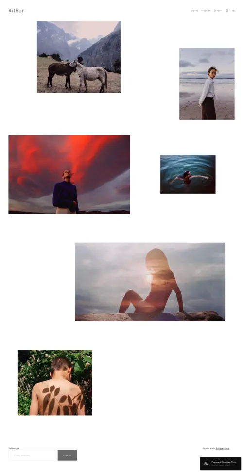
| 3 | Art educators, mindfulness instructors, personal development coaches, and creative course creators seeking a calm, spacious layout | Free | 4.7/5 |
|
More Info | |
| 4 | Wellness coaches, nutritionists, holistic health educators, and mindfulness teachers offering multi-format course content | Free | 4.8/5 |

|
More Info | |
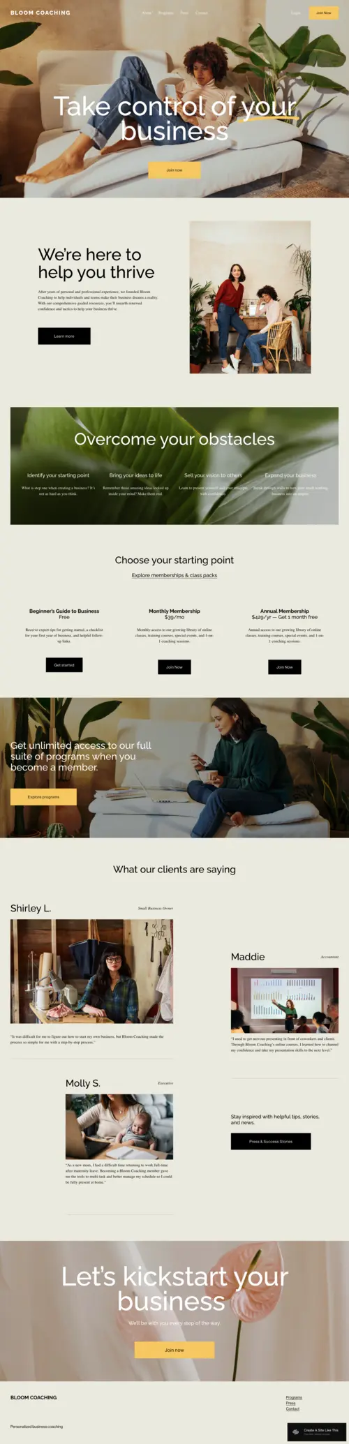
| 5 | Business coaches, life coaches, professional development educators, and course creators who need a structured, trust-building layout | Free | 4.8/5 |
|
More Info | |
| 6 | Creative course creators, media educators, interactive learning designers, and instructors who want an energetic, module-rich platform | Free | 4.7/5 |

|
More Info |
Our Picks: The Best Course Website Squarespace Templates
Kusa
Best for Beauty, Lifestyle & Creative Course Creators ✓ Pros
- Kusa’s warm, editorial design conveys expertise and lifestyle authority, with rich imagery and generous whitespace creating a premium, magazine-like feel that builds trust instantly.
- Its grid-based layout cleanly showcases multiple courses at once, with well-spaced cards for titles, descriptions, and clear calls to action.
- Built-in testimonial sections are seamlessly integrated and placed near enrollment prompts to maximise social proof and conversions.
- Spacious instructor bio areas allow for strong personal branding, combining imagery, narrative, and credentials to highlight your identity as an educator.
- The layout is optimised for engagement, guiding visitors through a clear, conversion-focused flow from introduction to enrollment.
✗ Cons
- Kusa’s lifestyle-focused aesthetic may require significant customization for more technical or corporate subjects to convey the right authority.
- Its reliance on high-quality imagery can be limiting without professional visuals, as generic stock photos may weaken the intended premium feel.
- More complex layouts can feel crowded on mobile if overfilled with text, requiring careful editing and mobile preview checks.
Kusa is one of the most visually compelling free Squarespace templates available for creative course creators - it manages to feel both aspirational and approachable, which is exactly the tone many lifestyle educators need to convert visitors into students. The multi-course layout options make it genuinely practical for instructors with a growing curriculum, not just those launching a single workshop. It strikes a rare balance between beauty and function, and the testimonial placement is particularly well thought out for driving enrollment. If your personal brand is central to your course business, Kusa gives it the visual stage it deserves.
Gilden
Best for Photography, Art & Visual Skill Courses ✓ Pros
- Gilden’s bold, minimal design lets visuals lead, making it ideal for showcasing work quality-especially effective for photography and art courses.
- Structured sections support course bundles and tiered learning paths, clearly communicating progression without complex setup.
- Clean, minimal navigation reduces friction and keeps focus on content, helping users move quickly toward enrollment.
- Full-width imagery creates a strong first impression, signaling high visual standards and reinforcing instructor credibility.
- Its restrained design is flexible across creative disciplines, framing content without competing with it.
✗ Cons
- Gilden’s minimal structure offers limited support for large course catalogs, making it better suited to curated selections than extensive platforms.
- Its bold, opinionated typography may feel too avant-garde for traditional or corporate audiences without customization.
- The visual-first layout can be restrictive for text-heavy content, requiring tighter editing and formatting for longer descriptions.
Gilden is the standout choice for any course creator whose work is inherently visual - the template's bold minimalism creates an immediate credibility signal that speaks directly to students looking to develop their own visual skills. The clean navigation and strong imagery blocks keep the focus exactly where it should be: on the quality of the instructor's work and the outcomes students can achieve. It handles course bundle presentations particularly well, making tiered curriculum structures feel organized rather than overwhelming. For photography educators, art teachers, and design course creators, Gilden delivers a level of visual sophistication that few free templates can match.
Arthur
Best for Art, Mindfulness & Personal Development Courses ✓ Pros
- Arthur’s calm, spacious design suits mindfulness and creative education, encouraging slower, more intentional engagement.
- It handles long-form text exceptionally well, keeping detailed course descriptions clear and visually appealing.
- Dedicated sections highlight instructor philosophy and teaching style, helping build trust and personal connection.
- Its neutral, organic aesthetic adapts easily across niches with minimal customization.
- Strong mobile performance preserves readability and design quality across devices.
✗ Cons
- Arthur’s minimalist aesthetic can feel too subtle in competitive niches, requiring stronger branding to stand out.
- Limited built-in support for multi-course catalogs means more manual setup for larger offerings.
- Its calm pacing may reduce urgency, making strong CTAs important for driving conversions.
Arthur is a beautifully considered template that earns its place on this list through sheer appropriateness - for mindfulness teachers, personal development coaches, and art educators, the calm spaciousness of the layout is not a design choice but a brand statement. The long-form text sections handle curriculum descriptions and instructor philosophy with an elegance that few templates match. It doesn't try to dazzle with complexity; instead it builds quiet confidence in the instructor and their work, which is exactly what students in transformational learning niches are looking for. With some deliberate CTA optimization, it converts thoughtful browsers into committed students.
Myhra
Best for Wellness, Nutrition & Holistic Lifestyle Courses ✓ Pros
- Myhra’s warm, organic design is ideal for wellness niches, creating an emotionally aligned, trust-building first impression.
- It supports multi-format content seamlessly, accommodating video, audio, and written materials within one cohesive layout.
- Built-in sections for transformation stories go beyond basic testimonials, helping illustrate real client outcomes.
- Lead magnet and opt-in areas are naturally integrated, supporting effective course funnels without extra design work.
- Strong mobile performance maintains its visual warmth and readability, especially for social-driven traffic.
✗ Cons
- Myhra’s strong wellness aesthetic can feel mismatched in other niches, requiring significant customization to maintain credibility.
- Its soft, organic style doesn’t easily support high-urgency sales elements without disrupting the overall tone.
- Image-heavy sections can impact page speed if not optimized, making careful image compression important for performance and SEO.
Myhra earns its top rating for wellness and nutrition course creators by doing something most templates struggle with: it feels genuinely congruent with the values and aesthetic language of the holistic health space rather than simply approximating them. The multi-format content sections are a standout feature for educators whose programs combine video, audio, written guides, and live workshops into a single offering. The transformation story sections are particularly well executed and give wellness coaches a real structural advantage in building the emotional case for enrollment. If your course business lives in the wellness, nutrition, or holistic lifestyle space, Myhra is arguably the single most appropriate free template Squarespace offers.
Bloom
Best for Business Coaching & Professional Skills Courses ✓ Pros
- Bloom’s clean, structured design builds immediate trust and positions instructors as credible professionals.
- Clear sections for curriculum, modules, and learning outcomes help reduce friction and answer key pre-purchase questions.
- Strong testimonial and case study layouts highlight measurable results, ideal for business-focused audiences.
- Well-designed pricing sections make it easy to present tiers, plans, and packages clearly and persuasively.
- Consistent, professional mobile performance preserves clarity and credibility across devices.
✗ Cons
- Bloom’s professional, structured design can feel too corporate for relationship-driven niches, requiring customization to add warmth and personality.
- Its formulaic layout may limit creative expression for instructors with a distinctive or unconventional brand.
- Conservative section transitions and styling can make the site feel less visually dynamic, needing proactive updates to stay contemporary.
Bloom stands out in the course template space because it solves one of the hardest problems in online education marketing: getting analytically-minded professional audiences to trust an instructor enough to invest in a course. The structured layout, curriculum section design, and results-oriented testimonial placement all work together to build a compelling professional case for enrollment rather than relying on emotional appeal alone. The pricing section handling is particularly strong, making it easier to present complex enrollment options clearly and confidently. For business coaches, professional skills educators, and anyone selling to a corporate or entrepreneurial audience, Bloom delivers the credibility architecture that converts.
Forma
Best for Dynamic, Interactive & Creative Online Course Platforms ✓ Pros
- Forma’s energetic, dynamic design signals innovation and creative confidence, immediately positioning instructors as forward-thinking.
- Its module-rich layout organizes complex, multi-part curricula clearly, reducing enrollment hesitation for intensive courses.
- Media-rich sections integrate video, audio, and interactive content seamlessly, framing multimedia as a core value.
- Visually dynamic design captures social media traffic effectively, maintaining brand energy and reducing bounce rates.
- Highly adaptable across creative disciplines, Forma can be personalized while retaining its professional, energetic identity.
✗ Cons
- Forma’s energetic design may feel inappropriate for serious or formal courses, making Bloom or Arthur better suited for credibility-focused subjects.
- Its visually complex layout amplifies content quality, so low-quality or inconsistent assets can look especially out of place.
- Elaborate section combinations for large curricula require careful planning and more setup time, making pre-built content outlines essential.
Forma is the template for course creators who want their site to feel as energetic and innovative as the content they teach - it brings a visual dynamism to the course website space that most free Squarespace templates simply do not attempt. The module-rich layout architecture is one of its most practically valuable features, making it genuinely capable of supporting comprehensive, multi-part curricula without the site feeling cluttered or hard to navigate. The media content integration is particularly well executed, treating video and audio previews as first-class design elements rather than embedded afterthoughts. For creative educators who live at the intersection of teaching and media production, Forma provides a design foundation that does justice to the sophistication of what they offer.
How to Choose the Right Squarespace Course Website Template
Match the Template's Visual Energy to Your Course Subject Matter
One of the most important and most underappreciated criteria when choosing squarespace course templates is visual-tonal alignment between the template's aesthetic energy and the emotional register of your course subject matter. A mindfulness meditation course and a business acceleration bootcamp may both be excellent courses, but they need fundamentally different design energy to speak credibly to their respective audiences - the first needs calm and spaciousness, the second needs confidence and structure. Choosing a template that is tonally misaligned with your niche creates a subtle but real credibility gap that can suppress enrollment even when every other element of your marketing is strong. Work through the six options above with your specific student avatar in mind: what would they feel when they landed on each design? Which template communicates, at a visual and emotional level, that the instructor understands their world? That question, more than any list of features, should guide your final choice.
Consider How Many Courses and Content Types You're Offering
The scale and diversity of your course catalog is a practical constraint that narrows your template options meaningfully. If you are launching a single flagship course, almost any of the six templates above can work well with a focused, single-course layout approach - but if you are building a multi-course platform with beginner, intermediate, and advanced tracks across different subjects, you need a template with genuine multi-course catalog architecture built in. Kusa and Forma are the strongest performers for multi-course presentations, offering grid and card-based section layouts that scale gracefully as your catalog grows. Instructors who offer a mix of content types - live cohorts, self-paced video courses, downloadable guides, and one-on-one coaching packages - also need to think carefully about whether their chosen template can present this variety clearly without the page feeling chaotic. Building out a quick wireframe of your full curriculum before selecting a template will help you assess which design can accommodate your content volume and variety most naturally.
Think About Your Enrollment and Sales Funnel Needs
Different course websites require different conversion architectures depending on price point, audience temperature, and sales approach. A high-ticket group coaching program priced at several thousand dollars needs a template that can support a long-form sales page with substantial social proof, curriculum details, instructor credibility sections, FAQ content, and multiple CTA placements - Bloom and Kusa handle this sales page architecture particularly well. A lower-ticket self-paced course sold primarily to warm audiences from a social media following may work better with a cleaner, faster-moving template that gets visitors to the purchase button quickly without overwhelming them with detail. Think about where your students are in the awareness journey when they arrive on your site: cold traffic from search needs more context and trust-building, while warm traffic from your email list needs less friction and more direct enrollment pathways. Matching your template's structural capacity to your actual sales funnel requirements is the difference between a beautiful site and a high-converting one.
Factor In Your Ongoing Content Strategy
A course website is rarely a static asset - most successful online educators are constantly publishing new content, launching updated courses, running promotions, and building community around their brand. If your course business includes an active blog or content marketing strategy, choose a template that integrates blog sections naturally rather than treating them as an afterthought relegated to a separate page. Templates that support newsletter opt-in sections, resource libraries, and community feature integration will serve growing course businesses better over the long term than those optimized only for single-course sales. Consider also how the template will evolve with your brand: starting with a template that has structural flexibility and Squarespace's Fluid Engine compatibility gives you significantly more room to adapt your site as your courses, audience, and content strategy mature without needing a full redesign every time your business model evolves.
Frequently Asked Questions
What is the best Squarespace template for a course website?
Can I sell online courses directly through a Squarespace template?
Do Squarespace course templates include video support?
What Squarespace plan do I need to run an online course website?
Can I add a blog to my Squarespace course website?
How do I add student testimonials to my Squarespace course site?
Can I offer free and paid courses on the same Squarespace site?
How do I make my Squarespace course website rank on Google?
How We Evaluate Templates
Conclusion: The Best Squarespace Course Website Templates for Online Educators
Kusa, Gilden, Arthur, Myhra, Bloom, and Forma represent the strongest options in Squarespace's template library for building a course website that converts - each brings a distinctive design approach and structural capability that makes it the right fit for specific course niches, content formats, and audience types. Together they cover the full range of online education use cases, from single-course lifestyle programs to comprehensive multi-module professional development platforms.
The right template for your course website is the one that feels most congruent with your niche, your students, and the scale of your current and planned curriculum - start there, and use the evaluation criteria above to make the final call with confidence.
If you're building a course website on Squarespace, you may also want to explore our picks for restaurants, retail, and events.
* Read the rest of the post and open up an offer