Editor's Picks
| # | Name | Best For | Price | Rating | Image | |
|---|---|---|---|---|---|---|
| 1 | Quirky e-commerce brands, collectibles, handmade goods, candles, crafts, and products with a personality-first identity | Free | 4.8/5 |
|
More Info | |
| 2 | Fitness studios, dance schools, community-driven businesses, and brands built on energy, movement, and belonging | Free | 4.7/5 |
|
More Info | |
| 3 | Language tutors, creative educators, coaches, and instructors who want a warm, playful online presence that makes learning feel exciting | Free | 4.7/5 |
|
More Info |
Our Picks: The Best Squarespace 90s Website Templates
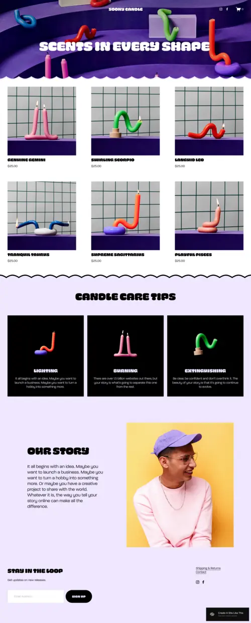
Soony
Best for Quirky E-Commerce Brands & Products With Personality ✓ Pros
- Curvy graphics, bold chunky colors, and a deliberately unconventional layout deliver the 90s website aesthetic with precision and intent - this is retro design that knows exactly what it's doing, not a generic template with a color swap applied on top of an otherwise standard layout.
- Product display architecture gives each item a visual moment of its own, which is exactly the right approach for quirky, artisanal, or collectible products where the individual character of each piece is a primary selling point rather than a commodity to be bulk-displayed in a grid.
- Modern responsiveness and smooth navigation sit underneath the retro visual layer - visitors get the nostalgia hit of an early web aesthetic without the usability frustrations that actual 90s websites inflicted, which means the charm works on mobile without alienating anyone.
- The template's visual personality does brand differentiation work that no amount of standard e-commerce copy can replicate - for brands competing in crowded Etsy-adjacent markets, a site that looks like nothing else online is a conversion advantage that compounds with every returning visitor.
- Versatile enough for physical products across multiple categories - candles, crafts, art prints, collectibles, vintage finds, and any other product that benefits from being presented with maximum personality rather than maximum efficiency.
✗ Cons
- The bold, unconventional visual language is a strong brand commitment - businesses in professional services, healthcare, finance, or any sector where visual credibility and authority are primary trust signals will find Soony's playful retro aesthetic actively undermines the positioning they need.
- The quirky layout performs best with products that are themselves quirky or distinctive - generic, commodity products presented in Soony's retro setting may feel tonally mismatched, with the design implying a personality the product range doesn't support.
- The high-personality aesthetic demands brand consistency throughout - photography, copy tone, and product selection all need to align with the retro-modern identity Soony creates, and a partially committed execution (retro template, generic product photography, corporate copy) will feel incoherent rather than charming.
Soony is the 90s website template for brands that understand their visual identity is a competitive weapon. The curvy graphics, the chunky color work, the product-forward layout - everything is designed to make visitors feel they've found something genuinely different online, not just another Squarespace store. For e-commerce brands whose products carry the same energy as the template - irreverent, individual, made with love and a distinct point of view - Soony creates a digital space where the personality of the brand and the personality of the shopping experience become the same thing.
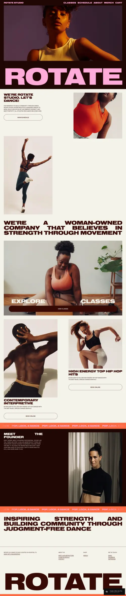
Rotate
Best for Fitness Studios, Community Spaces & High-Energy Brands ✓ Pros
- Bold, large-format typography and strong visual architecture capture the energetic, rebellious spirit of 90s website design while serving the specific communication needs of fitness and movement brands - big statements, fast clarity, and an immediate sense of what kind of community you're joining.
- Class schedule, instructor biography, and community storytelling sections are all naturally accommodated within the template's layout, giving fitness studios and community spaces the functional architecture they need without sacrificing the visual identity that makes Rotate memorable.
- High-contrast design philosophy creates visual impact at every scroll point - a crucial quality for fitness and community brands that need to sustain attention and motivate action through the browsing experience, not just at the hero image.
- The template's expressive, fearless visual language communicates the judgement-free, welcoming energy that defines successful community fitness spaces - the design itself does some of the community-building work before a visitor reads a single word of copy.
- Genuinely flexible across movement disciplines - dance, yoga, CrossFit, HIIT, cycling, barre, martial arts - the bold design principle adapts to different energy levels and aesthetics without losing the core 90s website template personality that makes it stand out.
✗ Cons
- The bold, high-energy design is calibrated for brands where intensity and community are the product - service businesses outside the fitness and movement space that need visual calm, professional restraint, or clinical authority will find Rotate's expressive aesthetic tonally incompatible with their positioning.
- The visual impact of the template depends significantly on strong, action-forward photography from real studio sessions - a Rotate site built with stock fitness imagery or posed, static photos loses the authentic community energy that the design is built to amplify.
- The bold color palette and strong visual statements mean Rotate is less adaptable to brand color schemes that are soft, muted, or pastel - the template performs at its best with high-contrast, saturated palettes that match its design energy.
Rotate channels the 90s website aesthetic into something more purposeful than pure nostalgia - it uses that bold, expressive visual language to communicate exactly what a community-driven fitness brand needs to communicate: that this is a place with energy, with personality, and with a point of view. The large fonts, the strong imagery, the class and community sections - everything is built for the brand that wants to attract people who care about belonging as much as training. For studios and spaces that thrive on that intersection of movement and community, Rotate creates the digital atmosphere that makes the right people feel immediately at home.
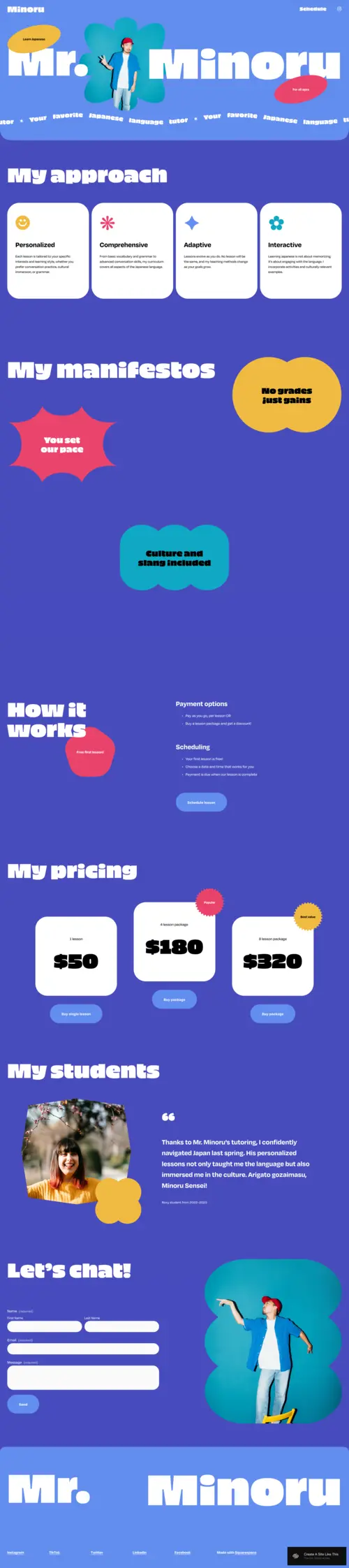
Minoru
Best for Educators, Tutors & Creative Mentors With a Playful Brand ✓ Pros
- Bright, playful color palette and interactive layout deliver the cheerful, maximum-personality energy of 90s website builders - for educators and tutors who understand that the approachability of their digital presence is part of their student acquisition strategy, Minoru creates the right first impression before a lesson description is read.
- Scheduling and pricing sections are clear and easily navigable within the playful layout - the design doesn't sacrifice usability for personality, which is the fundamental challenge of retro web design done well, and Minoru solves it more elegantly than most 90s-influenced templates.
- The conversational, warm visual tone is specifically effective for educational businesses targeting younger learners, their parents, or adults who find formal, clinical educational website templates off-putting - the design signals accessibility and encouragement before any copy makes those claims.
- Bold fonts and interactive visual elements create a sense of anticipation and engagement that mirrors the experience of a genuinely good class - visitors who enjoy browsing the website are already primed for a positive learning relationship, which is a meaningful head start on the conversion journey.
- Versatile across educational sub-niches - language tutoring, music lessons, art classes, creative writing coaching, STEM tutoring - without requiring significant restyling, making Minoru one of the most broadly applicable 90s website templates for the education sector.
✗ Cons
- The playful, high-energy aesthetic is calibrated for educators who want warmth and approachability - tutors and coaches targeting corporate clients, professional certification programmes, or executive education audiences may find Minoru's tone too informal for the credentialed, authority-first positioning those audiences expect.
- The bold visual personality of the template requires copy and photography that match its energy - conservative, formal, or overly academic content will feel incongruous against Minoru's expressive design, and the mismatch will undermine the visual credibility the template creates.
- The scheduling section, while functional, may feel insufficient as a standalone booking architecture for tutors running complex multi-subject, multi-student scheduling operations - a dedicated booking tool integration will almost certainly be needed for anything beyond basic lesson enquiry capture.
Minoru takes the 90s website aesthetic and does something specific and smart with it - it uses that era's innate playfulness and visual generosity to communicate the one thing that educational businesses most need to convey before a student books: that learning here will feel good. The bright colors, the interactive design elements, the warm and conversational visual tone - all of it signals that whoever runs this educational business understands that how teaching feels is as important as what is taught. For educators who share that conviction and want their website to reflect it, Minoru is the template that makes that argument most naturally.
How to Choose the Right Squarespace 90s Website Template
Decide Whether You Want Retro Aesthetics or Retro Functionality
There's an important distinction between templates that reference 90s website design as a visual style - bold colors, expressive typography, unconventional layouts - and templates that attempt to recreate the actual functional limitations of early web design. All three templates reviewed here take the first approach: they use 90s visual language purposefully while delivering modern responsiveness, fast load times, and intuitive navigation. This is the right approach for any business that wants to leverage the cultural appeal of retro web design without inheriting its usability problems. Before choosing a 90s website template, clarify whether you want visitors to feel like they've discovered something fresh and distinctive (which all three templates achieve) or whether you're seeking a literal recreation of 1996-era web design (which is better served by custom development than any Squarespace template).
Match the Template's Energy to Your Brand's Energy
Soony, Rotate, and Minoru each embody the 90s aesthetic in a different emotional register. Soony's retro energy is playful, product-obsessed, and consumer-facing - it's built for brands where the product's personality is the whole point. Rotate's 90s influence is bold, communal, and physically expressive - it's designed for brands where movement, energy, and belonging are the core offer. Minoru's retro warmth is inviting, educational, and deliberately approachable - it's suited to businesses where making visitors feel welcome and capable is the primary conversion goal. Choosing the right 90s website template means finding the one whose emotional register matches the relationship your business wants to build with its audience, not simply the one that looks most like your conception of 90s design.
Consider What Your Visitors Already Associate With Retro Design
Different audiences carry different associations with 90s web design. Younger audiences (18-30) often experience retro aesthetics as fresh, ironic, and intentionally different - a deliberate counter-positioning against the minimalism that has dominated digital design for a decade. Older audiences who actually browsed the internet in the 90s may experience the aesthetic with genuine nostalgia. Both responses are conversion-positive in the right context - but understanding which response your audience is likely to have helps you calibrate how earnestly or how playfully to commit to the retro aesthetic in your copy and photography alongside the template.
Think About How the Template Serves Your Primary Conversion Goal
Every 90s website template should be evaluated first as a business tool. Soony's primary conversion architecture is product discovery and purchase - the visual environment is designed to make products feel desirable and individual. Rotate's primary conversion goal is community engagement and class booking - the design motivates visitors to sign up and show up. Minoru's conversion focus is lesson enquiry and scheduling - the warmth and approachability of the template reduce the hesitation that often prevents first-time students from reaching out. Match the template's conversion architecture to your business's revenue model, and the retro aesthetic becomes a differentiator that works for you rather than a novelty that entertains without converting.
Frequently Asked Questions
What makes a good Squarespace 90s website template?
Can a retro website template work for a modern business?
What types of businesses suit a 90s aesthetic website?
How do I make a Squarespace template look like a 90s website?
Is Squarespace good for retro-style websites?
What Squarespace plan do I need for a 90s style website?
Can I add e-commerce to a Squarespace 90s template?
How do I choose between Soony, Rotate, and Minoru for my 90s website?
How We Evaluate Templates
Conclusion: Squarespace 90s Website Templates That Make the Internet Feel Like Discovery Again
The best 90s website template doesn't just look retro - it makes visitors feel something. Soony makes them feel like they've found a brand with genuine personality in a sea of identical stores. Rotate makes them feel the energy of a community that values belonging as much as performance. Minoru makes them feel that learning something new here might actually be as enjoyable as the teacher promises.
In an era of minimalism-by-default, a well-executed 90s aesthetic is not a novelty - it's a positioning decision. The brands that choose it are communicating something specific: that they have a point of view, that they're not afraid to express it, and that their website is the first evidence of both.
Still exploring design directions? If you're drawn to the retro end of the spectrum, take a look at our picks for the best Squarespace retro templates and our selection of the finest modern Squarespace templates - between them, you'll find every point on the classic-to-contemporary spectrum. You can also adapt our hand-selected list of the best interactive templates to create exactly the distinctive look you're going for.
* Read the rest of the post and open up an offer