Editor's Picks
| # | Name | Best For | Price | Rating | Image | |
|---|---|---|---|---|---|---|
| 1 | Cocktail bars, speakeasies, and retro dining venues | Free | 4.9/5 |
|
More Info | |
| 2 | Vegan cafes, organic restaurants, and natural food brands | Free | 4.7/5 |
|
More Info | |
| 3 | Artisan soap, skincare, candle, and small-batch wellness brands | Free | 4.8/5 |

|
More Info | |
| 4 | Novelty products, candles, lifestyle brands, and bold ecommerce stores | Free | 4.7/5 |

|
More Info | |
| 5 | Fitness studios, movement coaches, and 90s-inspired athletic brands | Free | 4.8/5 |
|
More Info | |
| 6 | Tutors, educators, online coaches, and creative learning brands | Free | 4.6/5 |
|
More Info |
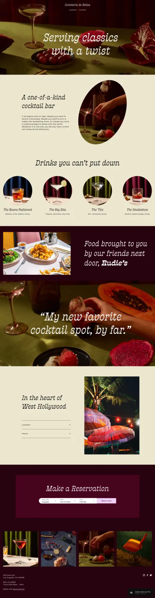
Belisa
Best for Cocktail Bars & Speakeasy Concepts ✓ Pros
- Bold, dark typography and moody color palette that immediately set the speakeasy atmosphere - your visitors feel the vibe before they read anything.
- Menu section layout highlights signature cocktails and dishes with the visual weight they deserve, not as a plain text list.
- Reservation-friendly design makes it easy to add a booking button or link to your table management system without disrupting the retro website aesthetic.
- Visual storytelling structure pulls visitors through the brand story - great for bars with a founding narrative or concept worth sharing.
- Dark backgrounds make photography pop, so food and cocktail imagery looks dramatically better here than on bright, minimal templates.
✗ Cons
- The dark, moody design isn't suited for bright or colorful brands - it works best when you fully commit to the speakeasy or vintage bar concept.
- Not the right fit for multi-concept venues that need to communicate several different aesthetic vibes on the same site.
- Text-heavy content (long menus, event listings, blog posts) can feel cramped against the dark background if not edited carefully.
Belisa doesn't just look like a retro bar - it feels like one. If you're running a cocktail lounge or speakeasy concept, this retro website template does half your marketing before a single word is read. Dark, moody, and dripping with personality. The template rewards commitment. Lean into it fully - bold drinks photography, punchy copy, minimal text - and Belisa becomes one of the most memorable retro website designs you can launch on Squarespace.
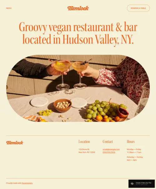
Hemlock
Best for Vegan Cafes & Organic Food Brands ✓ Pros
- Warm, earthy retro color palette that communicates organic and eco-conscious values without a word - perfect for plant-based brands that want their aesthetic to do the talking.
- Soft, playful typography strikes the balance between nostalgic and approachable, which is exactly what natural food brands need to feel genuine rather than corporate.
- Menu and specials layout integrates cleanly, making it easy to highlight seasonal dishes, daily specials, or changing menus without rebuilding the page.
- Relaxed structural flow gives the site a handcrafted, unhurried feel - ideal for cafes that want visitors to slow down and browse, not just grab a number.
- Reservation and contact integration sits naturally within the retro website design so the booking path feels like part of the experience, not an afterthought.
✗ Cons
- The lighter, softer retro feel won't suit brands going for bold, maximalist nostalgia - if you want high contrast and dramatic visuals, this isn't the right retro website template.
- Limited visual drama for high-energy concepts like food trucks, pop-ups, or brands that rely on punchy, loud creative.
- Better suited to restaurants and cafes than to ecommerce - selling packaged goods or merchandise feels slightly secondary to the dining experience in this layout.
Hemlock hits that rare sweet spot between nostalgic and natural. It feels like the kind of place that existed before Instagram - real, unpretentious, and deeply personal. For food brands that want their retro website design to feel as organic as their menu, this is the one. It doesn't try to impress. It just makes people feel welcome. And for cafes and natural food businesses, that's exactly the right note.
Alta Loma
Best for Artisan Shops & Wellness Brands ✓ Pros
- Clean retro design gives product photography plenty of room to breathe - ideal for artisan and small-batch brands where the product itself is the story.
- Elegant, restrained typography reinforces premium positioning without feeling corporate or cold, making it perfect for wellness, soap, and skincare brands.
- Timeless retro aesthetic doesn't chase trends, which means your site won't look dated in two years the way louder, more on-trend retro website templates might.
- Layout adapts well to small product catalogs - no need for complex navigation or filtering when you have a curated collection of 10-30 products.
- The "less is more" structure naturally communicates craftsmanship and intentionality, which is the exact brand message artisan sellers want to project.
✗ Cons
- Limited visual impact for brands that rely on bold colors, busy patterns, or a loud, maximalist retro aesthetic - this template's strength is its restraint.
- Small product catalog focus means it doesn't scale elegantly to 100+ products without significant structural additions.
- Not ideal if you want a statement-making, head-turning retro website design - Alta Loma earns attention through subtlety, not spectacle.
Alta Loma is the kind of retro website template that ages well. It's not loud - it's intentional. If your brand is built on craftsmanship, small-batch production, and the philosophy that quality speaks for itself, this layout speaks your language without saying too much. The retro details are subtle but unmistakable. It's the difference between wearing a vintage watch and wearing a costume.
Soony
Best for Quirky Product Shops & Bold Brands ✓ Pros
- Bold chunky shapes, bright colors, and a layout that makes every product feel like its own character - this retro website design rewards brands that aren't afraid to take up space.
- Playful browsing experience encourages product discovery - visitors naturally scroll further and explore more, which matters for brands with varied catalogs.
- The 90s-inspired retro website aesthetic is distinctive enough to generate genuine brand recall, which is rare in ecommerce where most sites look identical.
- Oversized product photography sections make each item feel like a launch, not just a listing.
- Stands out dramatically in any product category where minimalist, neutral templates dominate - being the loud one in the room is a real competitive advantage here.
✗ Cons
- The bold, maximalist retro website design will overwhelm minimalist or luxury brands - it only works if your brand identity fully matches the energy.
- Significant customization required to tone down the visual intensity for more refined or professional contexts.
- Not suited to service-based websites that need a calm, credibility-first layout - Soony is built to sell products, not consult clients.
Soony is unabashedly itself. Bold, loud, and completely committed to the bit. If your brand has a personality that refuses to be subtle, this is your retro website template. The retro website aesthetic here isn't decoration - it's the whole story. Every section screams "we're not like the others." And for brands built around personality and product obsession, that's the most valuable thing a template can do.
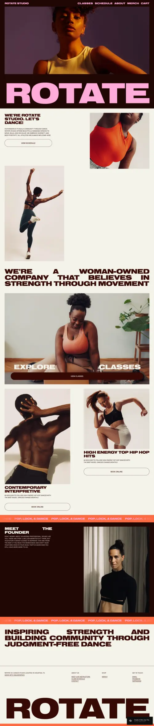
Rotate
Best for Fitness Studios & Movement Brands ✓ Pros
- High-energy 90s retro website aesthetic that drives action - visitors feel the studio's intensity before they see a class schedule or a price.
- Bold typography and large image sections communicate strength and movement in a way that clinical, minimal fitness templates simply can't match.
- Class schedule and offering sections integrate naturally, so the site functions as well as it looks for real fitness business operations.
- Built for community building - the retro website design creates an "us" feeling that's powerful for studios focused on loyalty and belonging.
- The empowering visual language works exceptionally well for woman-owned, body-positive, or inclusive fitness brands that want their values visible immediately.
✗ Cons
- The high-octane retro website design may feel too intense for yoga, mindfulness, or recovery-focused studios where calm and serenity are the brand promise.
- Heavy reliance on strong photography - if you don't have action shots of real classes, the template loses its impact significantly.
- Limited space for long written content like detailed instructor bios, workshop descriptions, or programming philosophies.
Rotate has the energy of a studio that earns its reputation by showing up every single day. It's not polished for the sake of being polished - it's powerful for the sake of making you feel something. If your fitness brand is about movement, community, and showing up even when it's hard, this retro website template has your back. It's the digital equivalent of a gym with no mirrors and all the right energy.
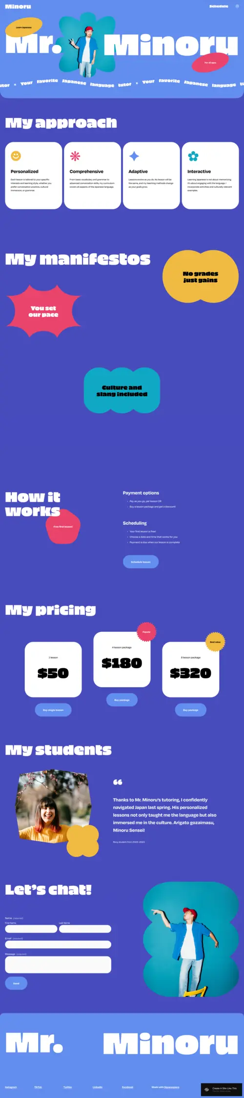
Minoru
Best for Tutors, Educators & Creative Coaches ✓ Pros
- Bright, playful retro website template that makes learning feel approachable and genuinely fun - a major differentiator in a space crowded with sterile, formal education sites.
- Bold colors and friendly layout help educators stand out from corporate training competitors who all use the same neutral, minimalist aesthetic.
- Strong personal branding support - the retro website design has real personality that lets individual educators build recognition and connection with students.
- Interactive feel invites exploration, which encourages visitors to look at more of your services, courses, or content rather than bouncing from the homepage.
- Supports course listings and booking integrations naturally, so the retro aesthetic doesn't come at the cost of functionality.
✗ Cons
- The playful retro website aesthetic won't suit formal academic institutions, corporate training programs, or contexts where authority and gravitas come first.
- Multiple bold colors can feel visually chaotic if used without a deliberate color system - requires more intentional customization than simpler templates.
- Requires strong personal branding to balance the template's bold energy; a weak or undefined brand identity will look lost in this much visual noise.
Minoru feels like learning from a friend who happens to be brilliant. Warm, accessible, and genuinely fun to navigate. If you're a tutor, coach, or educator who believes learning should feel like an adventure rather than an obligation, this retro website theme was built for you. It breaks the unwritten rule that educational websites have to look boring. And that's exactly the point.
How to Choose the Right Squarespace Retro Template
Match the Era to Your Brand's Energy
Not all retro website templates draw from the same era, and that distinction matters. Belisa pulls from the early 20th century speakeasy aesthetic - dark, warm, theatrical. Hemlock and Alta Loma lean toward the 60s and 70s natural, handcrafted movement. Soony and Rotate channel unmistakable 90s energy - bright, bold, irreverent. Minoru sits in a playful mid-century space. Before you choose, identify the specific retro era that aligns with your brand's personality. A 90s fitness aesthetic on a quiet artisan soap brand would create a jarring disconnect, no matter how well the individual template performs.
Consider Your Primary Website Goal
These six retro website templates are optimized for different outcomes. Belisa and Hemlock are built around creating atmosphere and driving reservations - perfect for food and drink businesses. Alta Loma and Soony prioritize product display and ecommerce conversion. Rotate drives class bookings and community building. Minoru is built for personal brand recognition and course enrollment. Identify your site's one primary job, then choose the template designed to do that job well within a retro aesthetic.
Think About the Role Photography Plays
Retro website templates live and die by their photography. Belisa demands moody, dark, atmospheric cocktail imagery. Alta Loma needs clean, soft product shots with natural lighting. Rotate requires real action photography - not stock gym photos. Minoru can work with illustrated or graphic elements alongside photography. Before committing to any retro website template, honestly assess what photography you have (or can create). The template that works for your photo library is more valuable than the template that would theoretically perform best with a different set of images.
Weigh Boldness Against Your Audience's Expectations
Your audience arrives with expectations. A client looking for a vegan cafe wants warmth and authenticity - Hemlock delivers that. A fitness class shopper wants energy and community - Rotate matches that expectation. The risk with retro website designs is choosing one that surprises your audience in the wrong direction: too dark for a children's education brand, too loud for a luxury skincare line. Use the template to amplify what your audience already wants to feel, not to challenge it.
Factor in Long-Term Scalability
Some retro website templates scale better than others. Soony handles a growing product catalog well. Belisa and Hemlock are best kept focused - more pages dilute the atmospheric impact. Rotate and Minoru work well as your service offering expands. Alta Loma stays elegant with a small, curated catalog but becomes harder to manage with 100+ SKUs. Think about where your business will be in two years, not just where it is today, when choosing between these Squarespace retro templates.
What Separates a Good Retro Template from a Great One
Not every template labeled "retro" actually delivers the nostalgia it promises. Many are simply generic layouts with a sepia filter or a serif font. A genuinely effective retro website template does something harder: it makes visitors feel something specific the moment they arrive, whether that's the haze of a 1970s dive bar, the energy of a 90s record shop, or the charm of a mid-century diner.
Typography is the most important element. The fonts on a retro template signal era and personality before any content loads. Belisa uses heavy slab serifs that read as speakeasy-era theatrical. Hemlock uses rounded organics that feel handcrafted and pre-digital. If a template's default fonts read as "clean and modern," no amount of color palette adjustment will make it feel genuinely vintage.
Color palette comes second. True retro palettes tend toward amber, rust, forest green, or faded cream rather than pure white backgrounds or bright primaries. Squarespace Site Styles let you adjust color globally, but the best retro templates start from a palette that already reads as vintage. This is a significant shortcut, because building a retro palette from scratch takes design experience most site owners do not have.
Layout structure reveals the platform's age. Retro-inspired sites often reference print design, with asymmetric grids, text that overlaps imagery, and decorative borders or dividers. Alta Loma and Rotate both pull from this visual language. Templates with clean, symmetric column layouts look contemporary regardless of their font choices, which limits how "retro" you can push them.
Performance cannot be sacrificed for aesthetics. Many decorative retro templates from third-party marketplaces load slowly because of custom JavaScript animations, decorative assets, and font loading overhead. All six templates reviewed here are native Squarespace templates, which means they inherit Squarespace's CDN delivery, automatic image optimization, and mobile responsiveness without any of the weight that third-party templates often add.
Frequently Asked Questions
What makes a Squarespace template look retro?
Are Squarespace retro templates free?
Which Squarespace retro template is best for a bar or restaurant?
Can I sell products on a Squarespace retro template?
How do I customize a Squarespace retro template without losing the vintage look?
Which retro Squarespace template works best for a personal brand or freelancer?
How We Evaluate Templates
Conclusion: Find Your Era, Build Your Site
The best retro website templates don't just look nostalgic - they feel like they belong to a specific world, and they make your brand feel like it belongs there too. Whether you're pouring cocktails in a Belisa-styled speakeasy, selling artisan goods through Alta Loma's timeless layouts, or energizing a fitness community with Rotate's 90s power, each of these Squarespace retro templates brings a distinct personality you can build an entire brand identity around.
Pick the one that matches your era, drop in your content, and let the nostalgia do the work.
Still exploring? These modern Squarespace templates offer a clean, contemporary alternative if retro isn't quite right for your brand. You can also browse our picks for personal website templates or our hand-selected templates for travel blogs to find your perfect starting point. For creatives specifically after the retro-internet aesthetic, our review of the best Squarespace 90s website templates covers the top picks for that niche.
* Read the rest of the post and open up an offer