
Editor's Picks
| # | Name | Best For | Price | Rating | Image | |
|---|---|---|---|---|---|---|
| 1 | Fine art photographers, still-life photographers, portrait artists, and visual creators with a cohesive, single-focus portfolio | Free | 4.8/5 |

|
More Info | |
| 2 | Fine art photographers, documentary photographers, street photographers, and visual storytellers with strong portfolio work | Free | 4.8/5 |

|
More Info | |
| 3 | Landscape photographers, nature photographers, architecture photographers, and visual creatives with expansive, wide-format work | Free | 4.7/5 |

|
More Info | |
| 4 | Architects, interior designers, graphic designers, industrial designers, and creative professionals with project-based portfolios | Free | 4.7/5 |
|
More Info | |
| 5 | Fine art photographers, exhibition photographers, visual artists, and gallery-represented creatives seeking a refined, white-space-led portfolio | Free | 4.9/5 |

|
More Info |
Our Picks: The Best Minimalistic Website Squarespace Templates
Cimen
Best for Minimalist Photographers & Visual Artists Showcasing a Single Body of Work ✓ Pros
- Open canvas layout with genuine negative space allows photography and artwork to exist on the page the way they exist in a gallery - without competition, without crowding, and without the visual noise that pulls a viewer's attention away from the work itself before they've had time to actually see it.
- Neutral colour palette is calibrated to complement rather than compete - warm neutrals, soft whites, and restrained tones create a visual foundation that makes any colour palette in the photography above it appear more vivid and intentional by contrast.
- Elegant typographic choices carry the aesthetic weight of the template's visual identity without needing any imagery to support them - a rare quality in minimalistic website templates that means the design holds together even in text-heavy sections like artist statements or project descriptions.
- Balanced, symmetric layout structure guides the viewer's eye through the portfolio in a deliberate sequence - a design consideration that matters enormously for photographers and artists whose work has a narrative or thematic arc that benefits from controlled discovery rather than random browsing.
- Deliberately simple navigation reduces cognitive load for gallery visitors, keeping the entire browsing experience focused on the work - every navigation element that doesn't need to exist has been removed, and what remains communicates exactly what it needs to and nothing more.
✗ Cons
- The minimalist architecture and sparse layout make the quality of photography and artwork the single most important variable - a Cimen site with mediocre or inconsistent imagery will feel empty rather than refined, and the template's openness amplifies both the excellence and the weakness of the work it displays.
- Limited sections for commercial or service-oriented content - pricing, availability, booking, or detailed commission information - means working photographers or artists who need their website to function as a client acquisition tool alongside a portfolio will find Cimen's architecture insufficient for those business functions.
- The focused, single-portfolio design philosophy doesn't scale well for visual creators with multiple distinct bodies of work, diverse client sectors, or a range of services that each require their own dedicated presentation - Cimen is designed for depth within a single creative vision, not breadth across many.
Cimen is the minimalistic website template that understands stillness as a design principle. The open canvas, the neutral palette, the precise typography - every element is there because it earns its place, and nothing that doesn't earn that place has been allowed in. For photographers and visual artists who create work that benefits from silence around it - still-life studies, fine art portraiture, conceptual imagery - Cimen provides the most respectful possible setting: one where the work receives the viewer's full, undivided attention.
Talva
Best for Photography Portfolios & Monochromatic Visual Storytelling ✓ Pros
- Monochromatic visual foundation creates a gallery-like viewing environment where colour within the photography itself appears with heightened presence and intentionality - for photographers who work with colour as a compositional element, this tonal restraint in the template design is a significant presentational advantage.
- Large, high-resolution image display prioritises photographic detail and full compositional integrity - visitors aren't viewing thumbnails that lose texture and depth, they're engaging with images at the scale where the photographer's craft is actually visible, which matters enormously for photographers whose work rewards close attention.
- Sequential gallery-style layout creates a curated viewing journey rather than a browsable grid - the distinction is important for photographers who create work in series or sequences, where the order in which images are encountered is part of the meaning they carry.
- Uncluttered, minimal navigational architecture keeps the visitor's attention undivided throughout the portfolio experience - there are no competing visual elements, no sidebar content, no promotional banners pulling focus away from the images that constitute the entire reason the visitor came.
- Adaptable across photography disciplines - street, documentary, portrait, landscape, editorial - without requiring restyling between genres, making Talva one of the most broadly applicable Squarespace minimalist templates for photographers working across multiple subject areas.
✗ Cons
- The sequential, gallery-style viewing model is less suited to photographers with large, diverse portfolios across many unrelated categories - visitors who want to navigate directly to a specific subject or client work type may find a linear gallery browsing model frustrating compared to a category-organised grid layout.
- The monochromatic template palette is a stronger design statement for photographers whose work is largely or partially monochromatic - photographers working primarily in bold, saturated colour may find the contrast between a black-and-white or low-saturation template and high-colour photography creates a tonal mismatch rather than complementary contrast.
- Limited content architecture for service-based photography businesses - wedding photographers, commercial photographers, or event photographers who need pages for packages, pricing, client testimonials, and enquiry forms will find Talva's portfolio-first design insufficient for the full business communication their website needs to accomplish.
Talva makes the strongest possible case for the power of simplicity in photography presentation. The monochromatic setting, the large-format image display, the sequential narrative structure - every design decision is in service of one goal: getting the viewer into the photography and keeping them there. For photographers who believe their work should be experienced rather than merely browsed, Talva creates the conditions for that experience with a rigour and restraint that few Squarespace minimalist templates match.
Falodu
Best for Landscape Photographers & Wide-Canvas Visual Portfolios ✓ Pros
- Wide-screen, full-bleed image display mirrors the actual scale and expansiveness of landscape and architectural photography - for photographers whose work is defined by horizontal scale, panoramic composition, and the vastness of natural or built environments, this is the presentational architecture that does that scale justice at screen size.
- Generous white space around and between images creates a contemplative pacing that is perfectly aligned with the viewing experience landscape photography invites - unhurried, immersive, and open to the quiet details that a viewer discovers on second and third looks.
- Subtle, restrained typography never competes with the visual scale of the work - section headings and descriptive text appear as quiet accompaniment rather than competing narration, maintaining the visual primacy of the landscape photography throughout the entire browsing experience.
- Clean, unassuming layout structure communicates the confidence of a photographer who knows the work doesn't need decoration - the absence of design flourishes is itself a statement about the quality and self-sufficiency of the photography it presents.
- Strong adaptability for architectural photography, seascape photography, and urban landscape work alongside traditional nature and wilderness imagery - the wide-canvas design principle serves any photography where horizontal composition and spatial scale are central to the work's meaning.
✗ Cons
- The wide-screen, full-bleed display architecture is specifically optimised for landscape-format (horizontal) photography - photographers working primarily in portrait orientation, square format, or mixed-aspect photography will find Falodu's proportional assumptions less accommodating of their compositional choices.
- The contemplative, spacious pacing of the layout is designed for viewing rather than rapid browsing or active search - visitors who arrive with a specific commercial purpose (licensing enquiry, print purchase, location scouting) may find the gallery-browsing experience less efficiently navigable than they need.
- Limited commercial and service content architecture - print sales, licensing information, location photography packages - means photographers who generate revenue from their landscape work will need to build significant additional pages beyond Falodu's core portfolio design to support those business functions.
Falodu is the minimalistic website template for photography that exists at scale - landscapes that demand room to breathe, architecture that needs the full width of the screen to make its argument, natural environments captured with a compositional ambition that only a wide-canvas display can honour. The template's generosity of space is not emptiness; it's the recognition that some photographic work requires distance to be seen properly. For landscape and architectural photographers committed to showing their work as it was made - large, open, and unhurried - Falodu provides the right context.
Utica
Best for Architects, Designers & Structured Portfolio Presentations ✓ Pros
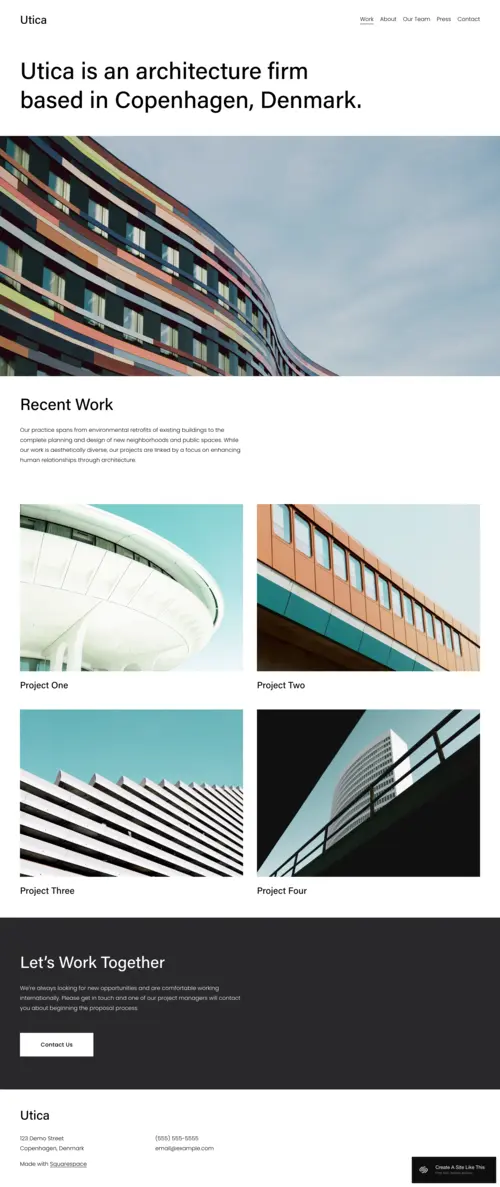
- Structured grid layout is architecturally appropriate for professionals whose work is itself defined by structure, order, and spatial logic - an architect or designer whose portfolio is presented in a rigorous, grid-based template communicates methodological coherence before a single project image is opened.
- Clean lines and precise white space reflect the design values of the professionals the template serves - visitors who are evaluating an architect or designer's portfolio are simultaneously evaluating their aesthetic sensibility, and a template whose design principles mirror those of the profession it serves creates an immediate alignment signal.
- Project-based grid navigation allows visitors to move efficiently between work - clients, recruiters, and collaborators who arrive to assess a specific type of project can navigate a Utica portfolio with the purposeful efficiency a professional context demands.
- Modern, sophisticated aesthetic communicates the professional credibility that architecture and design portfolios require - the template's visual authority positions the portfolio work as serious, accomplished, and worthy of the professional opportunities that portfolio site visitors are often evaluating.
- Thoughtful section spacing allows individual projects to stand out within the grid while maintaining the cohesive visual logic of the overall portfolio - a design balance that is genuinely difficult to achieve and that Utica resolves more elegantly than most structured portfolio templates.
✗ Cons
- The structured grid aesthetic is calibrated for professionals whose work has a certain formality and precision - artists, photographers, and creatives whose work has an organic, expressive, or unstructured quality may find Utica's rigorous architectural logic feels tonally incongruent with the nature of their practice.
- The project-grid orientation assumes a portfolio of completed, discrete projects - professionals in the early stages of their career with a limited project count, or creatives who work in continuous series rather than distinct projects, may find the grid format reveals gaps rather than communicating abundance.
- Limited narrative and contextual content sections mean architecture and design professionals who want to communicate their design philosophy, process methodology, or academic background in depth may find Utica's text architecture insufficient for that level of professional self-presentation.
Utica is the minimalistic website template that speaks the language of architecture and design - precise, structured, and confident in the visual grammar of the grid. The orderly layout, the clean lines, the deliberate spacing - all of it communicates what a design professional most needs to communicate before a portfolio image is opened: that they understand the discipline they practice at a level that shows in every design decision they make, including the ones governing how their portfolio is presented. For architects, interior designers, and graphic designers who believe the way their portfolio is organised is itself a piece of design thinking, Utica is the template that makes that argument clearly.
Nevins
Best for Fine Art Photography & Gallery-Quality Portfolio Presentations ✓ Pros
- Gallery-style layout with a commitment to negative space creates the white-wall exhibition environment that fine art photography and gallery-calibre creative work deserves - every image has the breathing room of a physical gallery presentation, communicating that the work is being shown rather than merely displayed.
- Precisely balanced layout architecture communicates curation and intention at the structural level - the template itself is a gallery design decision, and for photographers and artists who present at gallery and exhibition level, Nevins signals that standard before a single image is viewed.
- Subtle hover effects add a layer of contemporary interactivity without violating the minimalist visual contract - the gentle animation acknowledges the digital context while maintaining the restraint that the template's aesthetic philosophy demands.
- Sophisticated, refined overall aesthetic positions the portfolio within the visual language of gallery representation and fine art presentation - the kind of first impression that matters profoundly for photographers seeking exhibition, gallery, or editorial representation where the presentation of the work is evaluated alongside the work itself.
- Ample negative space allows each image its own moment of focus, creating a viewing rhythm that is slower, more contemplative, and more respectful of the photography than a densely packed grid - the design rewards the kind of viewer who gives work the attention it deserves, which is exactly the viewer a fine art photographer wants to attract.
✗ Cons
- The gallery-quality aesthetic and substantial use of negative space create a high baseline expectation - a Nevins site populated with technically inconsistent or stylistically varied work will be judged more harshly than the same work presented on a busier, less refined template, because the design signals that the work has been edited and curated to gallery standard.
- The fine art, gallery-oriented positioning is specifically calibrated for photographers and artists working at an exhibition or representation-seeking level - commercial photographers, documentary practitioners, or creatives whose primary audience is editorial or advertising clients may find the aesthetic too gallery-formal for their specific professional context.
- The white space emphasis and contemplative pacing are not optimised for visitors with a commercial or transactional purpose - clients seeking a photographer for an event, assignment, or licensing deal may find the gallery browsing experience less practically informative than a template that more directly surfaces pricing, availability, and commercial services information.
Nevins is the minimalistic website template for photographers and artists who see their work not as content but as art - and who understand that the context in which art is presented is as important as the art itself. The gallery layout, the negative space, the subtle hover details - every element of Nevins communicates the same thing: that what you're looking at has been made with intention, curated with rigour, and deserves to be seen in a space that respects it. For fine art photographers and visual artists whose portfolio serves as an exhibition rather than a catalogue, Nevins is the most considered choice.
How to Choose the Right Minimalistic Website Squarespace Template
Match Your Template's Spatial Philosophy to Your Work's Viewing Requirements
Minimalistic website templates are not interchangeable - each one embodies a specific approach to the relationship between work, space, and viewer that is suited to different types of creative practice. Cimen's open canvas and neutral palette serve work that benefits from complete visual isolation - still-life photography, fine art objects, single-image impact. Talva's sequential, gallery-scale display is designed for photography that rewards slow, linear discovery. Falodu's wide-canvas, full-bleed architecture honours the horizontal scale of landscape and architectural photography. Utica's structured grid communicates the disciplined, project-based thinking of design and architecture practice. Nevins' gallery-quality negative space is calibrated for fine art photography and artwork presented at exhibition standard. Before choosing a template, consider how your work is most meaningfully viewed - the template's spatial philosophy should serve the work's viewing requirements, not impose a generic minimalism on work that needs something more specific.
Think About Whether You Need Portfolio or Business Functionality
All five minimalistic templates reviewed here are portfolio-first designs - they are built to present creative work beautifully, not to function as comprehensive business websites. If your primary need is a portfolio that communicates the quality of your practice to galleries, agents, clients, or editorial commissioners, any of these five templates will serve that purpose with distinction. If your website also needs to function as a client acquisition tool - pricing pages, booking systems, testimonials, enquiry forms, commercial service packages - you will need to build those sections within the template's existing architecture or evaluate whether a more full-featured template better serves your combined portfolio and business needs. The most common mistake creative professionals make is choosing a portfolio template for a business that needs more than a portfolio website.
Consider the Role of Curation in Your Template's Success
Minimalistic website templates succeed or fail based on the quality of the editorial decisions made by the person populating them. In a dense, busy template, weak work can be hidden among strong work - in a minimalistic template, every piece is visible and every piece is evaluated. This is both the greatest strength and the most demanding aspect of minimalist design: it requires ruthless curation, the willingness to show twelve exceptional images rather than forty average ones, and the confidence that less is genuinely more. Before launching any of these templates, curate your portfolio as you would for a physical gallery submission: only the work that represents your practice at its current best, in a sequence that tells a coherent story about who you are and what you make. The edit is the design decision that matters most.
Prioritise Image Quality Over Image Quantity
Every minimalistic website template reviewed here has one absolute requirement: the photography and artwork must be excellent. In a design that removes everything except the work, the work has nowhere to hide. File resolution, colour accuracy, compositional consistency across the portfolio, and the coherent visual identity that emerges when images are viewed together - these are the variables that determine whether a minimalistic portfolio template communicates refinement and mastery or sparseness and incompleteness. Before populating any of these templates, invest in professional colour calibration for your display, export your images at the highest quality appropriate for web delivery, and view them at full size on a calibrated screen before publishing. The template will do everything possible to showcase your work at its best - the work needs to meet that standard.
Frequently Asked Questions
What is the best Squarespace minimalist template?
Can I use a minimalist Squarespace template for a business website?
How do I make my Squarespace website look more minimalist?
What Squarespace plan do I need for a minimalist portfolio website?
Can I sell prints from a minimalist Squarespace photography template?
How many images should I include in a minimalist Squarespace portfolio?
Can I switch Squarespace minimalist templates after my site is built?
What makes a good minimalist website design?
How We Evaluate Templates
Conclusion: Squarespace Minimalistic Website Templates That Let the Work Speak
The right minimalistic website template doesn't frame your work - it disappears around it. Cimen provides the open canvas where still-life and fine art photography stands completely alone. Talva creates the sequential gallery experience that does justice to photography as visual storytelling. Falodu gives landscape and architectural photography the wide, breathing space that its compositional ambition deserves. Utica brings the structural rigour of design practice to the portfolio format, communicating discipline before a project is opened. Nevins creates a gallery-quality presentation that positions fine art photography and artwork within the visual language of curation and exhibition.
Every visitor who lands on a minimalistic portfolio website is deciding whether the work they're seeing deserves their attention. The template you choose is the environment that frames that decision - and the best minimalistic templates make the environment so considered, so quiet, and so purposeful that the visitor's entire attention falls exactly where it should: on your work.
Looking for more portfolio and visual creative templates? Explore our picks for the best Squarespace templates for artists and the finest fashion photography website templates we've reviewed. If you work in paint and mixed media, our selection of templates for painters covers the specific presentational needs of painting and fine art practice.
If minimal isn't your aesthetic and you want a template where bold personality drives the design, our picks for the best Squarespace retro templates take a completely different approach.
* Read the rest of the post and open up an offer